


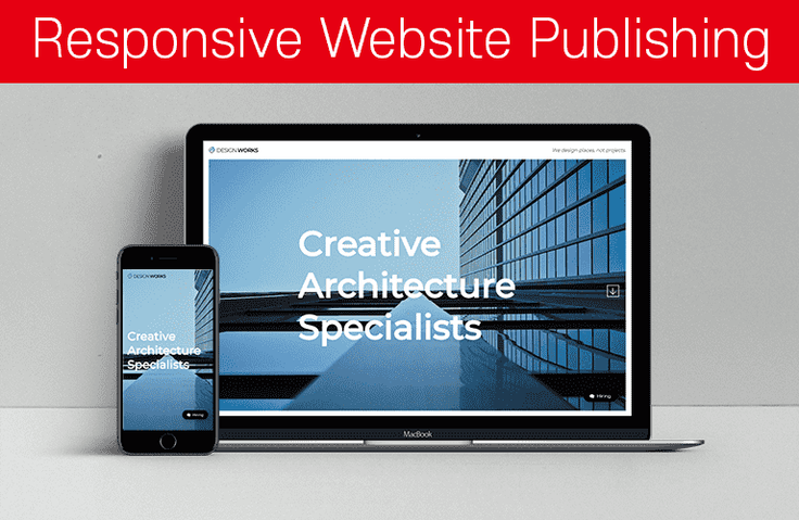
반응형 웹사이트 포트폴리오(Architecture Agency)
HTML+CSS+JQUERY 퍼블리싱으로 반응형 웹사이트 전체 제작과정을 통해 퍼블리싱 중급 실력으로 가는 기본기를 단단히 하고 실전 퍼블리싱의 노하우를 갖게 됩니다. 특히, 웹사이트 전체 제작과정을 충분한 설명과 실전 작업으로 경험하고 개인 포트폴리오 웹사이트 제작에 자신감을 갖게 됩니다. (반응형 제작 방식은 기존 방식의 float와 position을 이용한 반응형 레이아웃 제작 방식입니다. 현재로서는 기존 웹사이트가 기존 방식으로 제작된 레이아웃이 대부분이기 때문에 Flex와 Grid도 학습해야 하지만 기존 방식 레이아웃을 반드시 학습하시고 잘 사용해야 합니다.)
수강생 849명
난이도 중급이상
수강기한 무제한
다른 수강생들이 자주 물어보는 질문이 궁금하신가요?
- 미해결
full reload 질문
선생님 처럼 영상을 보고 css full reload 를 설정 했는데 체크를 해제하면 css 수정 시 안올라가고 체크를 하면 올라 갑니다 또한 html 수정시 마다 매번 위(무한스크롤링)로 올라 갑니다. 해결방법이 있나요?
HTML/CSSjquery웹-디자인반응형-웹작성자 없음
・
1
196
3
- 미해결
섹션4에 있는 4번째 강의 질문(스크롤링)
스크롤링 권장 스크립트 올려주신 부분으로 했는데 작동이 되지 않아 해결 방법 문의 드립니다. 권장&
HTML/CSSjquery웹-디자인반응형-웹작성자 없음
・
1
159
2
- 미해결
안녕하세요. 질문있어서 조심스레 글을 올려봅니다.
page-scroll-effect를 맨 상단 비주얼부분에만 적용하고나머지 section 들은 높이값을 갖도록 하고싶은대요.혹시 알수 있을까요? 말주변이 없어서 아래 이미지를 그렸습니다. ㅠㅠ <img s
HTML/CSSjquery웹-디자인반응형-웹foxball
・
1
209
1
- 미해결
브라켓 라이브 실행시 실행오류때문에 진도가안나갑니다..ㅠㅠ
■ 질문 남기실 때 꼭! 참고해주세요.<img src="https://cdn.inflearn.com/public/files/posts/0bd0fe43-d837-4814-895c-dd25fc557ec3/ì¤í¬ë¦°ì·2024-06-28ì¤í3.2
HTML/CSSjquery웹-디자인반응형-웹upward070
・
1
332
3
- 미해결
css full reload 문제가 발생하여 질문드립니다!
<meta name="viewport" c
HTML/CSSjquery웹-디자인반응형-웹ckrnckr12
・
1
327
3
- 미해결
파일 내 index.html에 대한 오류
<meta name="viewport" con
HTML/CSSjquery웹-디자인반응형-웹ckrnckr12
・
1
268
1
- 미해결
모바일 네비게이션 퍼블리싱 - 모바일트리거, GNB 보이기 감추기 부분 해결되지 않아 재 질문 드립니다ㅠㅠ
<meta name="viewport" con
HTML/CSSjquery웹-디자인반응형-웹ckrnckr12
・
1
213
1
- 미해결
모바일 네비게이션 퍼블리싱 - 모바일트리거, GNB 보이기 감추기 질문입니다
<meta name="viewport" con
HTML/CSSjquery웹-디자인반응형-웹ckrnckr12
・
0
219
2
- 미해결
모바일 네비게이션 퍼블리싱 ㅡ모바일트리거,GNB 보이기 감추기 부분 다시 수정하여 질문드립니다!
<meta name="viewport" con
HTML/CSSjquery웹-디자인반응형-웹ckrnckr12
・
1
208
2
- 미해결
모바일 네비게이션 퍼블리싱 ㅡ모바일트리거,GNB 보이기 감추기 부분 질문드립니다.
& History Awards Location <
HTML/CSSjquery웹-디자인반응형-웹ckrnckr12
・
1
261
3
- 미해결
크로스브라우징-크롬
선생님 안녕하세요.서브페이지 모바일로 변환하기를 마치고 마지막으로 크로스 브라우징을 하는 과정에서 크롬으로 서버를 바꿔서 해봤는데 엣지로 했을 때 보다 웹페이지가 엄청 확대되어서 나옵니다. 어떻게 해야 하나요? 제가 일일이 수정 해야 하나요? (저는
HTML/CSSjquery웹-디자인크롬엣지크로스브라우징김연재
・
1
291
2
- 미해결
섹션 17 하드코딩으로 이미지맵 만들기 부분 연습파일이 없어요..
하드코딩으로 이미지맵(image map) 만들기코딩웍스 유튜트 채널에 있는 [이미지맵(image map) 만들기]에 상세히 강좌가 있습니다.실무에서 꼭! 사용하게 되니
HTML/CSSjquery웹-디자인반응형-웹d111
・
0
261
1
- 미해결
line-hieght를 em 단위로 쓰는 것에 대하여 질문 드립니다
jump up 이론 파트 em단위와 rem 단위 이해하기 부분 강의를 듣는 중입니다. em 단위가 부모요소에 대해 상대적으로 지정하는 단위이고line-height에 주로 쓰인다고 하셨는데그렇다면 주로 p
HTML/CSSjquery웹-디자인반응형-웹d111
・
1
222
1
- 미해결
슬릭 슬라이더 dots 보이게 하는 방법 질문 드립니다
오른쪽 사진 밑에 슬릭 dots 보이게 하고 싶은데 어떻게하면 될까요?<p
HTML/CSSjquery웹-디자인반응형-웹d111
・
1
289
1
- 미해결
이거 h2 가 안나오고 스크롤도 안되는데 왜이래요?
이런 화면만 나오는데요? css 연결 잘했는데 안돼요
HTML/CSSjquery웹-디자인반응형-웹tkddnjs1018
・
1
265
1
- 해결
모바일 버전에서 메뉴 클릭 후 그 위치로 이동할 때 상단 영역
메인 페이지 모바일로 변경하는 부분까지 수강 잘 마쳤습니다.자세히 잘 설명해주셔서 감사해요.그런데 모바일 버전에서 메뉴로 해당 위치로 이동했을 때, 상단 영역 때문에 화면 윗부분이 잘려보이는 부분은 어떻게 해결해야 할까요?조금
HTML/CSSjquery웹-디자인반응형-웹hdmedi
・
1
521
2
- 미해결
PC에서 모바일화면으로 전환되면 GNB 메뉴가 OPEN되어있는 상태 (소스)4
@media (max-width:768px) { /* html { scroll-behavior: smooth; } */ /* Entire Layout */ .cd-section { height: auto; }
HTML/CSSjquery웹-디자인반응형-웹audlovewns
・
2
235
1
- 미해결
PC에서 모바일화면으로 전환되면 GNB 메뉴가 OPEN되어있는 상태 (소스)3
/* Google Web Font : Montserrat */ @import url('https://fonts.googleapis.com/css?family=Montserrat:200,300,400,500&display=swap'); @imp
HTML/CSSjquery웹-디자인반응형-웹audlovewns
・
2
316
1
- 미해결
PC에서 모바일화면으로 전환되면 GNB 메뉴가 OPEN되어있는 상태 (소스 js)2
/* document ready랑 같은거 = html을 다 읽은 후 실행해라고 표시 */ /* Trigger */ $(function(){ $('.trigger').click(function(){ $(this).toggleClas
HTML/CSSjquery웹-디자인반응형-웹audlovewns
・
2
274
1
- 미해결
PC에서 모바일화면으로 전환되면 GNB 메뉴가 OPEN되어있는 상태
수업진행을 하는 과정에 있어서 제가 문제를 찾아볼려고 했는데 못찾아서 질문을 드립니다.PC에서 모바일 화면으로 전환되면 GNB메뉴가 항시 OPEN되어있는 상태로 화면이 보이게 되면서 계속 GNB메뉴를 닫아야하더라구요. 선생님께서는 그런 문제가 없어보여
HTML/CSSjquery웹-디자인반응형-웹audlovewns
・
2
441
1