
-
질문 & 답변
카테고리
-
세부 분야
웹 개발
-
해결 여부
해결됨
개발자도구
23.10.25 11:04 작성 조회수 201
2
개발자도구에서 모바일 버전으로 볼때 계속 인터넷 연결없음으로 나옵니다 ㅠㅠ
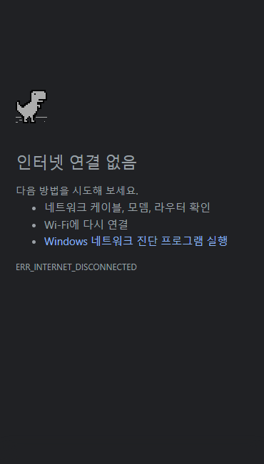
그리고 폴더에 있는 index파일을 누르면
 사진과 같이 기본 셋팅만 나오는데 왜 그런지 알 수 있을까요?

답변을 작성해보세요.
1

코딩웍스(Coding Works)
지식공유자2023.10.26
아래 올리신 코드를 제가 그대로 복사해서 테스트 해봤는데 전혀 문제 없는데요.

아마도 비주얼스튜디오코드에서 루트폴더 지정을 잘못하신게 아닌가 합니다.

0

오잉
질문자2023.10.26
js (글자수 제한이 있어서 따로따로 올립니다 감사합니다!)
$(function(){
  /* Trigger */
  $('.trigger').click(function(){
    $(this).toggleClass('active')
    $('.gnb').toggleClass('active')
  })
  $('section, .menu a').click(function(){
    $('.gnb').removeClass('active')
    $('.trigger').removeClass('active')
  })

	/* Smooth Scrolling */
  $('.menu a, .gototop').click(function(e){
    $.scrollTo(this.hash || 0, 900)
  })

  // Change CSS with Scroll
  $(window).scroll(function(){
    if($(window).scrollTop() > 50) {
      $('header, .gototop').addClass('active')
    }
    else {
      $('header, .gototop').removeClass('active')
    }
  })

   // Slick.js history
  $('.history-slider').slick({
    dots: true,
    infinite: false,
    speed: 300,
    slidesToShow: 4,
    slidesToScroll: 2,
    responsive: [
      {
        breakpoint: 1024,
        settings: {
          slidesToShow: 3,
          slidesToScroll: 3,
          infinite: true,
          dots: true
        }
      },
      {
        breakpoint: 600,
        settings: {
          slidesToShow: 2,
          slidesToScroll: 2
        }
      },
      {
        breakpoint: 480,
        settings: {
          slidesToShow: 1,
          slidesToScroll: 1
        }
      }
      // You can unslick at a given breakpoint now by adding:
      // settings: "unslick"
      // instead of a settings object
    ]
  })

  // Slick.js project photo
  $('.project-photo').slick({
    dots: true,
    infinite: true,
    speed: 500,
    fade: true,
    autoplay: true,
    autoplaySpeed: 2000,
    cssEase:'linear'
  })

})0
오잉
질문자2023.10.26
반응형 CSS
@media (max-width: 768px) {
  /* Entire Layout */
  .cd-section {
    height: auto;
  }
  .cd-section > div {
    height: auto;
  }
  .content {
    position: static;
    width: 100%;
    height: 100%;
  }
  /* Header */
  header {
    transition: 0.5s;
    z-index: 1;
  }
  header.active {
    background: white;
    border-bottom: 1px solid #ddd;
  }
  .menu {
    display: block;
  }
  .slogan {
    display: none;
  }
  .gnb {
    background-color: #fff;
    position: fixed;
    top: 0;
    right: -270px;
    width: 250px;
    height: 100vh;
    box-shadow: -5px 0 10px rgba(0, 0, 0, 0.1);
    transition: 0.5s;
  }
  .gnb.active {
    right: 0;
  }
  .menu {
    line-height: 40px;
    margin-top: 60px;
  }
  .menu a {
    display: block;
    text-align: right;
    padding-right: 20px;
    color: black;
    font-size: 20px;
  }
  /* Trigger */
  .trigger {
    display: block;
    width: 24px;
    height: 14px;
    position: absolute;
    right: 20px;
    top: 20px;
  }
  .trigger span {
    position: absolute;
    height: 1px;
    width: 100%;
    background-color: black;
    transition: 0.5s;
  }
  .trigger span:nth-child(1) {
    top: 0;
  }
  .trigger span:nth-child(2) {
    top: 50%;
    width: 80%;
  }
  .trigger span:nth-child(3) {
    top: 100%;
  }
  .trigger.active span:nth-child(1) {
    top: 50%;
    transform: rotate(45deg);
  }
  .trigger.active span:nth-child(2) {
    top: 50%;
    width: 80%;
    opacity: 0;
  }
  .trigger.active span:nth-child(3) {
    top: 50%;
    transform: rotate(-45deg);
  }
  /* Gototop */
  .gototop {
    position: fixed;
    bottom: 20px;
    left: 20px;
    z-index: 2;
    border: 1px solid white;
    display: block;
    width: 40px;
    height: 40px;
    border-radius: 50%;
    text-align: center;
    line-height: 52px;
    transform: translateY(30px);
    opacity: 0;
    transition: 0.5s;
  }
  .gototop.active {
    opacity: 1;
    transform: translateY(0);
  }
  /* Hiring Button */
  .btn-hiring {
    right: 20px;
    bottom: 20px;
  }
  .cd-vertical-nav {
    display: none;
  }

  /* ### Section : home ### */
  .home-inner {
    height: 100vh;
  }
  .welcome-text {
    transform: translate(-50%, -50%) scale(0.7);
    width: 100%;
  }
  .home-heading {
    left: 20px;
  }
  .home-heading span {
    font-size: 50px;
  }

/* ### Section : about ### */
  .about-inner {
    height: auto;
    padding: 20px;
    background: #0dace3;
  }
  .about-items {
    width: 100%;
    position: static;
    margin-left: 0;
    transform: none;
    text-align: center;
  }
  .item img {
    float: none;
  }

/* ### Section : plan ### */
  .plan-inner {
    height: auto;
    padding: 20px;
  }
  .plan-feature {
    width: 100%;
    position: static;
    transform: none;
  }
  .plan-feature > div {
    height: auto;
  }
  .plan-info {
    margin-bottom: 40px;
  }
  .plan-info div {
    float: none;
    width: 100%;
  }
  .plan-heading {
    padding-right: 0;
  }
  .plan-photo img {
    width: 100%;
    height: auto;
  }

  /* ### Section : awards winner ### */
  .awards-inner {
    height: auto;
  }
  .awards-inner > div {
    float: none;
    width: 100%;
  }
  .about-heading,
  .victory-jump img {
    position: static;
    transform: none;
    padding: 40px 20px;
  }
  .about-heading {
    width: 100%;
  }
  .victory-jump img {
    text-align: center;
  }

  /* ### Section : location winner ### */
  .location-inner {
    height: auto;
  }
  .feature {
    width: 100%;
    position: relative;
    top: 0;
    left: 0;
    transform: none;
  }
  .feature > div {
    float: none;
    width: 100%;
    padding: 20px;
  }

  /* ### Section : contact ### */
  .contact-inner {
    height: auto;
  }
  .contact-feature {
    width: 100%;
    position: static;
    transform: none;
  }
  .contact-feature > div {
    float: none;
    width: 100%;
  }

  /* ### Section : project ### */
  .project-inner {
    height: auto;
    border: none;
  }
  .tab > div {
    width: 100%;
    float: none;
  }
  .view-project {
    width: 100%;
  }
  .project-info {
    padding: 20px;
  }
  .detail div {
    font-size: 13px;
  }
  .btn {
    width: 100%;
    bottom: -10px;
  }
  .project-info p {
    position: relative;;
  }

  /* ##### SubPage : Hiring ##### */
  .hiring-info {
    padding: 20px;
  }
  .hiring-main {
    height: 300px;
  }
  .hiring-heading {
    width: 100%;
    top: 60%;
  }
  .hiring-heading h1 {
    font-size: 32px;
    margin-top: 10px;
  }
  .hiring-heading span:before,
  .hiring-heading span:after {
    background-color: #141414;
  }
  .hiring-info > div {
    float: none;
    width: 100%;
    height: auto;
  }
  .center-child {
    position: static;
    transform: none;
    width: 100%;
  }
  .hiring-slogan {
    padding: 50px 0;
  }
  .hiring-slogan p {
    font-size: 26px;
  }
  .hiring-slogan p:before {
    top: -72px;
    left: -60px;
  }
  .hiring-contact ul {
    display: block;
    width: 100%;
  }
  .center-child h2 {
    font-size: 28px;
  }

  /* Featherlight Mobile CSS */
  .featherlight .featherlight-close-icon {
    font-size: 25px;
    right: 30px;
  }

  /* ##### SubPage : Project ##### */
  .hiring-main.project-main1,
  .hiring-main.project-main2,
  .hiring-main.project-main3 {
    height: 70vh;
  }
  .hiring-main.project-main1 .hiring-heading h1,
  .hiring-main.project-main2 .hiring-heading h1,
  .hiring-main.project-main3 .hiring-heading h1 {
    font-size: 40px;
  }
  .photo.project-info {
    font-size: 19px;
  }


}0
오잉
질문자2023.10.26
스타일 CSS
/* Google Web Font : Montserrat */
@import url('https://fonts.googleapis.com/css?family=Montserrat:200,300,400,500&display=swap');
@import url('https://fonts.googleapis.com/css?family=Manrope:300,400,500,600&display=swap');
@import url('https://fonts.googleapis.com/css2?family=Source+Sans+Pro:wght@200;300;400;600;700;900&display=swap');
@import url('https://fonts.googleapis.com/css2?family=Overpass&display=swap');
/* FontAwesome CDN 4.7 */
@import url('https://stackpath.bootstrapcdn.com/font-awesome/4.7.0/css/font-awesome.min.css');

/* Reset CSS */
* { box-sizing: border-box; }
ul { list-style: none; padding: 0;}
a { text-decoration: none; }

/* Default CSS */
body {
  font-family: 'Montserrat', sans-serif;
  color: #222;
  font-size: 15px;
  margin: 0;
  height: 100vh;
  background: white;
}

/* Entire Layout */
.cd-section {
  height: 100vh;
}
.cd-section > div {
  height: 100%;
  position: relative;
}
.content {
  background-color: white;
  position: absolute;
  width: calc(100% - 40px);
  height: calc(100% - 80px);
  left: 20px;
  bottom: 20px;
  overflow: hidden;
}
/* Header */
header {
  position: fixed;
  width: 100%;
  top: 0;
  left: 0;
}
.gnb-inner {
  width: calc(100% - 40px);
  height: 60px;
  margin: auto;
  line-height: 60px;
}
.logo {
  float: left;
}
.logo img {
  padding-top: 17px;
}
.gnb {
  float: right;
}
.menu {
  display: none;
}
.slogan {
  font-size: 16px;
  font-style: italic;
}
.trigger {
  display: none;
}
/* Hiring Button */
.btn-hiring {
  position: fixed;
  right: 50px;
  bottom: 50px;
  color: white;
  background-color: black;
  padding: 10px 20px;
  border-radius: 20px;
  box-shadow: 5px 5px 20px #00000017;
  transition: 0.5s;
}
.btn-hiring .fa {
  transform: rotateY(180deg);
  margin-right: 5px;
}
.btn-hiring:active {
  transform: scale(80%);
}

/* ### Section : project ### */
.project-inner {
  height: 100%;
  overflow: hidden;
  border: 1px solid #ddd;
}
.tabs {
  height: 100%;
  width: 300%;
  transition: 0.5s;
}
.tab {
  width: calc(100% / 3);
  height: 100%;
  float: left;
}
.tab > div {
  height: 100%;
  float: left;
}
.project-info {
  width: 25%;
}
.project-photo {
  width: 75%;
  overflow: hidden;
}
input[name='tabmenu'] {
  display: none;
}
.btn {
  position: absolute;
  left: 0;
  bottom: 30px;
  width: 25%;
  text-align: center;
}
.btn label{
  cursor: pointer;
  width: 5px;
  height: 5px;
  background-color: black;
  display: inline-block;
  border-radius: 50%;
  margin: 8px;
  position: relative;
}
.btn label:before {
  content: '';
  display: inline-block;
  border: 1px solid transparent;
  width: 17px;
  height: 17px;
  border-radius: 50%;
  position: absolute;
  left: -6px;
  top: -6px;
  transition: 0.3s;
}
.btn label:hover:before {
  border: 1px solid #bbb;
}
input[id='tab1']:checked ~ .btn label[for='tab1']:before,
input[id='tab2']:checked ~ .btn label[for='tab2']:before,
input[id='tab3']:checked ~ .btn label[for='tab3']:before {
  border: 1px solid #bbb;
}
input[id='tab1']:checked ~ .tabs {
  margin-left: 0;
}
input[id='tab2']:checked ~ .tabs {
  margin-left: -100%;
}
input[id='tab3']:checked ~ .tabs {
  margin-left: -200%;
}
/* Project info */
.project-info {
  padding: 50px;
  position: relative;
}
.project-info:before {
  content: attr(data-text);
  font-size: 130px;
  color: #eee;
  position: absolute;
  top: -10px;
  left: 10px;
}
.project-info h3 {
  font-size: 20px;
  position: relative;
}
.project-info p {
  font-size: 16px;
  line-height: 1.6em;
}
.project-info ul {
  line-height: 2em;
  margin: 50px 0;
}
.project-info ul li:before {
  content:"\f105";
  font-family: fontawesome;
  margin-right: 10px;
}
.detail {
  margin-bottom: 50px;
}
.detail div {
  display: inline-block;
  text-align: center;
  width: 32.5%;
  color: #999;
}
.detail div span {
  font-size: 36px;
  font-weight: bold;
  display: block;
  color: black;
  margin-bottom: 10px;
}
.view-project {
  background: #3f3f3f;
  color: white;
  text-transform: uppercase;
  font-size: 13px;
  display: inline-block;
  width: 250px;
  padding: 10px;
  text-align: center;
  transition: 0.3s;
  position: relative;
}
.view-project:hover {
  background-color: black;
}
.view-project .fa {
  transition: 0.3s;
}
.view-project:hover .fa {
  margin-left: 10px;
}

/* ### Section : home ### */
.home-inner {
  background-color: white;
  height: 100%;
}
.home-inner:before {
  content: '';
  background-color: black;
  position: absolute;
  top: 0;
  left: 0;
  width: 10;
  height: 100%;
  animation: overlay 1s 2s ease-in-out both;
}
.welcome-text {
  position: absolute;
  top: 50%;
  left: 50%;
  transform: translate(-50%, -50%);
  font-size: 40px;
  font-weight: 300;
  text-align: center;
  line-height: 1.2em;
  margin: 0;
  font-family: 'Source Code Pro';
  animation: sliderup 2s 0s linear both;
}
.welcome-text span {
  display: block;
  font-size: 20px;
}
.welcome-text span .fa {
  color: crimson;
}
.opacity-image {
  background: url(/images/section-bg-01.jpg) no-repeat center center;
  background-size: cover;
  height: 100%;
  opacity: 0;
  animation: opacity-image 1s 2.5s ease-in-out both;
}
.home-heading {
  position: absolute;
  top: 50%;
  left: 300px;
  transform: translateY(-50%);
}
.home-heading span {
  display: block;
  font-size: 115px;
  color: white;
  font-weight: 600;
  width: 0%;
  overflow: hidden;
  animation: reveal 0.5s 3s ease-in both;
}
.home-heading span:nth-child(1) {
  animation-delay: 3s;
}
.home-heading span:nth-child(2) {
  animation-delay: 3.2s;
}
.home-heading span:nth-child(3) {
  animation-delay: 3.4s;
}

@keyframes sliderup {
  0% {
    opacity: 0;
    margin-top: 50px;
  }
  20% {
    opacity: 1;
    margin-top: 0;
  }
  40% {
    opacity: 1;
    margin-top: 0;
  }
  100% {
    opacity: 0;
  }
}
@keyframes overlay {
  0% {
    width: 0;
    left: 0;
  }
  50% {
    width: 100%;
    left: 0;
  }
  100% {
    width: 0%;
    left: 100%;
  }
}
@keyframes opacity-image {
  0% {
    opacity: 0;
  }
  100% {
    opacity: 1;
  }
}
@keyframes reveal {
  0% {
    width: 0;
  }
  100% {
    width: 100%;
  }
}

/* ### Section : about ### */
.about-inner {
  background: #0dace3 url(/images/line-drawing.png)no-repeat right bottom;
  height: 100%;
}
.about-items {
  width: 50%;
  color: white;
  position: absolute;
  top: 50%;
  transform: translateY(-50%);
  left: 100px;
}
.item {
  overflow: hidden;
  margin-bottom: 40px;
}
.item:hover img {
  filter: invert(0);
  transition: 0.5s;
}
.item img {
  height: 120px;
  float: left;
  margin-right: 20px;
  filter: invert(1);
}
.item h3 {
  font-size: 28px;
  font-weight: 500;
  margin: 0;
  transition: 0.5s;
  letter-spacing: -1px;
}
.item:hover h3 {
  color: black;
}
.item p {
  overflow: hidden;
  font-size: 18px;
}

/* Slick.js Custom CSS */
.history-slider .slick-arrow {
  display: none !important;
}
.history-slider .slick-dots li button:before {
  font-size: 40px;
  color: white;
}
.history-slider .slick-dots li {
  margin: 0;
}


/* Featherlight Custom CSS */
.featherlight .featherlight-content {
  position: relative;
  text-align: left;
  vertical-align: middle;
  display: inline-block;
  overflow: auto;
  padding: 0;
  border-bottom: 25px solid transparent;
  margin-left: 0;
  margin-right: 0;
  max-height: 100%;
  background: #fff;
  cursor: auto;
  white-space: normal;
  width: 100%;
  height: 100%;
}
.featherlight iframe {
  border: none;
  width: 100%;
  height: 100%;
}
.featherlight .featherlight-close-icon {
    position: absolute;
    z-index: 9999;
    top: 30px;
    right: 70px;
    line-height: 25px;
    width: 25px;
    cursor: pointer;
    text-align: center;
    font-family: Arial, sans-serif;
    background: #fff;
    background: rgba(255, 255, 255, 0.3);
    color: #000;
    border: none;
    padding: 0;
    font-size: 40px;
    outline: none;
}0
오잉
질문자2023.10.26
html (10000자 이하로 적으라고 해서 about섹션까지만 적었어요!)
<!doctype html>
<html lang="ko">
<head>
	<meta charset="UTF-8">
	<meta name="viewport" content="width=device-width, initial-scale=1">
	<title>DesignWorks Architecture Agency</title>
	<link rel="icon" href="/images/favicon.png">
	<script src="/js/jquery-2.1.4.js"></script>
	<!-- Page Scroll Effects JS & CSS -->
	<script src="js/velocity/modernizr.js"></script>
	<script src="js/velocity/velocity.min.js"></script>
	<script src="js/velocity/velocity.ui.min.js"></script>
  <script src="js/velocity/main.js"></script>
	<link rel="stylesheet" href="/js/velocity/velocity.css">
	<!-- Smooth Scrolling -->
	<script src="js/jquery.scrollTo.min.js"></script>
	<!-- Slick.js -->
	<script src="/js/slick/slick.min.js"></script>
	<link rel="stylesheet" href="js/slick/slick-theme.css">
	<link rel="stylesheet" href="js/slick/slick.css">
	<!-- Featherlight.js -->
	<script src="/js/featherlight/featherlight.js"></script>
	<link rel="stylesheet" href="/js/featherlight/featherlight.css">
	<!-- Custom JS & CSS -->
	<script src="/custom.js"></script>
	<link rel="stylesheet" href="/style.css">
	<link rel="stylesheet" href="/reponsive.css">
</head>
<!-- hijacking: on/off - animation: none/scaleDown/rotate/gallery/catch/opacity/fixed/parallax -->
<body data-hijacking="on" data-animation="scaleDown">
	<div class="container">
		<section class="cd-section visible" id="home">
			<div>
				<div class="content">
					<div class="home-inner">
						<h3 class="welcome-text">You can do it
							<span>with CodingWorks <i class="fa fa-heart"></i></span>
						</h3>
						<div class="opacity-image"></div>
						<div class="home-heading">
							<span>Creative</span>
							<span>Architecture</span>
							<span>Specialists</span>
						</div>
					</div>
				</div>
			</div>
		</section>

		<section class="cd-section" id="about">
			<div>
				<div class="content">
					<div class="about-inner">
						<div class="about-items">
							<div class="item">
								<img src="/images/careers-main-01.png" alt="">
								<span>
									<h3>Together we can make an impact</h3>
									<p>
										Design Works the excitement of an entrepreneurial environment with the stability of an established practice. Principals and senior leadership work side-by-side with junior designers to create innovative, workable designs.
									</p>
								</span>
							</div>
							<div class="item">
								<img src="/images/careers-main-02.png" alt="">
								<span>
									<h3>We’re always looking for talent</h3>
									<p>
										If you don’t see an open position that fits your talents, send us your resume. We’re always looking for smart, self-starters and will reach out to you if something becomes available.
									</p>
								</span>
							</div>
							<div class="item">
								<img src="/images/careers-main-03.png" alt="">
								<span>
									<h3>Fellowship</h3>
									<p>
										Every summer we offer a Fellowship to a select group of students in architecture, planning and landscape architecture. Read about our 2019 Fellowship winners and learn more about what the Fellowship has to offer.
									</p>
								</span>
							</div>
						</div>
					</div>
				</div>
			</div>
		</section>
		<header>
			<div class="gnb-inner">
				<div class="logo">
					<a href="#none"><img src="/images/logo.png"></a>
				</div>
				<div class="gnb">
					<div class="menu">
						<a href="#home">Home</a>
						<a href="#about">About</a>
						<a href="#project">Project</a>
						<a href="#plan">Plan & History</a>
						<a href="#awards">Awards</a>
						<a href="#location">Location</a>
						<a href="#contact">Contact</a>
					</div>
					<div class="slogan">We design places, not projects.</div>
				</div>
				<div class="trigger">
					<span></span>
					<span></span>
					<span></span>
				</div>
			</div>
		</header>
	</div>

	<a href="#" class="gototop"><img src="/images/gototop.png" alt=""></a>
	<a href="/hiring.html" class="btn-hiring" data-featherlight="iframe">
		<i class="fa fa-commenting"></i>
		Hiring
	</a>

	<nav>
		<ul class="cd-vertical-nav">
			<li><a href="#0" class="cd-prev inactive">Next</a></li>
			<li><a href="#0" class="cd-next">Prev</a></li>
		</ul>
	</nav>
</body>

</html>0
코딩웍스(Coding Works)
지식공유자2023.10.25
개발자도구에서 모바일 사이즈로 보면 저렇게 인터넷 연결이 안됨으로 나온다구요?
저도 처음보는데요.
전체 html,css,js 코드를 복사해서 올려주세요. 테스트해볼게요~
오잉
질문자2023.10.26
네! 개발자도구에서 모바일로 변경후 css,html,js 한 글자만이라도 수정을 하면 사진과 같이 뜨더라고요 ㅠㅠ 글자수 제한이 있어서 html , style.css , reponsive.css , js 4개 따로 올립니다!

답변 6