
-
질문 & 답변
카테고리
-
세부 분야
웹 개발
-
해결 여부
해결됨
단위심화 강의 중..
23.02.05 11:34 작성 조회수 252
0
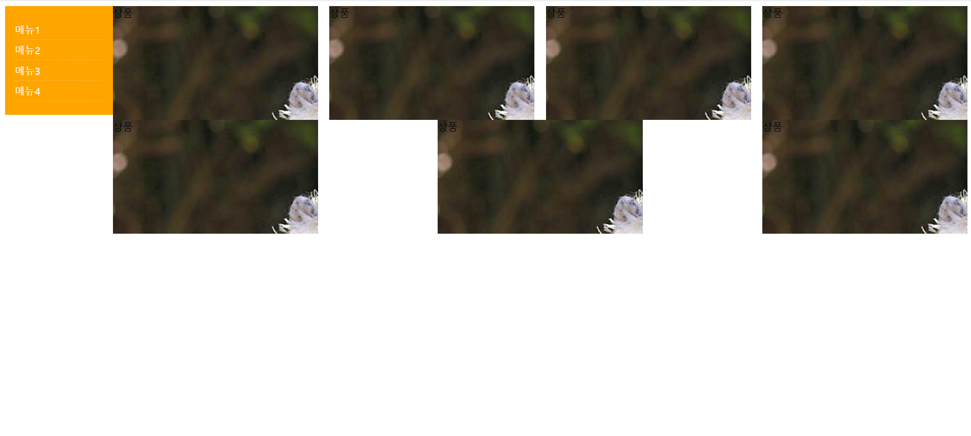 안녕하세요 단위심화 강의 중 두 번째 실습 과정 중, 두 번째 줄에 사진이 3개만 들어가는데 왜 그런건지요..?? flex-wrap: wrap; 까지 적용시켰는데 영상과는 다르게 되네요..

답변을 작성해보세요.
0


liltjay
질문자2023.02.07
html
<!DOCTYPE html>
<html lang="ko">
<head>
    <meta charset="UTF-8">
    <meta http-equiv="X-UA-Compatible" content="IE=edge">
    <meta name="viewport" content="width=device-width, initial-scale=1.0">
    <title>06-02-calc2</title>
    <link rel="stylesheet" href="./index.css">
</head>
<body>
    <div class="container">
        <div class="sidebar">
            <ul>
                <li>메뉴1</li>
                <li>메뉴2</li>
                <li>메뉴3</li>
                <li>메뉴4</li>
            </ul>
        </div>
        <div class="contents">
            <div class="item">상품</div>
            <div class="item">상품</div>
            <div class="item">상품</div>
            <div class="item">상품</div>
            <div class="item">상품</div>
            <div class="item">상품</div>
            <div class="item">상품</div>
        </div>
    </div>
</body>
</html>
css
* {
    box-sizing: border-box;
}

.container {
    display: flex;
    flex-direction: row;
    justify-content: space-between;
    align-items: flex-start;
}

.sidebar {
    width: 170px;
    background-color: orange;
    padding: 5px 15px;
}

.sidebar ul {
    width: 100%;
    padding: 0;
}

.sidebar ul li {
    list-style: none;
    padding: 5px 0;
    color: #ffffff;
    border-bottom: 1px dashed rgba(255,255,255,0.3); /* 메뉴 사이 구분선*/
}

.contents {
    width: calc(100% - 170px);
    display: flex;
    flex-direction: row;
    align-items: flex-start;
    flex-wrap: wrap;
}

.item {
    width: 24%;/
    height: 180px;
    background-image: url("../img/dochihello.jpg");
}
강의 영상에서는 사진이 총 8장이 들어가던데
저는 총 7장만 표시됩니다. 첫번째 장은 네 장으로 정상인데, 두번째 줄은 세 장입니다.

답변 1