-
질문 & 답변
카테고리
-
세부 분야
웹 개발
-
해결 여부
미해결
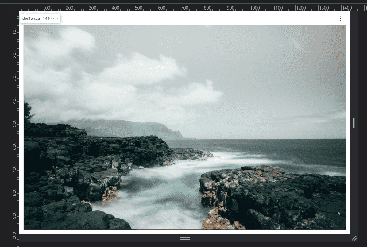
선생님 이 슬라이드를 아래로 스크롤했다가 맨위로 올리면 화면이 하얗게 되면서 이상해지네요 ㅠㅠㅠ
21.11.21 22:13 작성 조회수 110
1
■ 질문 남기실 때 꼭! 참고해주세요.
- 왜이런것일까요 ㅠㅠㅠ ??
<!DOCTYPE html>
<html lang="en" class="no-js">
  <head>
    <meta charset="UTF-8" />

    <!--반응형웹선언문-->
    <meta
      name="viewport"
      content="width=device-width, initial-scale=1, minimum-scale=1, maximum-scale=1, user-scalable=no"
    />

    <!-- jQuery CDN -->
    <script src="https://code.jquery.com/jquery-latest.min.js"></script>

    <!-- CSS basic-->
    <link rel="stylesheet" href="css/basic/reset.css" />
    <link rel="stylesheet" href="css/basic/aos.css" />
    <link rel="stylesheet" href="css/basic/slick.css" />
    <link rel="stylesheet" href="css/basic/slick-theme.css" />
    <link rel="stylesheet" href="css/basic/featherlight.css" />

    <!-- JS basic -->
    <script src="js/basic/aos.js"></script>
    <script src="js/basic/veloslide/velocity.min.js"></script>
    <script src="js/basic/veloslide/velocity.ui.min.js"></script>
    <script src="js/basic/veloslide/main.js"></script>
    <script src="js/basic/jquery.scrollTo.min.js"></script>
    <script src="js/basic/slick.min.js"></script>
    <script src="js/basic/featherlight.js"></script>

    <!-- CSS/JS custom -->
    <link rel="stylesheet" href="css/veloslide.css" />
    <link rel="stylesheet" href="css/style.css" />
    <link rel="stylesheet" href="css/responsive.css" />
    <script src="js/custom.js"></script>

    <title>Ellarose's portfolio</title>
  </head>

  <!-- hijacking: on/off - animation: none/scaleDown/rotate/gallery/catch/opacity/fixed/parallax -->

  <body data-hijacking="on" data-animation="catch">
    <div id="wrap">
      <header>
        <div class="gnb-inner">
          <div class="logo">
            <h1><a href="#">Ellarose's</a></h1>
          </div>

          <div class="tran">
            <div class="trigger">
              <span></span>
              <span></span>
              <span></span>
            </div>
          </div>
        </div>
      </header>

      <!-- home -->
      <section class="cd-section visible" id="home">
        <div>
          <div class="content">
            <img src="img/pic1.jpg" alt="" />
          </div>
        </div>
      </section>
      <!-- profile -->
      <section class="cd-section" id="profile">
        <div>
          <div class="content">
            <img src="img/pic1.jpg" alt="" />
          </div>
        </div>
      </section>
      <!-- vision -->
      <section class="cd-section" id="vision">
        <div>
          <div class="content">
            <img src="img/pic1.jpg" alt="" />
          </div>
        </div>
      </section>
      <!-- work : responsive -->
      <section class="cd-section" id="works1">
        <div>
          <div class="content">
            <img src="img/pic1.jpg" alt="" />
          </div>
        </div>
      </section>
      <!-- work : adaptive -->
      <section class="cd-section" id="works2">
        <div>
          <div class="content">
            <img src="img/pic1.jpg" alt="" />
          </div>
        </div>
      </section>
      <!-- work : another works -->
      <section class="cd-section" id="another">
        <div>
          <div class="content">
            <img src="img/pic1.jpg" alt="" />
          </div>
        </div>
      </section>

      <nav>
        <ul class="cd-vertical-nav">
          <li><a href="#0" class="cd-prev inactive">Next</a></li>
          <li><a href="#0" class="cd-next">Prev</a></li>
        </ul>
      </nav>
    </div>

  </body>
</html>
@charset "utf-8";

@import url("https://fonts.googleapis.com/css2?family=Montserrat:ital,wght@0,200;0,400;0,600;1,200;1,400;1,600&family=Noto+Sans+KR:wght@100;400;700&display=swap");

/*  font-family: 'Montserrat', sans-serif;
200 400 600
font-family: 'Noto Sans KR', sans-serif;
100 400 700 */

/* Default */
body {
  font-family: "Montserrat", sans-serif;
  background-color: #fff;
  height: 100vh;
}

/* Default Layout */
.cd-section {
  width: 100%;
  height: 100vh;
}
.cd-section > div {
  width: inherit;
  height: inherit;
  position: relative;
}

/* .content {
  background-color: #ccc;
  position: absolute;
  width: 100%;
  height: 100%;
} */

.content {
  position: absolute;
  width: calc(100% - 40px);
  height: calc(100% - 80px);
  /*   margin: 40px 20px; */
  left: 20px;
  bottom: 20px;
  overflow: hidden;
  border: 1px solid #000;
  background-color: lightpink;
}

.content img {
  width: 100%;
  height: 100%;
  object-fit: cover;
}

header {
  position: fixed;
  width: 100%;
  top: 0;
  left: 0;
  z-index: 999;
  transition: 0.5s;
}
.gnb-inner {
  width: calc(100% - 40px);
  margin: 0 auto;
  height: 60px;
  /* overflow: hidden;
  line-height: 60px; */
  display: flex;
  justify-content: space-between;
  align-items: center;
}

/* 자식요소가 float 성질을 가지니까 높이값을 잃음 overhiden 혹은
height 60px 도 가능*/
.logo h1 a {
  font-size: 3rem;
  padding-left: 10px;
  color: #000;
}

.gnb {
  position: fixed;
  width: 100%;
  height: 100%;
  background-color: rgb(44, 44, 44);
  z-index: 999;
  display: none;
}

.menu {
  float: left;
  width: 50%;
  height: 100%;
  display: flex;
  justify-content: center;
  align-items: center;
  text-align: center;
}

.menu a {
  display: block;
  color: rgb(255, 255, 255);
  font-size: 4rem;
  padding: 10px 20px;
  scroll-behavior: smooth;
}

.gnb .image {
  float: right;
  position: relative;
  width: 50%;
  height: 100%;
  overflow: hidden;
  border: 1px solid #000;
}
.gnb .image img {
  height: 100%;
  width: auto;
  object-fit: cover;
  object-position: center;
}

.tran {
  border: 1px solid transparent;
  border-radius: 50%;
  width: 50px;
  height: 50px;
  display: flex;
  justify-content: center;
  align-items: center;
}

.trigger {
  display: block;
  width: 30px;
  height: 16px;
  cursor: pointer;
  position: relative;
  z-index: 999;
}

.trigger span {
  position: absolute;
  height: 1px;
  width: 100%;
  background-color: #000;
  transition: 0.3s;
}

.trigger {
  display: block;
  width: 3px;
  height: 16px;
  cursor: pointer;
  position: relative;
  z-index: 999;
}

.trigger span {
  position: absolute;
  height: 3px;
  width: 3px;
  background-color: #000;
  transition: 0.3s;
  border-radius: 6px;
}
.trigger span:nth-child(1) {
  top: 0;
}
.trigger span:nth-child(2) {
  top: 50%;
  width: 100%;
}
.trigger span:nth-child(3) {
  top: 100%;
}
.trigger.active span:nth-child(1) {
  transform: translateX(-40%) rotate(45deg);
  width: 20px;
  height: 2px;
  top: 50%;
}

.trigger.active span:nth-child(2) {
  opacity: 0;
}
.trigger.active span:nth-child(3) {
  transform: translateX(-40%) rotate(-45deg);
  width: 20px;
  height: 2px;
  top: 50%;
}
@keyframes jello-vertical {
  0% {
    transform: scale3d(1, 1, 1);
  }
  30% {
    transform: scale3d(0.75, 1.25, 1);
  }
  40% {
    transform: scale3d(1.25, 0.75, 1);
  }
  50% {
    transform: scale3d(0.85, 1.15, 1);
  }
  65% {
    transform: scale3d(1.05, 0.95, 1);
  }
  75% {
    transform: scale3d(0.95, 1.05, 1);
  }
  100% {
    transform: scale3d(1, 1, 1);
  }
}
.trigger:hover {
  animation: jello-vertical 0.9s both;
}
/* --------------------------------

Primary style

-------------------------------- */

body::before {
  /* never visible - this is used in jQuery to check the current MQ */
  content: "mobile";
  display: none;
}
@media only screen and (min-width: 1281px) {
  body::before {
    /* never visible - this is used in jQuery to check the current MQ */
    content: "desktop";
    display: none;
  }
}

/* --------------------------------

Main Components

-------------------------------- */
@media only screen and (min-width: 1281px) {
  body[data-hijacking="on"] {
    overflow: hidden;
  }

  .cd-section {
    height: 100vh;
  }

  .cd-section h2 {
    font-size: 4rem;
    font-weight: 300;
  }
  [data-hijacking="on"] .cd-section {
    opacity: 0;
    visibility: hidden;
    position: absolute;
    top: 0;
    left: 0;
    width: 100%;
  }
  [data-hijacking="on"] .cd-section > div {
    visibility: visible;
  }
  [data-hijacking="off"] .cd-section > div {
    opacity: 0;
  }
  [data-animation="rotate"] .cd-section {
    /* enable a 3D-space for children elements */
    -webkit-perspective: 1800px;
    -moz-perspective: 1800px;
    perspective: 1800px;
  }
  [data-hijacking="on"][data-animation="rotate"]
    .cd-section:not(:first-of-type) {
    -webkit-perspective-origin: center 0;
    -moz-perspective-origin: center 0;
    perspective-origin: center 0;
  }
  [data-animation="scaleDown"] .cd-section > div,
  [data-animation="gallery"] .cd-section > div,
  [data-animation="catch"] .cd-section > div {
    box-shadow: 0 0 0 rgba(25, 30, 46, 0.4);
  }
  [data-animation="opacity"] .cd-section.visible > div {
    z-index: 1;
  }

  .cd-section:first-of-type > div::before {
    display: none;
  }

  .cd-section > div {
    position: fixed;
    top: 0;
    left: 0;
    width: 100%;
    /* Force Hardware Acceleration */
    -webkit-transform: translateZ(0);
    -moz-transform: translateZ(0);
    -ms-transform: translateZ(0);
    -o-transform: translateZ(0);
    transform: translateZ(0);
    -webkit-backface-visibility: hidden;
    backface-visibility: hidden;
  }
  [data-hijacking="on"] .cd-section > div {
    position: absolute;
  }
  [data-animation="rotate"] .cd-section > div {
    -webkit-transform-origin: center bottom;
    -moz-transform-origin: center bottom;
    -ms-transform-origin: center bottom;
    -o-transform-origin: center bottom;
    transform-origin: center bottom;
  }

  .cd-vertical-nav {
    /* lateral navigation */
    position: fixed;
    z-index: 1;
    right: 3%;
    top: 50%;
    bottom: auto;
    -webkit-transform: translateY(-50%);
    -moz-transform: translateY(-50%);
    -ms-transform: translateY(-50%);
    -o-transform: translateY(-50%);
    transform: translateY(-50%);
    display: none;
  }
  .cd-vertical-nav a {
    display: block;
    height: 42px;
    width: 42px;
    /* image replace */
    overflow: hidden;
    text-indent: 100%;
    white-space: nowrap;
    background: url(../img/arrow_gray.svg) no-repeat center center;
    transform: rotate(180deg);
  }
  .cd-vertical-nav a.cd-prev {
    -webkit-transform: rotate(0deg);
    -moz-transform: rotate(0deg);
    -ms-transform: rotate(0deg);
    -o-transform: rotate(0deg);
    transform: rotate(0deg);
    margin-bottom: 10px;
  }
  .cd-vertical-nav a.inactive {
    visibility: hidden;
    opacity: 0;
    -webkit-transition: opacity 0.2s 0s, visibility 0s 0.2s;
    -moz-transition: opacity 0.2s 0s, visibility 0s 0.2s;
    transition: opacity 0.2s 0s, visibility 0s 0.2s;
  }

  .cd-vertical-nav {
    display: block;
  }
}
- 왜이런것일까요 ㅠㅠㅠ ??
- HTML, CSS, JQUERY 코드 소스를 텍스트 형태로 첨부해주시고 스크린샷도 첨부해주세요.
- 다운로드가 필요한 파일은 해당 강의의 마지막 섹션에 모두 있습니다.

반응형 웹사이트 포트폴리오(Architecture Agency)
[오류수정] 콘솔창 에러 관련([Intervention] Unable to preventDefault...)
강의실 바로가기
답변을 작성해보세요.
0


답변 1