"I will grow more than yesterday. And, I will help those who strive to grow more than yesterday."
With Actionable Content that embodies the sincerity and aspirations of Maso Campus,
100 million cumulative hours of lectures shared online and offline since 2013!
This precious experience and time are always the source of growth for both Maso Campus and our students.
The Miso Campus team strictly adheres to two principles for the growth of us all. 1. Actionable Content that can be put into practice immediately after learning. 2. Respecting the time and effort of participants.
The Miso Campus team strictly adheres to two principles for the growth of us all.
1. Actionable Content that you can actually use after learning
2. Time-Saving Curriculum that respects the participant's time and effort
Grow with Miso Campus's Actionable and Time-Saving Curriculum
1. Actionable Content that you can surely use once you learn it
2. Time-Saving Curriculum that respects the time and effort of participants
We hope you will walk the path of growth together with Masocampus's Actionable and Time-Saving Curriculum.
We hope you will walk the path of growth together with Maso Campus's Actionable and Time-Saving Curriculum.


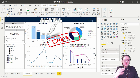
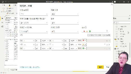


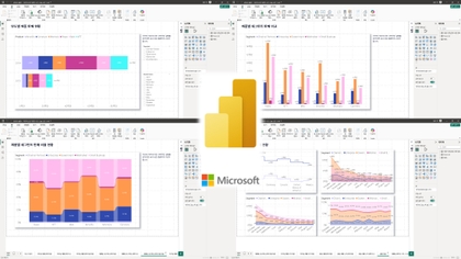
![[For Beginners] Data Visualization with Power BICourse Thumbnail](https://cdn.inflearn.com/public/courses/327055/cover/455b54c1-3e63-439b-9b60-5d12e12bc303/PowerBI-001 (1).png?w=420)


![[D-PEC UP_PASS] National Technical Qualification: Management Information Visualization Ability (Written Exam)Course Thumbnail](https://cdn.inflearn.com/public/files/courses/336327/cover/01jytyqa2egrzn52a7m57fntzk?w=420)