


.png.webp")


Introduction to UX Design for Beginners by a New York Product Designer
uxeric
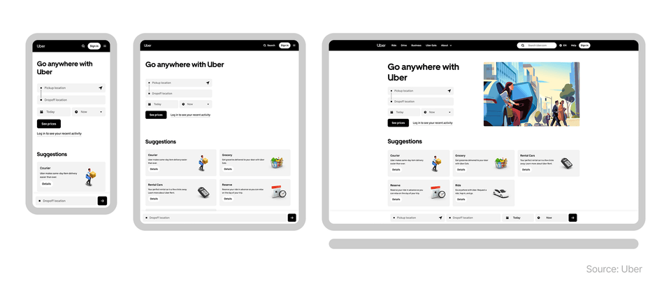
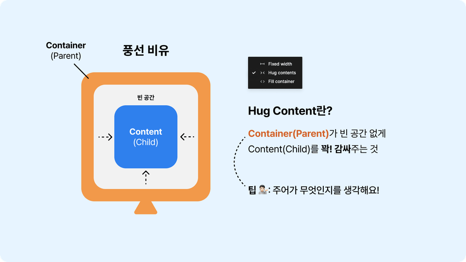
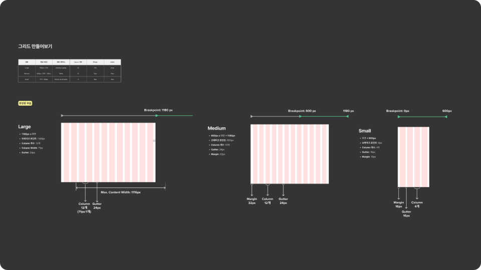
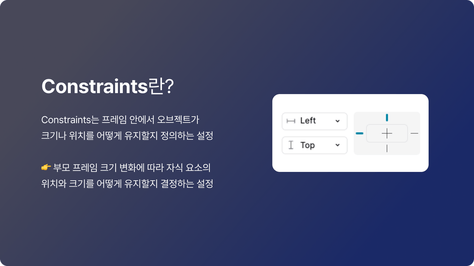
This is an introductory UX design course for non-majors who have never studied design, students who are just starting to study UX design, and job seekers in UX and UI design. We will "release" methods to become a UX, UI designer with solid fundamentals in a short period of time from a practitioner's perspective.
입문
Web Design, Mobile App Design


