강의

멘토링

커뮤니티

Design

/

UI/UX

Mastering Responsive UI Design with Figma

Do you want to master responsive design by effectively utilizing Figma's Auto Layout, Grid, and Constraints features? In this lecture, you will gradually develop the skills to create responsive designs, from small UI elements to cards, tables, components, and web and app screens. Learn how to use Figma immediately for job preparation and practical work, and master the ability to design responsive interfaces optimized for various devices!

(4.9) 14 reviews

76 learners

  • uxeric
반응형디자인
UXUI
피그마
오토레이아웃
취업
Figma
Responsive Web
ui
ux
get a job

Reviews from Early Learners

What you will gain after the course

  • Equip with skills from responsive design concepts to practical application.

  • Master Figma's gem, "Auto Layout," for responsive design.

  • Figma's Auto Layout, Grid, and Constraints will make small UI elements, cards, and components responsive.

  • Can design both web and app responsively.

  • You will gain "responsive" design capabilities, enabling flexible adaptation to diverse device environments with a single design.

  • You can more effectively deliver design handoffs to developers and stakeholders.

띠배너

2 Reasons Why Beginners/Job Seekers "Must" Master Responsive Design🤔


First reason. Because it's an important skill that practitioners/interviewers consider crucial. An essential competency for employment(!)

As a product design practitioner and interviewer in the industry, and through UX coaching for beginners, I've gained one key insight: "If you want to get hired, you need to demonstrate the skills that interviewers want to see, not the skills you want to show off." This might seem as obvious and simple as understanding the test maker's intent on the college entrance exam, but in reality, many applicants don't properly consider this, so while gaining experience, the answer is


Second reason. Tremendous improvement in work productivity and better user experience design

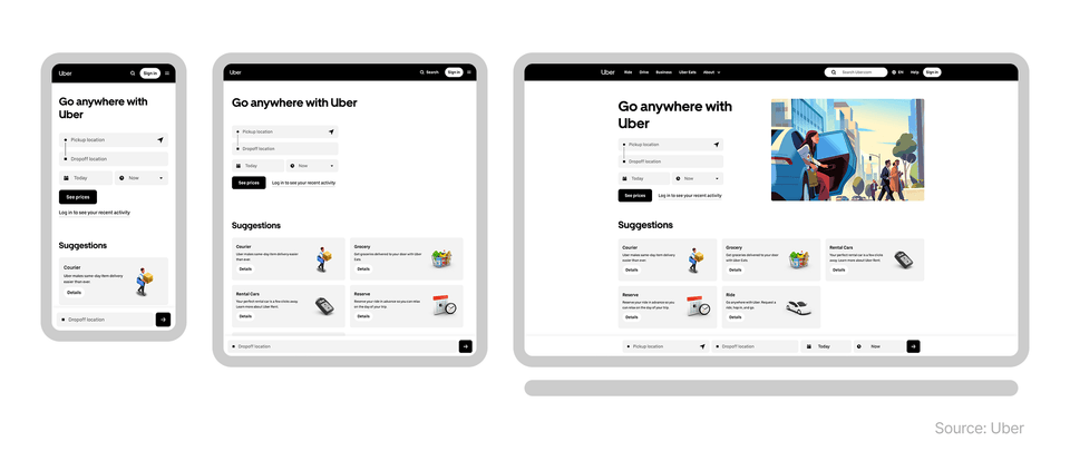
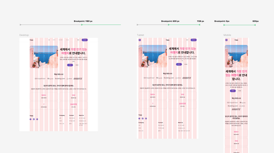
Today, users don't just use a single device, but navigate across devices with various screen sizes such as smartphones, tablets, and laptops when using websites or apps. In this environment, designers must create designs that allow users to naturally use services without inconvenience on any screen size.

Looking at the Uber case above, we can see that when using the same service across various devices, while the interface structure and information layout may differ, it maintains an overall consistent user experience. This ability to provide users with a unified experience across different screens is exactly what responsive design enables.

If you understand responsive design and can utilize it properly, your work productivity will improve tremendously. When you design and structure from the beginning to flexibly respond to screen sizes, you reduce the need to repeatedly create separate designs for each device, and by reusing designs, your work speed becomes several times or even dozens of times faster. Additionally, in collaboration with developers, unnecessary modifications and communication costs are reduced, making the design-development connection much more efficient.

As a result, responsive design goes beyond the technology of simply creating "good-looking screens" and is a core practical competency that provides a more consistent experience with less effort.

Hello. I'm Eric, a product designer. 👋

I am currently working as a senior product designer in the tech industry in New York, USA. I am responsible for practical work that encompasses all aspects of UX/UI, from UX research to UI design, design system construction and management, and as an interviewer, I also take on the role of reviewing and evaluating applicants' portfolios. Therefore, I have a good understanding of what capabilities are actually needed for beginners or those preparing for employment. I have also written a book for UX design beginners called "Design thinking for beginners," which became an Amazon bestseller.


The reason I decided to create this course is because after I properly mastered responsive design and Figma's core features for it in my actual work, I experienced a several-fold improvement in design productivity and efficiency. At the core of this was a systematic screen design approach utilizing Figma's auto layout, grid, and constraints features.

Previously, it took too much time to create and modify designs for different screen sizes with the same design approach. But now, I can build responsive UI designs that flexibly adapt to various devices with a single design, which has reduced repetitive work and made collaboration between designers and developers much smoother. Based on my experience, knowledge, and practical know-how, I will help beginners/job seekers significantly increase their employment opportunities through responsive design, and help current designers who don't know responsive design greatly improve their work productivity. Take this opportunity to properly learn responsive design and create opportunities for career growth.

What will you learn in this course? 🧑‍🏫

Understanding the Concepts and Principles of Responsive Design Properly

We'll theoretically examine why responsive design is necessary and what problems it solves, building a solid foundation. You'll understand the differences in user experience across devices and clearly learn the core concepts that will serve as the basis for future hands-on practice.

"Auto Layout and Resizing Options", Mastering Figma's Core Weapons for Responsive Design

The real power of Figma lies in Auto Layout and resizing options. By creating components and screens frequently used in practice, you'll learn the principles of automatic alignment and flexible layout arrangement through real-world examples.

Complete Mastery of Grid Systems

Grid is the hidden blueprint of responsive design. You'll systematically learn the principles of grid and practical application methods to create consistent UI across various screen sizes.

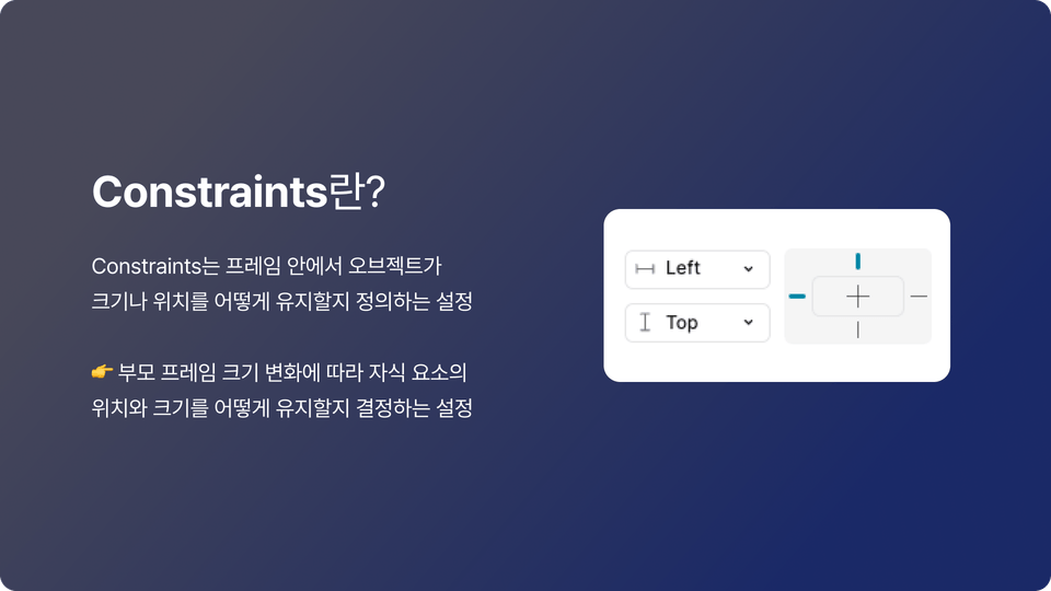
Creating Flexible Responsive Objects with Constraints

The secret to layouts that don't break when the screen shrinks or expands is Constraints. Learn how to create flexible object compositions that respond to various device sizes through hands-on practice.

Learning Responsive Design Through Real-World Case Studies

Theory alone is not enough. Develop responsive design skills that you can apply to your work right now through various real UI examples.

Honey Tips for UI Design🍯 Big Release

In the lectures, I generously share the plugins and resources that I actually use in real-world projects. To make responsive work that seemed overwhelming much easier, practical tips that can be applied immediately are included.

What will you build through this course? 📐

Design and implement responsive UI optimized for web and app environments. Create practical layouts that naturally adapt to various devices.

Designing "Apps" Responsively

Learn how mobile app UI should respond to various screen sizes and resolutions, and implement actual app screens in a responsive manner.

Creating Responsive "Web" Design

Learn how to build responsive UI in web environments and directly design layouts that naturally scale from desktop to mobile.

Creating Responsive Cards

Design content cards containing images and text to naturally adapt across various screen widths.

Creating Tables

Build responsive table UI that can handle various situations such as alignment, width, and cell configuration, and develop practical design skills.

Creating Responsive UI Components

Learn to design commonly used UI components such as buttons and input fields responsively for practical use, mastering reusable structures that can adapt to various screen sizes.

Practice with various other cases

Practice various UI situations frequently encountered in real work to expand your responsive design sense. Through repetitive practice, develop the ability to flexibly respond to complex layouts.

This is recommended for these people 🧭

🎯 Beginner / Job Seeker

I recommend this for design beginners or job seekers who want to learn the core concepts and practical skills of responsive design. You'll be able to master Figma usage that can be immediately applied in practice and develop responsive UI creation skills that will strongly appeal in your portfolio.


💻 Current Designer

I recommend this for designers who want to master core responsive features like grid and auto layout to enhance their practical work completion. You'll be able to develop UI design capabilities optimized for various screens.


🧩 Planner / PM / PO

This is suitable for planners, PMs, and POs who want to create wireframes efficiently and collaborate smoothly with designers. Understanding Figma's layout features makes both screen design and communication much easier.


🛠Developer

If you're a frontend developer, you can gain an opportunity to understand designers' working methods and improve collaboration efficiency. Even when handling design directly, you can confidently prepare for the design phase before development by learning the structure and principles of responsive UI.

Frequently Asked Questions 📌

Q. Can non-majors also take this course?

A.Yes, this course is designed for beginners and non-majors. However, I recommend that you come with prerequisite knowledge including conceptual basics of UX design, foundational knowledge for UI design, and familiarity with Figma's basic functions. If you're just starting with UX/UI design, taking my courses on Inflearn first - UX Design Introduction for Beginners and UI Design Course Using Figma - will help you master responsive design several times faster through this course.


Q. How can I quickly master responsive design?

A. If you've learned the basic principles of responsive design and how to use Figma tools, I think the most important thing is to "directly" practice with numerous examples. In this course, we've prepared everything from fundamentals to various real-world cases, and we'll guide you so you can master them by following along. However, the most important thing is that you don't just watch the lectures, but "directly" follow along and practice.


Q. Is it possible to study on both Windows and Mac?

A.Yes, it's possible. This course is created based on the Figma tool. Since Figma is internet browser-based software, it can run on both Windows and Mac, and I will provide you with the shortcuts I use in this course for both Windows and Mac respectively.


Q. Can I take the course with the free version of Figma?

A. Yes, the content taught in this course can be accessed with the free version of Figma as well.

Learning Materials

  • We provide organized Figma files so you can directly practice all the examples covered in the lectures.

Recommended for
these people

Who is this course right for?

  • UX/UI design beginners & job seekers wanting quicker employment

  • Developer who collaborates with UX/UI designers, or directly designs.

  • PM/PO/Service Planners looking to boost work productivity in proposal creation using Auto Layout/Grid, etc.

  • Junior or incumbent designers unfamiliar with responsive design or Auto Layout/Constraints usage

Need to know before starting?

  • Figma: Basic Knowledge and How to Use

  • Basic concepts of UX/UI design

Hello
This is

5,041

Learners

683

Reviews

306

Answers

4.8

Rating

7

Courses

현재 뉴욕의 글로벌 테크 회사 The Knot Worldwide에서 시니어 프로덕트 디자이너로 일하고 있습니다.

뉴욕에 오기 전에는 서울에서 UI기획자로 일을 했습니다.

브런치 매거진 "디자인, 그리고 프러덕트"와 UX, UI 지식과 정보를 공유하는 "뉴욕 UX디자이너" 인스타그램페이스북을 운영하며 디자이너 및 예비 디자이너들과 소통하고 있습니다.

개인적으로는 세 아이👶의 아빠이며 요리🍲, 교육🏫에 관심이 많습니다.


집필 및 강의

• "뉴욕 프로덕트 디자이너가 알려주는 UX디자인 입문 A to Z" 책 출간 (링크: Yes24, 알라딘, 교보문고

• 퍼블리 아티클 "서비스의 첫 인상을 결정하는 3초: 랜딩 페이지 UX 4가지 원칙" 발행

• Samsung SW Academy for Youth (SSAFY) UX/UI다자인 및 피그마 강사

• 1:1 멘토링 및 기업 강의 진행 (토픽: UX, UI디자인, UX퍼실리테이션, UX/UI 포트폴리오  제작 및 발행)


경험 및 경력

• (현) 뉴욕 The Knot Worldwide 시니어 프로덕트 디자이너

(전) 서울 Pantech 모바일 앱 UI기획자

• 뉴욕 기반의 다수 스타트업과 UX/UI 컨설팅 프로젝트 진행

• 뉴욕 School of Visual Arts 디자인 대학원 졸업 / 전공: Interaction Design

• 한동대학교 학부 졸업 / 전공: 산업디자인

Curriculum

All

40 lectures ∙ (5hr 10min)

Published: 
Last updated: 

Reviews

All

14 reviews

4.9

14 reviews

  • stumire9262님의 프로필 이미지
    stumire9262

    Reviews 1

    Average Rating 5.0

    5

    30% enrolled

    Cảm ơn bạn đã tạo ra những bài giảng cần thiết.

    • uxeric
      Instructor

      Cảm ơn bạn đã gửi phản hồi. Tôi rất vui khi có thể giúp đỡ bạn thông qua khóa học. Tôi sẽ ủng hộ để tất cả những kế hoạch mà bạn dự định trong tương lai đều thành công~!

  • goodrain2626님의 프로필 이미지
    goodrain2626

    Reviews 1

    Average Rating 5.0

    Edited

    5

    75% enrolled

    Tôi đang làm phát triển frontend tại một startup nhưng cũng phải đảm nhận cả phần thiết kế. Trước đây tôi chỉ tìm tài liệu YouTube cho những phần cần thiết và mò mẫm thiết kế, nhưng lần này tôi phải học thiết kế responsive trong thời gian ngắn. Vì khóa học tập trung vào thực hành nên có thể trực tiếp làm theo từng bước một, hoặc thử trước rồi kiểm tra sau, có vẻ hiệu quả để học thiết kế responsive trong thời gian ngắn! Đặc biệt phần giải thích nguyên lý constraints đã giúp ích rất nhiều, và khi alignment không được áp dụng thì thầy đã chỉ ra lý do tại sao, giúp tôi hiểu được những phần mà bình thường tôi hay bỏ sót. Ngoài ra trong quá trình học có gặp khó khăn về file, nhưng dù có chênh lệch múi giờ thầy vẫn phản hồi nhanh chóng, cảm ơn thầy rất nhiều...! Lần này thay vì cách làm phiền phức như trước đây là sửa từng con số một cách vất vả, tôi muốn áp dụng đúng những gì đã học trong khóa học để làm việc hiệu quả. Cảm ơn thầy rất rất nhiều 😭😭! Tôi sẽ cố gắng đến cuối để hoàn thành khóa học!

    • uxeric
      Instructor

      Tôi rất vui vì có thể giúp đỡ bạn thông qua khóa học thiết kế responsive. Tôi cũng nhớ lại thời gian trước khi không sử dụng auto layout hay constraints, phải làm rất nhiều thao tác thủ công từng chi tiết một. Bây giờ có thể nói rằng năng suất đã tăng lên hàng chục lần. Tôi nghĩ nếu Joy áp dụng nội dung khóa học vào công việc thực tế thì chắc chắn sẽ nâng cao hiệu quả công việc. Cảm ơn bạn vì những phản hồi quý báu và tôi sẽ ủng hộ để tất cả những kế hoạch mà bạn dự định đều thành công tốt đẹp.

  • ko98329025님의 프로필 이미지
    ko98329025

    Reviews 1

    Average Rating 5.0

    5

    50% enrolled

    Tôi là người coi động lực 'tại sao' phải làm điều đó là cực kỳ quan trọng. Thực ra dù có biết nhiều tính năng nhưng nếu không biết cách áp dụng hoặc không thực tế thì hiệu quả của những thông tin đã biết cũng giảm và ý nghĩa của việc học các tính năng cũng sẽ phai nhạt rất nhiều. Nhưng điều tuyệt vời nhất của khóa học này là tôi cảm nhận rõ rằng nó được tạo ra theo lộ trình khó khăn trong thực tế -> học tập -> thoát khỏi khó khăn chứ không phải học tập -> áp dụng thực tế. Thực tế cách giảng dạy cũng theo cấu trúc tại sao tính năng này quan trọng trong thực tế -> có thể áp dụng như thế nào + các trường hợp thực tế nên càng in sâu vào đầu. Và vì giảng dạy dễ hiểu nên tôi đã có thể phá bỏ hoàn toàn cảm giác lo lắng về những phần mà trước đây nghĩ là những tính năng khó khăn một cách mơ hồ. Và với tư cách là người chuẩn bị việc làm, việc được biết 'tại sao' những tính năng này thường được sử dụng trong thực tế xuyên suốt khóa học khiến tôi chú ý hơn với suy nghĩ phải ghi nhớ thêm một lần nữa ngay cả khi đang học. Nhờ đó mà cảm giác lo lắng về thực tế vốn mơ hồ đáng sợ cũng giảm bớt! Cảm ơn anh :)

    • uxeric
      Instructor

      Cảm ơn bạn đã viết review một cách chân thành như vậy. Tôi cũng nhớ lại thời điểm khi mới bắt đầu học và nghiên cứu về responsive design, đặc biệt là auto layout, tôi đã cảm thấy rất bối rối vì không biết làm thế nào để áp dụng những kiến thức này vào công việc thực tế. Tức là tôi không muốn học chỉ để biết về chức năng đó, mà muốn học cách giải quyết vấn đề responsive design, nhưng điều đó không hề dễ dàng. Vì vậy khi tạo ra khóa học này, tôi đã suy nghĩ làm thế nào để các học viên, đặc biệt là những người mới bắt đầu hoặc đang chuẩn bị tìm việc, có thể hiểu dễ dàng hơn và có được những kỹ năng có thể áp dụng vào thực tế, rồi từ đó xây dựng curriculum và nội dung. Tức là tôi đã đặt mục tiêu tạo ra khóa học sao cho sau khi học xong responsive design, từ góc độ nhà tuyển dụng sẽ nghĩ rằng "ứng viên này đã chuẩn bị sẵn sàng về khả năng responsive design". Khi bạn nói rằng thông qua khóa học này, cảm giác áp lực mơ hồ và sợ hãi đối với công việc thực tế đã giảm bớt(!!) thì tôi cảm thấy vô cùng vui mừng và thực sự cảm nhận được ý nghĩa của việc tạo ra khóa học này :) Một lần nữa cảm ơn bạn đã để lại review và feedback quý báu, tôi chân thành ủng hộ để tất cả những kế hoạch career mà bạn đang lên kế hoạch sẽ thành công tốt đẹp.

  • jm0park님의 프로필 이미지
    jm0park

    Reviews 2

    Average Rating 5.0

    5

    80% enrolled

    Cảm ơn rất nhiều vì khóa học quý giá này! Việc chia sẻ file Figma cũng rất tuyệt, giúp tôi có thể thực hành trực tiếp cùng với bài học. Tuy nhiên, ban đầu tôi không nhanh chóng nhận ra là có tài liệu nên đã phải đi tìm trong lúc đang học😊😊 Cách giải thích trực quan với những so sánh, ví dụ, phép ẩn dụ... giúp người mới bắt đầu cũng có thể hiểu dễ dàng, và tôi có thể biết được những phần không nổi bật trong các tính năng Figma có hiệu quả và khả năng ứng dụng như thế nào, thật tuyệt vời! Hơn nữa, các câu hỏi ôn tập ở mỗi phần giúp tôi nhớ lại và ôn tập nội dung của một chu kỳ, tạo ra niềm vui trong việc học hỏi.

    • juliepj673691님의 프로필 이미지
      juliepj673691

      Reviews 1

      Average Rating 5.0

      5

      30% enrolled

      Mặc dù đã biết những kiến thức cơ bản này rồi, nhưng việc giảng viên giải thích từ những điều cơ bản một cách tỉ mỉ và dễ hiểu như một lời nhắc nhở giúp tôi có thể hiểu dễ dàng! Việc giải thích bằng cách đưa ra các ví dụ thực tế rất hay, và tôi cũng có thể tự tìm những trường hợp tương tự để so sánh và học tập, điều này thật tuyệt vời!!!

      • uxeric
        Instructor

        Cảm ơn bạn. Tôi đã thiết kế khóa học với mục tiêu giúp các học viên dễ dàng hiểu và thực hành theo, nên thật vui khi biết rằng nó đã giúp ích cho bạn. Tôi sẽ ủng hộ bạn thực hiện thành công tất cả những kế hoạch sắp tới.

    $77.00

    uxeric's other courses

    Check out other courses by the instructor!

    Similar courses

    Explore other courses in the same field!