


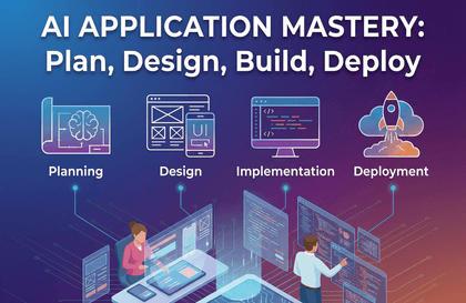
Building Web Services with Generative AI – An All-in-One Project from Planning and Design to Coding and Deployment
ezweb
$41.80
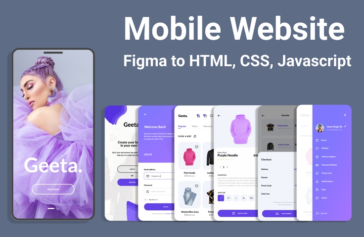
Basic / Figma, Vibe Coding, HTML/CSS, JavaScript, React
5.0
(1)
This is a practical web development project course where you complete everything from planning and design to implementation and deployment using generative AI. You will create designs using Stitch and Figma Make, generate code with AI Studio, and deploy them as actual services. Even if you don't know much about coding, you will learn how to develop alongside AI and complete your own AI web app. Now, you too can become a developer who collaborates with AI.
Basic
Figma, Vibe Coding, HTML/CSS

![Web Design Development Technician [2025] Complete Practical Course (KakaoTalk Q&A Available)Course Thumbnail](https://cdn.inflearn.com/public/courses/332868/cover/3a2245ca-bb9f-414a-ba67-403cfcb2b7c9/332868.jpg?w=420)


![[2026 Examination Standards] Perfect Guide for the Web Design & Development Technician Practical ExamCourse Thumbnail](https://cdn.inflearn.com/public/courses/324878/course_cover/12211037-e74b-46b3-8942-46d465b81bba/webdesign-cover-02.png?w=420)


![[Web Development Full Stack Course] HTML&CSS BasicsCourse Thumbnail](https://cdn.inflearn.com/public/courses/330075/cover/56b8da2a-c02d-4812-8ae0-a5dad11a3aab/fullstack-html-css-1.jpg?w=420)