It was very helpful. I plan to take the related courses in the future.
What you will gain after the course
The ability to organize data clearly and concisely
Ability to utilize Excel formatting features
Ability to deliver core messages
Problem-solving skills during data visualization
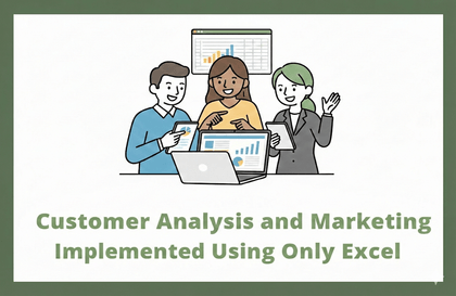
Data visualization is a basic quality of a professional, achieve data visualization with Excel features!
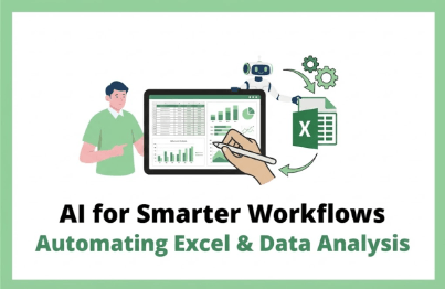
📊 Easily complete data visualization in a snap using Excel! 📊
Deliver the core message accurately with materials using visual elements to make a strong impression on the person in charge! Level up your personal skills and become a true pro!
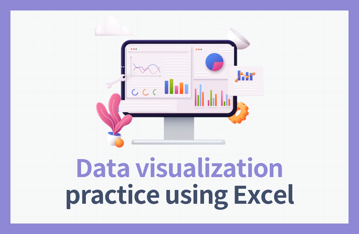
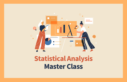
The Importance of Data Visualization 📈
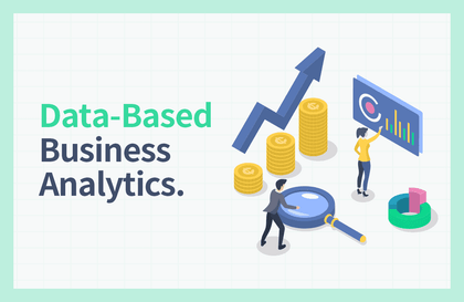
Data Visualization (Data Visualization) refers to the technology that allows for effective message delivery by using visual elements such as charts, graphs, and more so that users can easily understand information and data. Since companies make decisions based on their own data, it is more important than ever to be able to create accurately visualized materials that can be understood at a glance. However, for practitioners who are not data analysts, even handling Excel and Word can be difficult, so they often give up on data visualization.
Excel can be considered the optimal tool for solving these problems. By utilizing the features built into Excel, scattered data can be transformed into charts that provide a comprehensive overview, allowing those in charge to understand it easily. Furthermore, reports that were once complex and difficult to use for decision-making can be made simple and convenient through Excel, conveying only the core points to ensure clear messaging and the achievement of organizational goals.
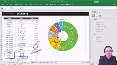
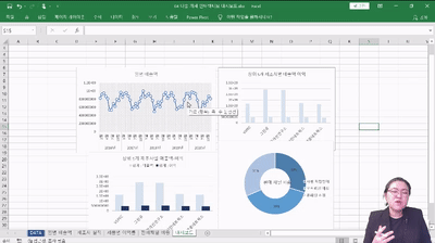
This course allows you to learn various ways to visualize data, starting from the basics through hands-on practice, including Slicers, Pivot Tables, Sparklines, Sunburst Charts, Waterfall Charts, Radar Charts, Bidirectional Charts, Overlapping Bar Graphs, Gantt Charts, and Dumbbell Charts. If you have struggled with data visualization until now,reach your goals by learning various data visualization methods through this course!
To help you become a data visualization master, we will guide you ✨
💁 Recommended for these people
✔️ Those who want to learn basic Excel formatting
✔️ Those who want to convey key points based on accurate figures
✔️ Those who want to organize data clearly and concisely
✔️ Those who want to improve their Excel skills
✔️ Those dreaming of /starting a business/career change/reskilling/talent transformation
🎲 After taking this course
By taking the Excel Data Visualization Practical Course, you will be able to acquire the following competencies!
✔️ The ability to organize data clearly and concisely
✔️ Ability to utilize Excel functions
✔️ Ability to deliver core messages
✔️ Problem-solving skills through data visualization
Key points unique to this course ✨
1. Let's start with the basics of Data Visualization!
The point of data visualization is to effectively communicate key messages to others. This course is designed with a curriculum that allows even beginners who are new to Excel, rather than data analysts, to learn data visualization from the basics without difficulty. Therefore, it enables anyone to skillfully visualize data and master advanced data visualization techniques after completing the course.
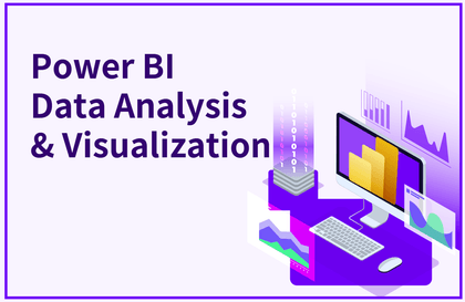
2. Master both of Excel's two data visualization methods!
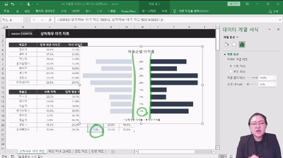
Excel data visualization is largely divided into Form visualization and Chart visualization. In the case of Form visualization, it allows you to clearly express the message you want to convey, enabling the other party to grasp the core points at a glance. In the case of Chart visualization, based on what you have learned about bar charts and line charts, you can learn how to handle various charts suitable for different situations.
3. Miso Campus also opposes lectures that are only strong in theory!
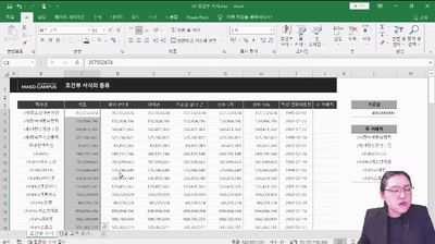
There is already a flood of complex data, and you're not even going to practice...? Learning that focuses only on theory will never allow you to apply that knowledge in the real world! This course provides a total of 8 practice files to help you apply what you learn directly to your work. As a result, it helps you accurately visualize data and make rational decisions.
4. Mastering Data Visualization in Just Two Days Challenge
Listening to lectures in a busy modern society is a luxury...? No! This course is perfect even for K-office workers who are busy commuting to and from work! With a total of 7 hours and 47 minutes, this course contains only the core competencies so you can learn data visualization methods actually used in practice! Highly recommended for those who want to master data analysis and visualization methods in a short amount of time!
Check out what you will learn 📚
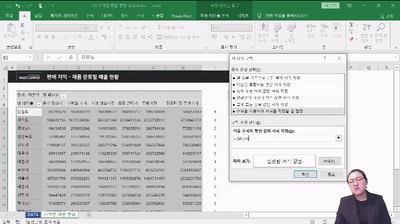
1. Learning basic formatting for cells and tables 2. Visualizing various formats using conditional formatting
3. Creating highly versatile business data visualization charts (Overlapping Bar Charts, Dumbbell Charts, Diverging Charts, Gantt Charts)
4. Practical Business Data Visualization Exercises
5. Multi-alternative interactive dashboard practice
Frequently Asked Questions Q&A 💬
Q. Do I need to be proficient in Excel to follow the class?
The instructor will guide you through every single button you need to click, so you don't have to worry about your Excel skills.
Q. I'm not at a very high rank yet; is this lecture only meaningful for those in high-level positions?
Not at all. While the size of the data being handled may vary, the ability to think based on data is a required competency regardless of rank or field.
Q. Are there any requirements or prerequisites for taking the course?
As this is a practice-oriented course, we recommend using a dual monitor setup or an extra device to separate the lecture screen from your practice screen. Additionally, since the exercises are based on Windows OS, we recommend taking the course in a Windows environment.
Director Jung-ah Choi of Miso Campus is here with you ✒️
Please check before taking the course ✔️
There are differences in sound volume for each lecture unit. Depending on your listening environment, the sound of certain videos may feel a bit low, so please be sure to check the [Preview] of the lecture before taking it.
As this is a practice-oriented course, we recommend using dual monitors or an extra device to separate the lecture screen from your practice screen. Additionally, since the exercises are based on Windows OS, we recommend taking the course in a Windows environment.
Lecture notes and practice files can be found in the <13. Lecture Material Download Center> section.
Recommended for these people
Who is this course right for?
Those who want to learn about the basic formatting in Excel
Those who want to deliver the core message based on accurate figures.
Those who want to organize data clearly at a glance
Those who want to improve their Excel skills
Those dreaming of starting a business, joining a company, career transition, reskilling, or talent transformation.
"I will grow more than yesterday. And, I will help those who strive to grow more than yesterday."
With Actionable Content that embodies the sincerity and aspirations of Maso Campus,
100 million cumulative hours of lectures shared online and offline since 2013!
This precious experience and time are always the source of growth for both Maso Campus and our students.
The Miso Campus team strictly adheres to two principles for the growth of us all. 1. Actionable Content that can be put into practice immediately after learning. 2. Respecting the time and effort of participants.
The Miso Campus team strictly adheres to two principles for the growth of us all.
1. Actionable Content that you can actually use after learning
2. Time-Saving Curriculum that respects the participant's time and effort
Grow with Miso Campus's Actionable and Time-Saving Curriculum
1. Actionable Content that you can surely use once you learn it
2. Time-Saving Curriculum that respects the time and effort of participants
We hope you will walk the path of growth together with Masocampus's Actionable and Time-Saving Curriculum.
We hope you will walk the path of growth together with Maso Campus's Actionable and Time-Saving Curriculum.


![[Smart Working Practice] Working Smarter with NotionCourse Thumbnail](https://cdn.inflearn.com/public/courses/328128/cover/11115dce-68f1-4f5c-a63c-76d9c725772b/328128-eng.png?w=420)


![[Pass ITQ Excel A in One Go] in 3 daysCourse Thumbnail](https://cdn.inflearn.com/public/courses/329652/cover/b44e11b6-a47e-4993-86ea-a85da9836bb5/329652-eng.png?w=420)