


Xu hướng là bắt đầu với Vibe Coding và MCP_Cursor AI
Masocampus
Xu hướng mới nhất của AI tạo sinh, AI Agent! Cách đi trước với Cursor giúp hoàn thành công việc phát triển và MCP mở rộng tính năng!
입문
cursor, mvp, AI Agent
This course teaches you how to derive business insights or share derived insights by creating visual reports in the form of dashboards that support automated user interaction based on Google Data Studio, a free service.

Understanding Data for Data Visualization
Main purpose and practical use of visualization charts for explanatory visualization
Creating user-interactive visualization dashboards that support exploratory visualization
Creating a visualization dashboard for decision-making practices through heterogeneous data linkage
Create integrated data dashboards to support business decisions
In this era where data utilization skills are essential!
From data analysis to reporting, we'll do it all 💪
In an era where data has a profound impact on industry, data utilization skills are essential for workers. However, no matter how well data is processed and analyzed, most decisions aren't made alone. Therefore, compelling reports and charts are essential.
This course is designed to help you learn data visualization in less than 3 hours and 30 minutes, developing the visualization skills needed in real-world business settings. From the first launch of Google Data Studio, you'll learn how to utilize its key dashboard features and all built-in charts, perform visualizations, and enhance the results to share them with your team.

Business Intelligence
Effective use of data visualization

Using Data Studio
Implement all types of charts supported

Writing various reports
The ability to visualize data to suit your needs

Understanding the data
Select a chart based on data type and usability
Google Data Studio can handle a variety of data sources, including Excel, CSV, SQL, and Google Analytics, and allows for easy visualization. The fact that all these features are available for free is also a huge draw for visualization beginners. This course, prepared by Maso Campus, aims to help you quickly acquire the visualization skills needed to effectively share business intelligence and improve decision-making efficiency. Unleash the power of visualization, an essential skill in the Fourth Industrial Revolution, with Google Data Studio!
📢 Please note before taking the class!

Beginners in data analytics and business intelligence

Anyone who wants a dashboard visualization project

For those who want to get started with data visualization

Who builds an integrated dashboard for management decision-making?
Develop your understanding of data visualization and practical visualization skills through this course. You'll complete the entire process of effectively sharing your insights.
While there are countless methods for data visualization, finding the right one for your specific data can be challenging. To achieve true visualization, you'll learn how to understand data and leverage heterogeneous data, laying the foundation for achieving your desired visualization .
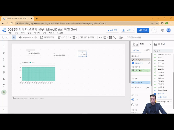
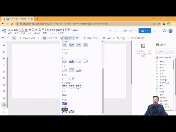
From the very beginning, you'll learn how to use all 14 core charting features of Google Data Studio. You can select and practice various charts appropriate for the various types of real-world data provided in the course.
You can create user-interactive visualization reports that support exploratory visualizations using control elements such as drop-down lists, fixed-size lists, input boxes, advanced filters, sliders, and time periods.
Ultimately, data visualization is a process for easily sharing insights. Sharing completed charts with team members in real time further enhances communication efficiency.
1. Visualize with a combo chart line!
2. Visualize mixed data with treemaps!
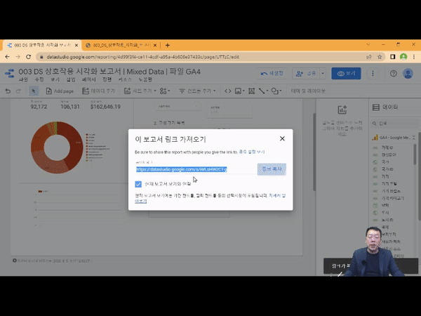
3. Share reports with your team members and collaborate easily!
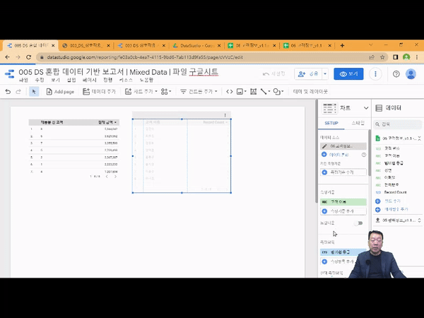
4. Visualize data from different sources and formats at once!
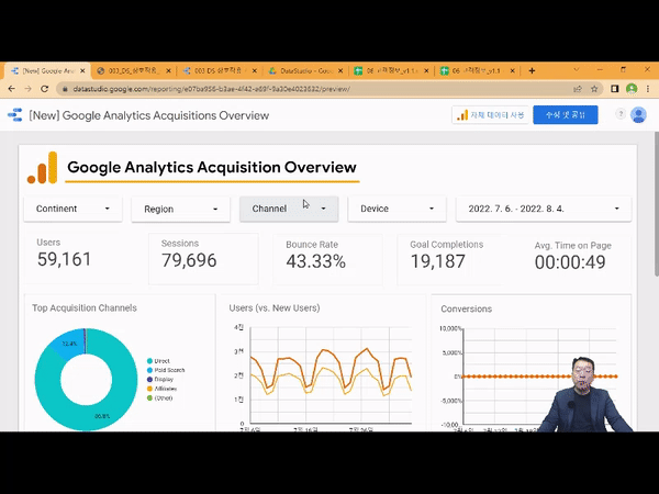
5. Create a GA4 Acquisition Dashboard!

Q. Is prior knowledge of data visualization required?
In this course, you'll follow the instructor's step-by-step visualization practice process from the first launch of Google Data Studio, so no prior knowledge is required.
Q. Are there any requirements or prerequisites for taking the course?
Since this is a hands-on course, we recommend bringing a dual monitor or a spare device that allows you to separate the lecture and practice screens. Furthermore, since the practical training will be conducted on a Windows OS, we recommend taking the course in a Windows environment.
Who is this course right for?
Beginner in Data Analytics and Business Intelligence
People who want to learn how to build interactive automated dashboard visualization projects.
Those who want to get started in the field of data visualization using Google Data Studio
For those who want to build an integrated dashboard for business decision making.
7,285
Learners
905
Reviews
96
Answers
4.7
Rating
86
Courses
"어제보다 성장하겠습니다. 그리고, 어제보다 성장하려는 사람을 돕겠습니다."
마소캠퍼스의 진심과 소망을 담은 Actionable Content로,
2013년부터 온오프라인으로 함께해 온 누적 강의 1억시간!
이 소중한 경험과 시간은 언제나 마소캠퍼스와 수강생 모두의 성장의 원천입니다.
마소캠퍼스 팀은 우리의 모두의 성장을 위해 두 가지 원칙을 반드시 지킵니다.
1. 배우면 반드시 쓸 수 있는 Actionable Content
2. 참여자의 시간과 수고를 존중하는 Time-Saving Curriculum
마소캠퍼스의 Actionable and Time-Saving Curriculum으로 성장의 길을 함께 걸어나가길 기원합니다.
All
40 lectures ∙ (3hr 19min)
Course Materials:
All
4 reviews
4.8
4 reviews
Reviews 1
∙
Average Rating 5.0
5
Tôi thích cách giải thích có hệ thống về các chức năng phân tích dữ liệu.
Cảm ơn! Chúng tôi đã cố gắng hết sức để đảm bảo rằng bạn có thể hiểu rõ nội dung. Chúng tôi sẽ giải thích chi tiết trong tương lai!
Reviews 2
∙
Average Rating 5.0
5
Thật tuyệt vời!
Cảm ơn! Tôi rất vui vì bạn nói đó là một khóa học tốt.
Reviews 1
∙
Average Rating 5.0
5
Nó rất hữu ích. Cảm ơn
Tôi rất vui khi được giúp đỡ ^^ 😊Tôi hy vọng bạn đạt được những kỹ năng mà bạn mong muốn. Cảm ơn!
Reviews 2
∙
Average Rating 3.5
4
Tôi nghĩ lời giải thích chi tiết sẽ giúp ích rất nhiều cho người mới bắt đầu.
Tôi rất vui vì nó hữu ích cho bạn 😊 Nếu bạn có bất kỳ câu hỏi nào, xin vui lòng hỏi!
Limited time deal
$1,077,904.00
23%
$51.70
Check out other courses by the instructor!


