강의

멘토링

커뮤니티

NEW
Productivity

/

Office

Master Everything About Excel Charts & Graphs in Just 2 Hours

Data Visualization Storytelling That's Perfectly Achievable with Excel Alone

(5.0) 2 reviews

6 learners

  • niniexcel
엑셀
데이터시각화
데이터리터러시
Excel
시각화
Data literacy

What you will learn!

  • Learning charts that were vaguely understood through a systematic roadmap

  • Data Storytelling: Delivering Core Messages with a Single Chart

  • The mindset of data analysts who visually design the stories hidden behind numbers

Excel Data Visualization Master Class from a Data Analyst 📊

— A good-looking chart is ultimately a chart that reads better.


This course is not simply about decorating charts.
From a roadmap for designing charts according to the purpose of your data,
to the most persuasive visualization methods for delivering your message, we cover it all together.
You can complete practical visualizations using only Excel as your one tool, without any additional BI tools.

From a data analyst's perspective, you will learn how to persuade with data through charts.

I recommend this for people like this

After taking the course

After taking this course, you will be able to express complex data as a single persuasive chart.

  • You can complete practical visualizations with just Excel alone, without any additional BI tools.

  • You can create charts that convey core intent directly without text descriptions.

  • Even when looking at the same data, everyone can interpret it in the same direction.

  • You can structure metrics so that month-over-month comparisons, target comparisons, and factors of increase/decrease are visible at a glance.

  • Reports change from 'explanatory materials' to 'discussion-centered meeting materials'.

Charts become not just shapes, but 'messages'.

You'll learn this content


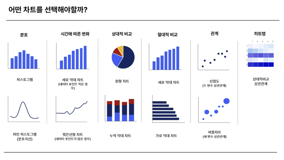
How to Choose Charts That Match Your Data Type

  • Learn a systematic roadmap for selecting the most suitable charts for each data type

  • Example: When comparing target vs. actual/plan achievement rate/month-over-month and year-over-year comparisons, which charts to use and what to hide for each

Chart Design Principles to Enhance Readability

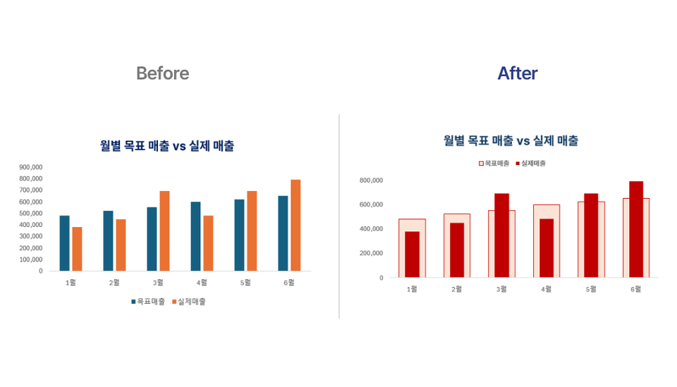
  • Design charts that remove unnecessary information and intuitively highlight only the information that needs to be emphasized


  • Design charts that match the viewer's perspective

Chart Automation and Practical Tips

  • Learn how to automatically update charts without manually updating them monthly

  • Learn practical know-how such as truncating to billions/thousands units, fixing axes, hiding combo chart axes, and more

Practical chart knowledge that has never been taught anywhere else

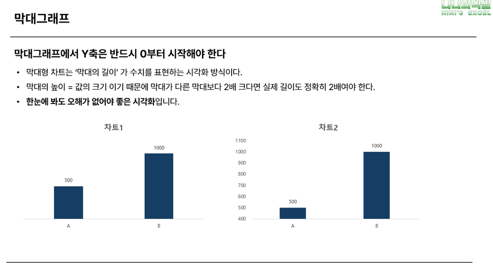
  • Why Bar Charts Should Start from Zero

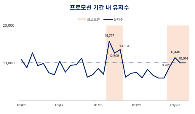
  • When can line graphs deviate from zero

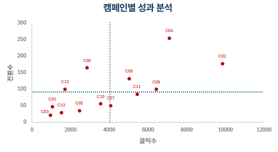
  • How are scatter plots interpreted and utilized in practical work


Key Features of This Course

Lectures structured from a data analyst's perspective

Based on the practical experience of a working analyst,
we explain "why you should use this chart" along with real work situations.
This is not just a simple visualization tutorial, but a course where you learn both analytical thinking and how to visually implement charts together.

We avoid charts that only look good and keep only the information necessary for decision-making.

There are many charts that look sophisticated but make it difficult to read the meaning of the data.
In this course, you'll learn how to retain only the essential information needed for decision-making along with good design.

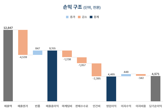
Advanced Chart Practice: Scatter Plots, Histograms, Waterfall Charts, and More

Going beyond typical bar or pie charts,
we develop the analytical thinking to handle various visualization methods suited to the form and purpose of data.
This course covers advanced charts like scatter plots, histograms, and waterfall charts,
teaching how to select and apply appropriate representation methods based on data structure.

👇Class examples to be covered during lessons


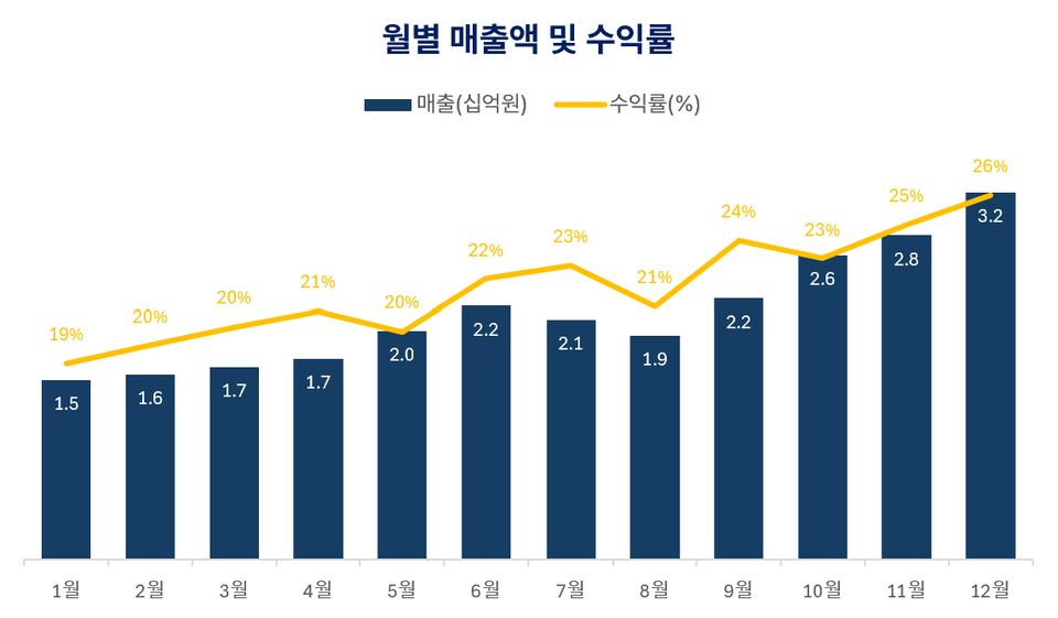
Combo Chart Applications

Scatter Plot

Waterfall Chart


Sparkline


Prerequisites and Important Notes

  • You can take this course even without advanced Excel knowledge.

    This course is designed to help you understand Excel's basic chart functions and develop them for practical use. Even beginner to intermediate Excel users can easily follow along.

  • Microsoft Excel 2016 or higher required (Both Windows / Mac supported)


Recommended for
these people

Who is this course right for?

  • A practitioner who must convey messages rather than numbers

  • Someone who wants to create data visualizations that are both beautiful and logically sound

  • Those who want to create practical business insights with just Excel, without complex analysis tools

  • Someone who is familiar with practical Excel skills but still finds 'speaking with data' challenging

Hello
This is

前 식품/의류/강의 등 다양한 도메인 기업의 MD

現 B2B스타트업 데이터분석가

하남시청, 광주은행, SK, 한샘 등 기업/기관 다수 출강


저는 스타트업에서 기획 MD로 일하며 수많은 데이터를 다뤘고

데이터분석으로 다양한 기획과 사업 전략을 세우는데 흥미를 느껴

현재는 데이터분석가로 직무를 전환했습니다.

요즘은 세일즈, 마케팅, CX 거의 모든 직무에서 데이터 분석 능력이 기본이 된 시대입니다.

그래서 저는 데이터분석이 궁금했지만 허들이 높아 망설였던

비전공자, 타직무의 눈높이에서 실무에 적용 가능한 지식과 노하우를 나누고 있습니다.

제가 겪어온 변화와 시행착오가 누군가에게는 데이터를 시작하는 방향이 되면 좋겠습니다.

Curriculum

All

20 lectures ∙ (2hr 9min)

Course Materials:

Lecture resources
Published: 
Last updated: 

Reviews

All

2 reviews

5.0

2 reviews

  • 녹산님의 프로필 이미지
    녹산

    Reviews 1

    Average Rating 5.0

    Edited

    5

    35% enrolled

    모호하게 알고 있었지만 꼭 제대로 배우고 싶었던 차트들 여기서 다 배울 수 있었어요. 짧지만 굵은 강의 감사합니다. 여러번 다시 볼게요. 추천합니다!

    • 망구미님의 프로필 이미지
      망구미

      Reviews 1

      Average Rating 5.0

      5

      85% enrolled

      보고, 공유에 데이터를 가지고 설득할 일이 많아지면서 한눈에 이해할 수 있게 하는 그래프 그리기가 고민이 되었어요. 같은 데이터도 어떻게 표현하느냐에 따라 설득력이 많이 달라져서 고민이었는데, 큰 도움 되었어요. 보고할 때마다 필요한 데이터나 그래프가 다를거라 그때그때 필요한 부분 여러번 돌려볼게요~

      $22.00

      Similar courses

      Explore other courses in the same field!