Lecture History
Seoul National University, Yonsei University, Kyung Hee University University of Seoul, Myongji University, Keimyung University, Hanyang University, Soonchunhyang University, Konkuk University, Chungbuk National University, Microsoft(MS), KB Kookmin Bank, Credit Union, SKChemicals, ConvaTec, Ministry of Food and Drug Safety, Korea Centers for Disease Control and Prevention, Korea Health Personnel Licensing Examination Institute , National Medical Science Knowledge Center, Seoul National University Hospital, Seoul National University Bundang Hospital, Boramae Medical Center, Asan Medical Center, Korea Cancer Center Hospital, Korea University Guro Hospital, Catholic University Hospital, Kwangju Christian Hospital, Samsung Medical Center, Wonju Christian Hospital, Gachon University Gil Medical Center, National Rehabilitation Center, Dongguk University Ilsan Hospital, Chonnam National University Hospital, Chosun University Hospital, The Seoul Institute, Korea Health Industry Development Institute Middle East Center, Korea Publishing Contents Center etc.
Books / Publications
『Orthopedics for Primary Care Physicians』(Korean Medical Book) 1st Edition, 2nd Edition
『Let's Write Papers Easily and Comfortably』(Korea Medical Book) 1st Edition, 2nd Edition, 3rd Edition
『Learning Medical Statistics at a Glance』(2013 Ministry of Culture, Sports and Tourism Excellent Academic Book Award) 1st Edition, 2nd Edition
『Sample Size Calculation』(Daehan Medical Books)
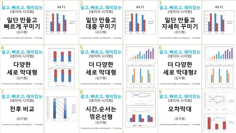
『Graphing for Researchers』(Book&Edu) 1st Edition, 2nd Edition
『Presentation Work Guide』(Book & Edu)
『Taming dBSTAT』(Barun Medical Research Institute)
『Randomized Controlled Trials for Clinical Research』(Hannarae)
『Playing with Data, R Data Visualization』(Book&Edu)
『Easy and Convenient, Meta-Analysis』(Book&Edu)
『Smart Reports, Speed Public Documents』(Book&Edu)
『Pick and Eat Only the Delicious Parts, Excel Pivot Tables』(Book & Edu)
『Using Zotero 』(Book & Edu)
『Predictive Models Anyone Can Make Easily and Funly』(Book & Edu)
『Welcome, Is This Your First Academic Conference?』(Book&Edu)
『Let's Play with Data, R Data Visualization-Advanced Application』(Book&Edu)
『Excel+R Data Analysis』(Hannarae)
『ggplot2+α Told by Dad』(Hannarae)


![Making [R shiny app] as told by DadCourse Thumbnail](https://cdn.inflearn.com/wp-content/uploads/rshiny1.jpg?w=420)

![[For Beginners] Data Visualization with Power BICourse Thumbnail](https://cdn.inflearn.com/public/courses/327055/cover/455b54c1-3e63-439b-9b60-5d12e12bc303/PowerBI-001 (1).png?w=420)
![[Work Automation Using Free MS RPA] Power Automate Desktop EssentialsCourse Thumbnail](https://cdn.inflearn.com/public/courses/329655/cover/8364da63-535b-4613-9b02-3dcdfc21791d/329655-eng.png?w=420)
![[Work Automation Using Free MS RPA] Power Automate Desktop - Excel AutomationCourse Thumbnail](https://cdn.inflearn.com/public/courses/330201/cover/8adc841c-39de-4770-98d3-2439ed8881a3/330201-eng.png?w=420)
![[Pass ITQ Excel A in One Go] in 3 daysCourse Thumbnail](https://cdn.inflearn.com/public/courses/329652/cover/b44e11b6-a47e-4993-86ea-a85da9836bb5/329652-eng.png?w=420)