To be applicable to practice, The course consists of three stages
Step 1
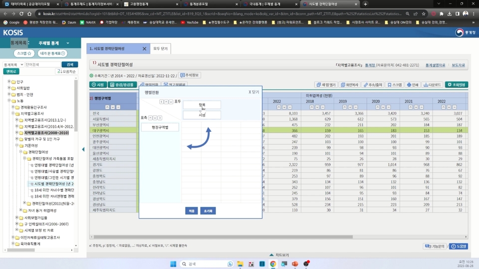
Following the lecture Download the statistics.
Step 2
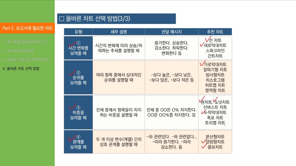
Chart (graph) type Understand how to choose.
Step 3
Data such as bars, lines, circles, etc. Let's practice the basic chart.
You need to know the basics to apply them.
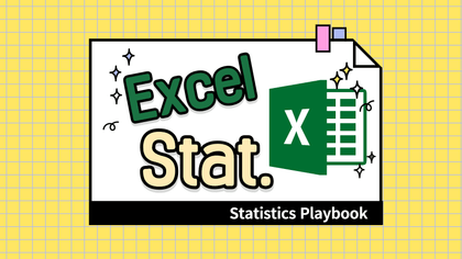
Charts (graphs) are a constant presence in every report or report we write. They're so widely used and important. Even after taking numerous classes, when it comes to actually applying them in practice, I often feel lost as to where to begin. This indicates a lack of fundamental understanding. Understanding the fundamentals is more important than mastering complex and diverse charts.
Develop your practical data utilization skills.
Just because you have a single data set doesn't mean you can create just one chart. Charts are created to convey a message based on data, and the type and visualization of the chart varies depending on the message. This course aims to help you create more than ten charts using three sets of data.
Lecture Structure ✨
Part 1. How to Use the Statistics Portal and Practice
Understand where to obtain national statistical data and gain practical experience by downloading data directly according to actual conditions.
Part 2. Understanding the charts needed for the report
You will learn how to create charts using statistical data and what are the important parts of chart creation.
Part 3. Chart Creation Practice
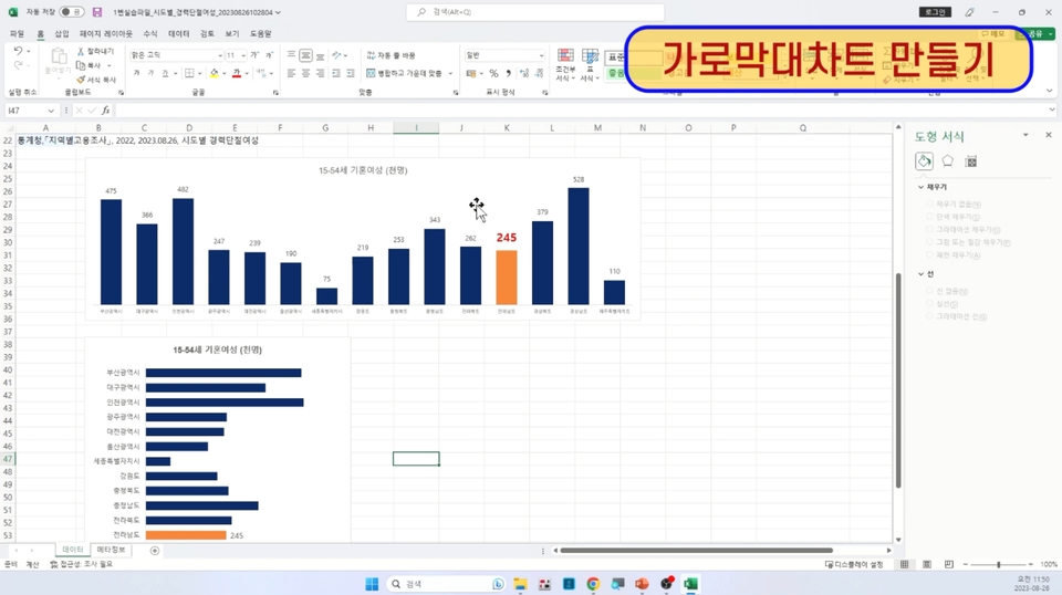
[Writing Practice 1] Creating Vertical and Horizontal Bar Charts (Using Practice File 1)
Using the first practice file, you'll create your own vertical and horizontal bar charts. Through this exercise, you'll learn not only how to create charts, but also how to adjust axes, adjust bar thickness (interval width), and other features.
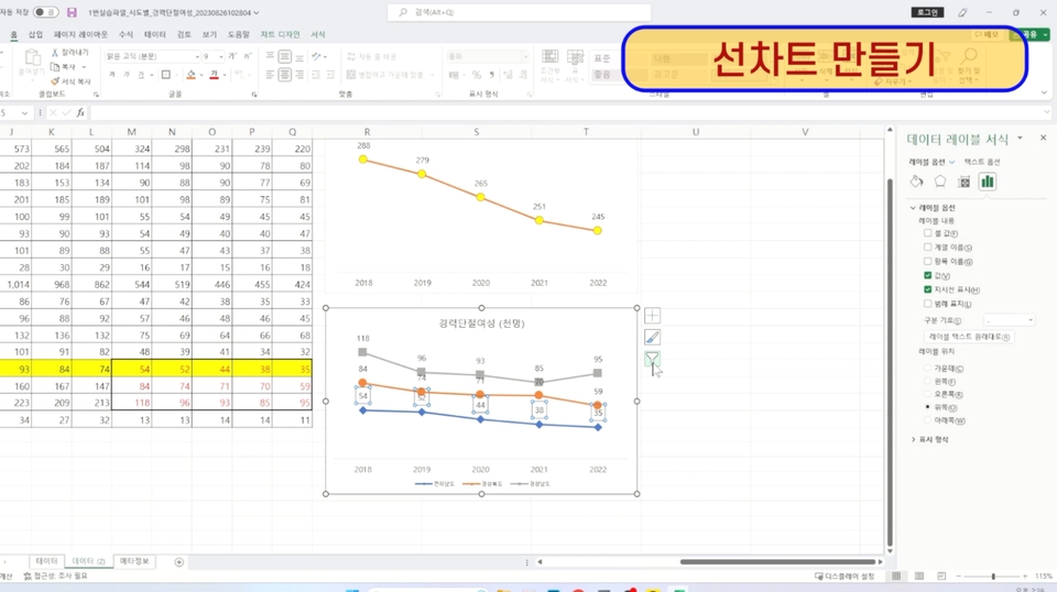
[Writing Practice 2] Creating a Line Chart (Using Practice File 1)
Let's create a line chart using the practice file in step 1. Through this exercise, you'll learn not only how to create a chart, but also how to change line colors, change markers, and place legends.
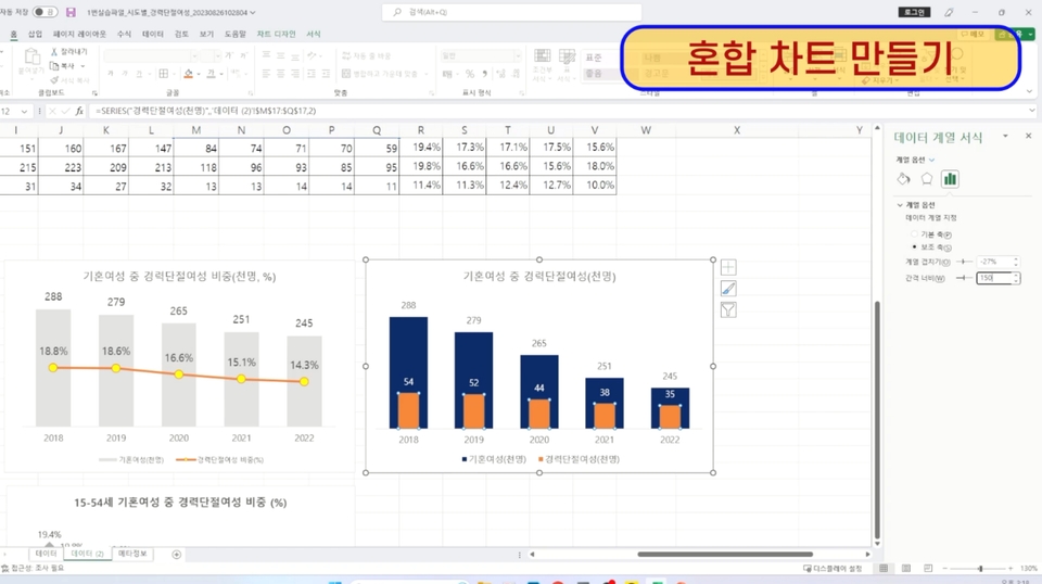
[Writing Practice 3] Creating a Mixed Chart (Using Practice File 1)
Using the practice file #1, you'll create your own mixed chart (line + bar, bar + bar). Through this practice, you'll learn how to use auxiliary axes, set the correct axes, and create mixed charts.
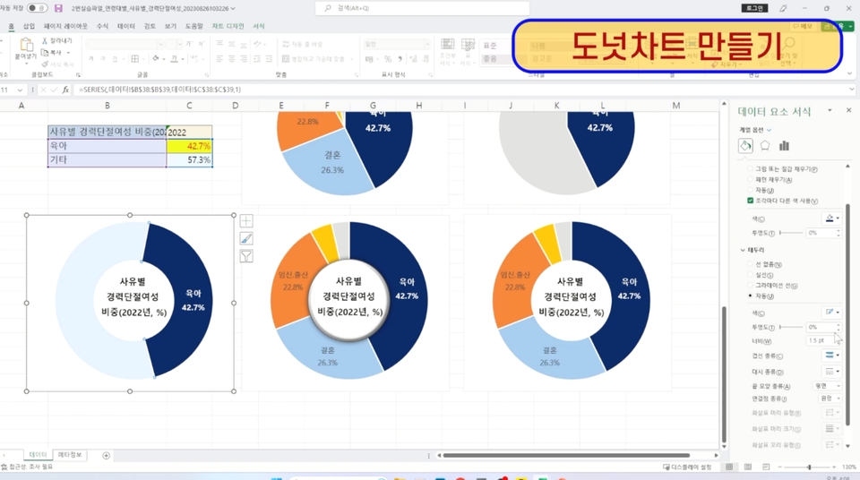
[Writing Practice 4] Creating a Circle Chart, Donut Chart, and Semi-Circle Donut Chart (Using Practice File 2)
Using the second practice file, you'll create your own pie chart, donut chart, and semi-pie chart. Through this exercise, you'll learn how to arrange circle segments, adjust hole sizes, and process statistical data.
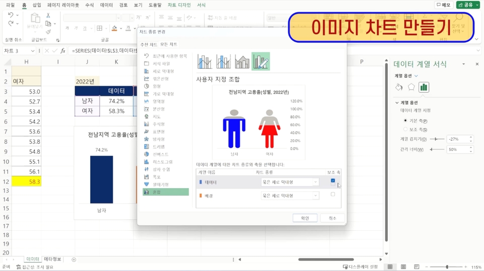
[Writing Practice 5] Creating Image Charts and Two-Way Charts (Using Practice File 3)
Using the third practice file, you'll create your own image chart and interactive chart. Through this exercise, you'll learn features like inserting images into bars and chart design techniques.
Recommended for these people
Who is this course right for?
For those who want to create charts and apply them immediately in real life
Anyone who wants to learn visualization using data
I specialize in researching report writing techniques (proposals, planning documents) essential for becoming a top performer, as well as visualization skills (Excel, PPT, OA) that make results stand out.
Having worked for firms specializing in strategic planning and R&D, I am currently active as a technology commercialization consultant at a patent law firm. Over the past 15 years, I have gained extensive experience writing numerous reports, including proposals and planning documents, while carrying out projects in government policy planning, R&D planning, and new business planning.
Currently serving as the Lead Consultant at TN and an Adjunct Professor in the Department of Business Administration at Soongsil University. Previously held positions as an Adjunct Professor in the Department of Data and Library Information Science at Tongwon University, Senior Researcher at The B&I and ED Research, and Director at Inno Patent & Law Firm, while also serving as an advisor and evaluation committee member for numerous organizations.
He has lectured at numerous universities and institutions, including Konkuk University, Konkuk University (Glocal), and the Korea Institute of Ceramic Engineering and Technology. His major publications include "Practical Proposals Everyone Covets."


![[Star Instructor Teacher Choi] The Standard for Passing Quickly|ITQ Excel MasterCourse Thumbnail](https://cdn.inflearn.com/public/files/courses/343264/cover/01kxzse3ftyrhrd3te3b03e3ch?w=420)


![[Pass ITQ Excel A in One Go] in 3 daysCourse Thumbnail](https://cdn.inflearn.com/public/courses/329652/cover/b44e11b6-a47e-4993-86ea-a85da9836bb5/329652-eng.png?w=420)