![[Author's Lecture] R Data Analysis with Practical ExamplesCourse Thumbnail](https://cdn.inflearn.com/public/courses/328429/cover/0e68ecdb-65d3-4da8-8ca7-ecbddf079cc4/328429-eng.png?w=420)
[Author's Lecture] R Data Analysis with Practical Examples
junyoung85179634
$26.40
Basic / R
1.0
(1)
This is a lecture titled "Data Analysis Based on Practical Examples" prepared for data analysts.
Basic
R
The entire course is covered in one lecture, starting from the basics of understanding Tableau's various functions to a practical example of a sales analysis dashboard.

You can get an overall understanding of Tableau.
You can understand data visualization approaches.
You can create a sales dashboard.
Data Visualization with Tableau
From basics to practical examples! 📊
In this course, you'll learn the data visualization approach I've used over the past eight years in data analysis and dashboard building projects. By following along, you'll gain a comprehensive understanding of Tableau. This course also includes a practical example, a "Sales Analysis Dashboard," to help you understand Tableau visualization from the basics to the practical application.
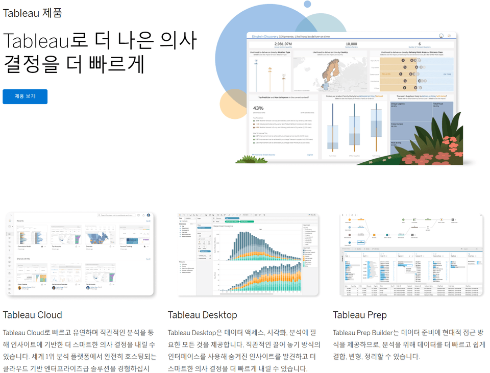
Tableau is a business intelligence tool that helps you extract meaningful insights from data and make quick decisions. Its products are broadly divided into Cloud/Server, Desktop/Public, and Prep products. This lecture covers Tableau Desktop and Public, which provide everything you need for data access, visualization, and analysis.

Easy to learn
Without coding
You can visualize your data
there is.

Convenience
Regardless of size or scope
Get data easily
You can.

Interactive Dashboard
Gather multiple visualization charts
You can create a dashboard
there is.
Through various data visualization approaches
Learn how to derive insights from data!
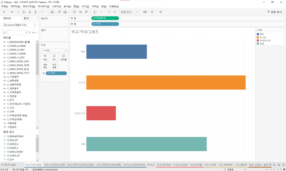
Published books and lectures often cover the theories and programming fundamentals required for data analysis. This allows you to focus your time on deriving meaningful insights from your data. Tableau allows you to easily combine data using drag-and-drop to create a variety of data visualizations.
Through practical examples of sales analysis
Learn essential tips for the field!
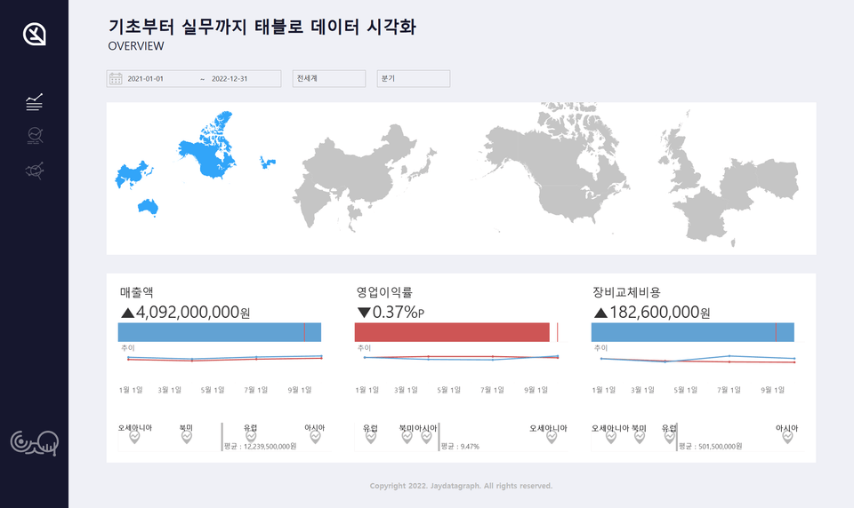
Businesses are for-profit organizations that produce and sell goods and services, generating sales data in the process. We'll use sales data from a small company that produces and sells small products to create a dashboard that can be used in practical examples. While learning about practical examples, we'll also provide reminders to relearn data visualization approaches.
You can download the necessary course materials by clicking "Course Materials" in the upper right corner of the lecture screen below. If you have any further questions during the course, please post them in the community.
Who is this course right for?
People without experience in data analysis
Tired of Python Code
People who need to quickly derive insights from data
People who need to utilize the tool due to the introduction of Tableau within the company
99
Learners
8
Reviews
6
Answers
3.9
Rating
2
Courses
All
39 lectures ∙ (3hr 55min)
Course Materials:
All
7 reviews
4.3
7 reviews
Reviews 6
∙
Average Rating 4.7
Reviews 9
∙
Average Rating 5.0
Reviews 4
∙
Average Rating 4.8
Reviews 8
∙
Average Rating 5.0
Reviews 1
∙
Average Rating 5.0
Check out other courses by the instructor!
Explore other courses in the same field!
25% off for new members
$32.90
25%
$42.90


![[D-PEC UP_PASS] National Technical Qualification: Management Information Visualization Ability (Written Exam)Course Thumbnail](https://cdn.inflearn.com/public/files/courses/336327/cover/01jytyqa2egrzn52a7m57fntzk?w=420)