[Systematization of Engineering Intuition and Intelligent Problem-Solving Methodology Roadmap]
1. Introduction: Shift in the Problem-Solving Paradigm (The Birth of the Problem Architect)
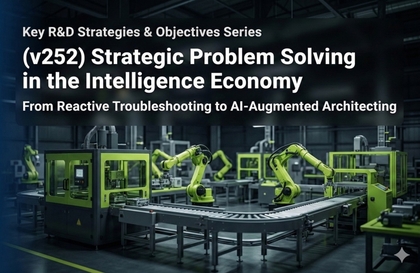
The complexity of modern industry has reached a level that exceeds the cognitive capacity of individual engineers, clearly exposing the limitations of "troubleshooting," which is a simple reactive repair approach. To derive meaningful solutions in manufacturing and R&D sites where tens of thousands of variables are intertwined, it is essential to evolve into a "Problem Architect" who goes beyond solving occurring problems to eliminating the problem-generating structure itself at the design stage.
This masterclass combines 40 years of engineering intuition with cutting-edge artificial intelligence technology to present specific intelligent problem-solving techniques that transform uncertainty into engineering necessity.
2. Step-by-Step Intelligent Problem-Solving Techniques (The Methodology)
① Data-Driven Causal Identification Technique: DMAIC 4.0
The traditional Six Sigma methodology—Define, Measure, Analyze, Improve, and Control—is advanced by combining it with the computational power of modern AI.
Selection of Key Process Input Variables (KPIV): AI algorithms are utilized to extract key factors with actual causal relationships, rather than mere correlations, from among thousands of variables.
Securing Statistical Consistency: We establish an analytical process that proves capabilities with a Process Capability Index (Cpk) of 1.33 or higher through data, realizing "zero defects through statistical necessity" rather than "accidental good products."
② Virtual Verification and Lead Time Reduction Technique: Zero-Trial Strategy
To minimize physical trial and error, we introduce verification techniques in a Digital Twin environment, which perfectly replicates real-world processes in a digital space.
Cost-Free Limit Testing: Optimal process conditions are derived by performing tens of thousands of simulations in a virtual environment without interrupting actual production lines or destroying prototypes.
Multi-Agent System-based RCA: We apply a "time leverage" technique that innovatively shortens the lead time required for Root Cause Analysis (RCA) by deploying multiple AI agents that simultaneously perform search, reasoning, and cross-verification.
③ Logical Thinking and Knowledge Assetization Technique: Pyramid Narrative and Knowledge Graphs
This is a knowledge structuring technique that ensures field problem-solving experiences do not remain in individual memories but spread as the intelligence of the entire organization.
Pyramid Principle and SCQA Framework: By combining Barbara Minto's Pyramid Principle with the Situation, Complication, Question, and Answer (SCQA) structure, complex technical issues are reconstructed into logical narratives that management can immediately accept.
Building Knowledge Graphs: Fragmented technical reports and drawing data are converted into a graph structure capable of real-time reasoning. Through this, an organizational learning system is established where problem-solving cases from a specific point are immediately propagated (Yokoten) to production bases worldwide.
④ Transparency-Based Decision Support Technique: Explainable AI (XAI)
This technique involves verifying AI outputs based on engineering logic rather than blindly accepting them.
Chain of Thought Visualization: By transparently disclosing (Glass Box) the step-by-step logical development process the AI went through to reach its final conclusion, the basis for decision-making is secured.
Human-in-the-Loop Governance: AI serves as a Co-pilot suggesting optimal alternatives, while the system is designed so that the final trigger is approved by human engineering insight and ethical judgment.
3. Human-Centered Cognitive Sovereignty Acquisition Techniques
As the automation rate of systems increases, active response techniques are required to prevent the decline of the cognitive capabilities of the humans operating them.
Sandwich Workflow: Instead of delegating the entire work process to AI, a structural work technique is applied where humans preemptively occupy context design (Top Bun) and final value judgment (Bottom Bun) to prevent cognitive paralysis.
RQTDW Learning Protocol: By mandating five stages—Read, Question, Think (confronting contradictions), Discuss (virtual debate), and Write—into the practical process, we reject simple acceptance of information and actively internalize knowledge into the brain.
Intentional Cognitive Friction: To maintain a critical distance from the overly smooth answers provided by AI, an adversarial verification process using a Critique Agent is conducted.
4. Practical Application: Super-Gap Leadership for "Designing Out" Problems
The ultimate maturity of problem-solving lies not in solving problems well after they occur, but in "Designing Out" the system structure so that problems cannot occur.
Data Infrastructure and Autonomous Operation Design: We block the possibility of human error by building an autonomous operation system that ranges from real-time data collection to feedback loop-based correction.
Organizational Intelligence: By converting individual expert know-how into standardized algorithms and knowledge graphs, we secure an upwardly standardized problem-solving capability for the entire organization.
5. Conclusion: Future Competitiveness Completed by Engineering Rigor
While intelligence is manifested through AI technology, the vessel that contains that intelligence and makes it operate according to its purpose is only a rigorous and sophisticated engineering problem-solving methodology.
This masterclass will move away from technology adoption that relies on luck or probability and present a path to becoming a "True AI Architect" who perfectly commands systems with data and logic. We hope you establish your status as a super-intelligent helmsman who dominates technology and eliminates problems.


![[AI 치트키] 평범한데이터도살려내는AI시각화_홍보포스터](https://cdn.inflearn.com/public/files/courses/343878/builder/01m0e9rybr5761zrn4dg8rh5ds?w=960)
![[AI 치트키] 평범한데이터도살려내는AI시각화_학습목표](https://cdn.inflearn.com/public/files/courses/343878/builder/01m0ea0scghxe08hstxeqkevrd?w=960)
![[AI 치트키] 평범한데이터도살려내는AI시각화_학습대상](https://cdn.inflearn.com/public/files/courses/343878/builder/01m0ea19h7f8vnsasraxqscgg1?w=960)
![[AI 치트키] 평범한데이터도살려내는AI시각화_학습목차](https://cdn.inflearn.com/public/files/courses/343878/builder/01m0ea1msv9dhvp388g90by36k?w=960)

![[Vibe Coding] No Coding Knowledge Needed! Build Automated Data Analysis with AICourse Thumbnail](https://cdn.inflearn.com/public/files/courses/343876/cover/01m0cdq4w7crfs0n22s6r6z4bm?w=420)

![[Vibe Coding] No coding knowledge needed! Practical planning and marketing automation implemented just as you envision itCourse Thumbnail](https://cdn.inflearn.com/public/files/courses/343702/cover/01m0bw7ftw0a710nyfxba59aky?w=420)
![[Vibe Coding] No Coding Knowledge Needed! Build a Sales & CS Solution in Just 10 MinutesCourse Thumbnail](https://cdn.inflearn.com/public/files/courses/343700/cover/01m0bwmk0xryrpn86rxf27dmwt?w=420)
![[Black-and-White Office Worker] Workplace Sexual Harassment Prevention TrainingCourse Thumbnail](https://cdn.inflearn.com/public/files/courses/343698/cover/ai/2/89eed4b2-24ef-49dc-acef-1e936d2a4258.png?w=420)

![[AI Cheat Sheet] Reshaping the Game: Artificial Intelligence × Human IntelligenceCourse Thumbnail](https://cdn.inflearn.com/public/files/courses/340718/cover/ai/0/506ad926-381d-4363-882b-528c1409d7fb.png?w=420)
![[AI Cheat Sheet] The secret to finishing work instantly, Agentic AICourse Thumbnail](https://cdn.inflearn.com/public/files/courses/340717/cover/ai/1/3b5cb844-25b5-4576-8224-d293d0989376.png?w=420)
![[AI Cheat Sheet] From today, you too are someone who knows a thing or two about Physical AICourse Thumbnail](https://cdn.inflearn.com/public/files/courses/340712/cover/ai/2/67356416-3a86-427e-b742-5a33663c4ad0.png?w=420)
![[Biz Cheat Sheet] The game changer after AI, Quantum ComputingCourse Thumbnail](https://cdn.inflearn.com/public/files/courses/340708/cover/ai/3/fd31d41e-336b-4afe-903d-2a908ecadfa2.png?w=420)
![[Biz Cheat Sheet] Confusing Stablecoins: How Far Can They Be Used?Course Thumbnail](https://cdn.inflearn.com/public/files/courses/340703/cover/ai/3/46cf3bf4-ea76-4be2-897d-0cd4df4b301a.png?w=420)


.png?w=420)


![[Replay of August Regular Training Session] Regression Analysis - Understanding the Factors Affecting Indicator DifferencesCourse Thumbnail](https://cdn.inflearn.com/public/courses/331897/cover/48ee8779-14a8-4911-86ed-2c2800331192/제목을 입력하세요 (12).png?w=420)


![[Renewed] MongoDB and NoSQL (Big Data) Database Bootcamp for Beginners [From Introduction to Application] (Updated)Course Thumbnail](https://cdn.inflearn.com/public/courses/324183/cover/fbe9f0cc-4c42-4435-b855-f283f6932415/324183.png?w=420)
![[2026-D-PEC UP_PASS] Data Architecture Semi-Professional (DAsP)Course Thumbnail](https://cdn.inflearn.com/public/files/courses/333571/cover/ai/2/1a2dc349-c7f4-46e7-b0dd-d977c0dc4a0b.png?w=420)