Welcome to Tableau World
VizLab
Free
Basic / Tableau
4.9
(162)
6,800+
Learn the basics of Tableau, the most popular data visualization tool today.
Basic
Tableau
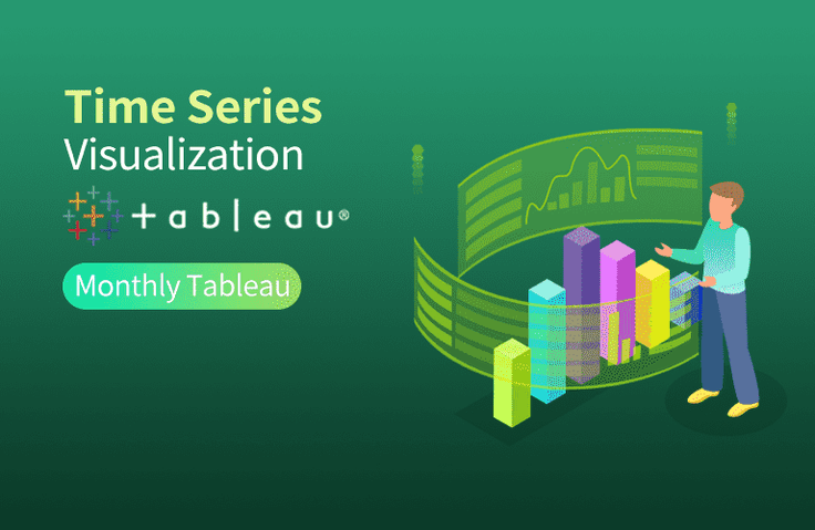
VizLab's monthly Tableau is an online seminar that started with the purpose of thinking about better ways to utilize the software called 'Tableau' together with people who are using Tableau in the field.
We'll continue to refine this platform to create a space for everyone to discuss new ideas, better screen layouts, and more efficient calculations, all while working on their own tasks. We hope to grow together by discussing Tableau's real-world use cases with industry experts with extensive domain knowledge. We're open to all kinds of ideas, topics, and datasets. We encourage your active participation ( bryan@vizlab.kr ).
In April 2020, in our fourth monthly Tableau, we explored new ways to visualize date and time data . Line charts, along with bar charts, are one of the most commonly used charts in data visualization. However, there's a concern that simply drawing line charts repeatedly can make the screen somewhat boring. Still, the screen should be fun to look at! We wondered if there were other ways to do this besides line charts. We explored ways to complement line charts in the following two directions.
☑️ I believe there's no disagreement that line charts are the best way to visualize date and time data. It's hard to find a better way to show trends or tendencies. However, when using date and time data to (1) examine relationships between units of time (months, quarters, years, etc.), (2) examine ranking changes over time, or (3) specifically identify cycles or patterns, there may be better alternatives than line charts. This seminar will explore these very aspects.
☑️ As mentioned earlier, line charts are excellent on their own, so it's worth considering whether you can leverage them while adding a few more features. In this seminar, we'll learn how to easily compare current month-to-month performance year-over-year by connecting Tableau's Actions feature, and how to highlight the year you're exploring to make trends stand out even more.
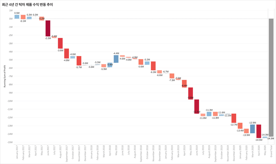
Here are the chart images we'll be creating for this seminar! First, we'll create a Waterfall chart , allowing you to simultaneously view the previous month's performance and the current cumulative performance. This chart allows for a variety of storytelling possibilities.
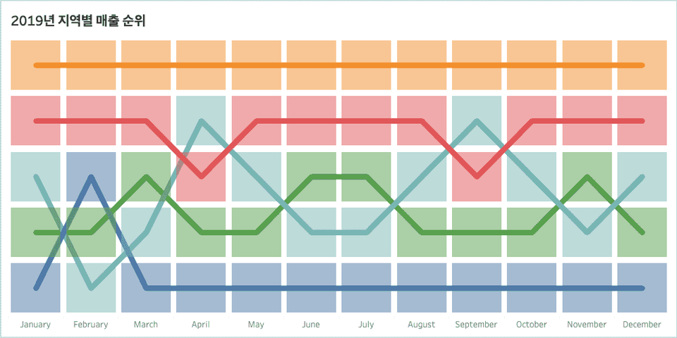
Below is a Bump Chart , which simplifies complex content and focuses on rankings. By condensing information, it's easy to read and delivers a clear message!
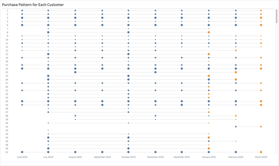
Another alternative to line charts is the History Tracking Chart . This chart can effectively reveal customer purchasing patterns and trends.
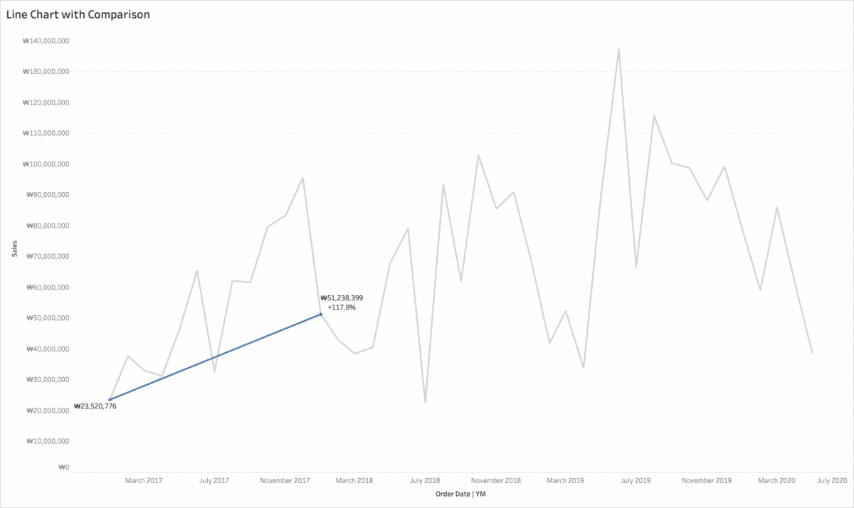
Another option is to add Tableau actions to existing line charts to create a more meaningful display. First, combining it with a parameter action allows you to immediately see a comparison with the same month last year, providing a broader understanding of the current situation.
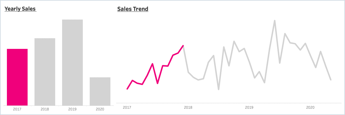
The second way to upgrade a line chart is to use aggregate actions to highlight only the months of a specific year. This allows users to explore data more intuitively.
![]()
Tableau Desktop Professional is a paid product, but offers a two-week free trial. You can download Tableau Desktop here .
The Tableau Public version is free to use and can be downloaded here .
The biggest difference between the desktop version and the public version is
(1) The public version cannot save the created workbook to the local machine.
(2) The public version cannot retrieve data stored in the database.
The public version is also suitable for following this course. Guidelines for installing Tableau can be downloaded here . However, the Tableau workbook provided in the course cannot be opened in the public version of Tableau. Therefore, public users must install Tableau Reader (download here ) to open the provided workbook.
This seminar is a recording of an online seminar held LIVE on April 13, 2020.
It's been properly edited and organized into a format that's easy to learn. Please refer to it when making your purchase decision!
Q. Who would benefit from this seminar?
A. I recommend this seminar to anyone interested in creating various types of charts . Line charts are one of the most commonly used charts in the industry, so it's true that they can feel a bit clichéd. If you're considering other charts that utilize date and time data, this seminar may be helpful. We also welcome those who want to gain ideas for enhancing the UI/UX elements of their screens using Tableau's aggregate or parameter actions.
Q. What functional aspects of Tableau will this seminar cover?
A. It covers Gantt charts, RANK table calculations, dual axes, relative date filters, aggregate actions, parameter actions, and more . While these concepts are more advanced than basic concepts, they aren't overly complex, so anyone with some experience using Tableau should be able to follow along.
Q. Is there anything I need to prepare before attending this seminar?
A. This seminar is designed for attendees who already have some basic Tableau skills. If you learn the basics of Tableau through the Welcome to Tableau class , you'll be able to participate more easily.
Q. Where can I download study materials?
A. The study materials for this seminar can be downloaded from Section 0, Lesson 2, "Understanding Line Charts" after purchasing the course. The materials consist of (1) the Superstore KR - VizLab 2020 Excel data file and the Subscription Model Excel data file, (2) the seminar guide document, and (3) a Tableau workbook for hands-on practice.

Okay. It gives me a chance to learn different visualization methods.
I think it would be fun and useful to make a chart that can find more meaning by changing the line chart. I didn't know how to get the sample data, so I practiced with the existing superstore, and it was enough~
I am listening to all the lectures well. I didn't know anything about Tableau, but after listening to everything from the basics, I am now at a level where I can use it in my work. I would also like to take the certification class, so if you could upload it or give me a link, I would be grateful :)
It is very informative and the lecture time is efficient. ^^


![[D-PEC UP_PASS] National Technical Qualification: Management Information Visualization Ability (Written Exam)Course Thumbnail](https://cdn.inflearn.com/public/files/courses/336327/cover/01jytyqa2egrzn52a7m57fntzk?w=420)