🤯 I've done the data analysis, but persuasion is hard...
We will talk about the know-how on how to effectively communicate data analysis results and persuade others. If you are someone who needs to persuade your boss, colleagues, or clients with data, please pay attention to this presentation!
2부에서 답하는 사전 질문 펼쳐보기
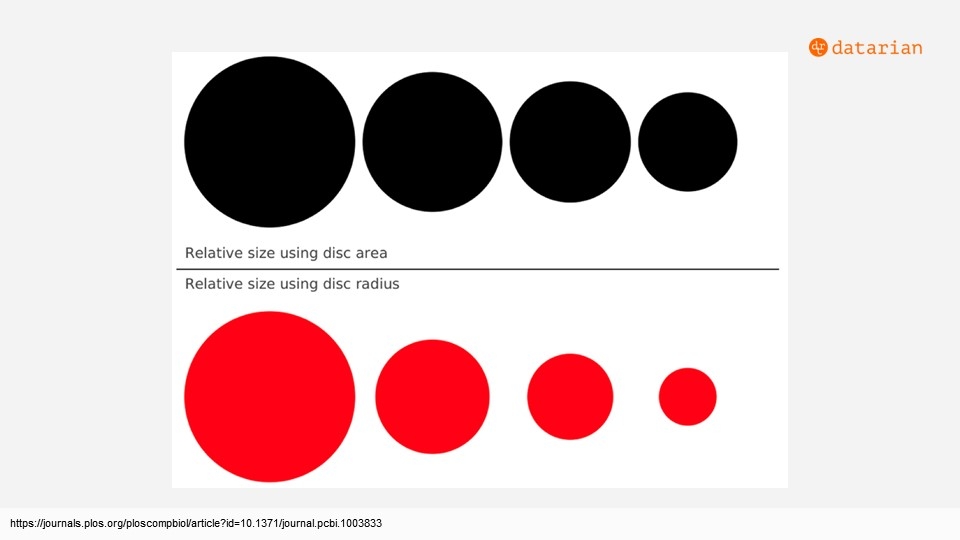
Q1. Why do we do visualization? Is it just to please the eyes?
Q2. When visualizing analysis outputs, to what extent should they be made aesthetically pleasing?
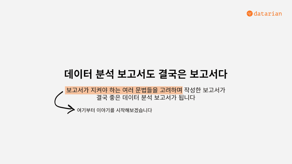
Q3. Do you design the narrative after final confirmation of the data results? Or do you set a desired direction first and then prepare supporting data to match it? What are some tips for data interpretation that lead to action plans and insights, rather than just listing data?
Q4. I need to create a data analysis portfolio, but I'm at a loss as to how to present the analysis results.
Q5. As someone preparing for a job, I'm not sure what I should learn. Some lectures say PowerBI is widely used in the field, others say Tableau is used more, and some even say I should just focus on mastering Google Sheets visualization. Which visualization tool should I prioritize learning to be most helpful?
Q6. Is it common to visualize using Python libraries without utilizing BI tools? I use matplotlib or seaborn for visualization, but it takes more effort than expected, so I often find myself just pulling charts from Excel when I'm in a hurry. Is this due to my lack of Python skills...? Or do others also find using Excel more efficient?
Q7. Are there specific rules for which graphs to use in different analytical situations? Also, have you ever had an experience where you escaped a situation by slightly overstating or understating data through graphs?
Q8. Is there such a thing as a persuasive dashboard? C-level and internal dashboards seem like they would be different—what points should be prioritized for each?
Q. Is it possible to view the lecture materials used in the seminar separately?
Please check the lecture materials at the link below!
∙ May Seminar Slides: https://bit.ly/38VZdxG
In this seminar, we are providing Notion lecture notes so you can take notes while listening. Please feel free to duplicate them to your personal Notion or use them on your tablet while watching :)
∙ Notion Lecture Notes: https://bit.ly/3x9ljF5


![How did 4 non-majors become data analysts? [Monthly Datarian Seminar Replay | January 2022]Course Thumbnail](https://cdn.inflearn.com/public/courses/328396/cover/5c5bec5b-5393-4b0b-9674-ea578e81ea9b/328396-eng.png?w=420)
![Data Analyst Resumes That Lead Straight to Interviews [Monthly Datarian Seminar Replay | February 2022]Course Thumbnail](https://cdn.inflearn.com/public/courses/328519/cover/9dcb604b-7dd6-464b-909c-686ed349a891/328519-eng.png?w=420)
![What does a data analyst do? [Monthly Datarian Seminar Replay | March 2022]Course Thumbnail](https://cdn.inflearn.com/public/courses/328570/cover/158d2129-e4a3-4471-b575-dfea5f6d5b68/328570-eng.png?w=420)
![Data Analysis Skills for Immediate Use in Practice [Monthly Datarian Seminar Replay | April 2022]Course Thumbnail](https://cdn.inflearn.com/public/courses/328708/cover/75cd40e3-b22d-42fb-a613-572707875ab4/328708-eng.png?w=420)
![[A hundred words are not as good as seeing once] Basic SQL for data analysisCourse Thumbnail](https://cdn.inflearn.com/public/courses/324566/cover/aa1fac55-6e80-4506-9c92-f32c2b65f93a/sql_basic.png?w=420)
![[Practice Makes Perfect] Intermediate SQL for Data AnalysisCourse Thumbnail](https://cdn.inflearn.com/public/courses/324568/cover/9f81ac3f-d663-49e7-9eda-61253189790c/sql_intermediate.png?w=420)
![Data-Driven Design Without a Data Analyst [Datarian Seminar Replay | November 2025]Course Thumbnail](https://cdn.inflearn.com/public/files/courses/339608/cover/01kbpcbn9gv7ysm630hkz313gd?w=420)
![Free GA4 Course for Beginners [Datarian Seminar Replay | July 2025]Course Thumbnail](https://cdn.inflearn.com/public/files/courses/338668/cover/01k38fk7pq2a3ht1pn7nwrk7s4?w=420)
![Data Analysis Portfolio That Takes You Straight to an Interview [Datarian Seminar Replay | January 2025]Course Thumbnail](https://cdn.inflearn.com/public/courses/336048/cover/c90f7e08-0953-41b6-9892-236f20b110ec/336048.png?w=420)
![Effectively Persuading Marketing Plans Based on Data [Datalian Seminar Replay | October 2024]Course Thumbnail](https://cdn.inflearn.com/public/courses/335163/cover/af19c098-8652-462d-8533-939a23e1d5bd/335163.png?w=420)
![Data Analyst, Which Company Should I Go to? [Datarian Seminar Replay | July 2024]Course Thumbnail](https://cdn.inflearn.com/public/courses/334459/cover/22684393-748c-43e3-8282-fcd6fee701d9/334459.png?w=420)
![Data Analyst Career with Generative AI [Datalian Seminar Replay | May 2024]Course Thumbnail](https://cdn.inflearn.com/public/courses/333839/cover/8abc6cdd-25bd-4a69-9527-16b9fc9cb460/333839.png?w=420)
![How are other companies doing funnel analysis? [Datalian Seminar Replay | March 2024]Course Thumbnail](https://cdn.inflearn.com/public/courses/333329/cover/9e7725db-639d-469a-adac-5089658875a6/333329.png?w=420)
![How did a non-major become a data analyst? [Datalian Seminar Replay | January 2024]Course Thumbnail](https://cdn.inflearn.com/public/courses/332976/cover/1c20f1ed-fb65-4c32-9624-4cedc370ed5b/332976.png?w=420)
![Senior Data Analyst's SQL Coding Test Know-how Revealed [Monthly Datalian Seminar Replay | December 2023]Course Thumbnail](https://cdn.inflearn.com/public/courses/332774/cover/a9900f25-50a4-46f1-930d-e6ef03ea88f1/332774.png?w=420)
![Everything About Marketing Performance Analysis (feat. GA4) [Monthly Datarian Seminar Replay | November 2023]Course Thumbnail](https://cdn.inflearn.com/public/courses/332465/cover/fc2a010b-e04d-48ee-b842-f3698bc66634/332465-eng.png?w=420)
![Beyond SNS Marketing to Offline Advertising with Data [Monthly Datarian Seminar Replay | October 2023]Course Thumbnail](https://cdn.inflearn.com/public/courses/332241/cover/5d548964-3f42-4b6b-9e46-67cf2e1f670f/332241-eng.png?w=420)
![Complete Guide to Data Analyst Job Preparation by Industry Professionals [Monthly Datarian Seminar Replay | September 2023]Course Thumbnail](https://cdn.inflearn.com/public/courses/331936/cover/9c693d54-1183-4dcf-bda8-a46e161c61d2/331936-eng.png?w=420)
![These days, hot side projects and ways to view data [Monthly Datarian Seminar Replay | August 2023]Course Thumbnail](https://cdn.inflearn.com/public/courses/331782/cover/4683da6b-272f-4901-a0d9-a744f00289e9/331782-eng.png?w=420)
![Data Analyst Ask Me Anything [Monthly Datarian Seminar Replay | July 2023]Course Thumbnail](https://cdn.inflearn.com/public/courses/331572/cover/251a81dd-6e3f-414f-9b3c-862567366618/331572-eng.png?w=420)
![GA4 Utilization Methods You Can Use Right Away Tomorrow [Monthly Datarian Seminar Replay | June 2023]Course Thumbnail](https://cdn.inflearn.com/public/courses/331370/cover/e1ecc7a1-6c05-4951-857a-aa6a72eee87a/331370-eng.png?w=420)
![Data-Driven Content Marketing That Drives Business Growth [Monthly Datarian Seminar Replay | May 2023]Course Thumbnail](https://cdn.inflearn.com/public/courses/331081/cover/b10ce0eb-8a35-4653-a3f5-488a06981d60/331081-eng.png?w=420)
![Data Analyst Career: From Side Projects to Public Speaking [Monthly Datarian Seminar Replay | December 2022]Course Thumbnail](https://cdn.inflearn.com/public/courses/329681/cover/d821238e-7090-49c2-869c-15b69a001962/329681-eng.png?w=420)