강의

멘토링

로드맵

Data Science

/

Data Analysis

Introduction to Google Data Studio Data Visualization

This course teaches you how to derive business insights or share derived insights by creating visual reports in the form of dashboards that support automated user interaction based on Google Data Studio, a free service.

(4.8) 4 reviews

44 learners

  • Masocampus
데이터시각화
데이터
마케팅
google
3시간 만에 완강할 수 있는 강의 ⏰
Google Datastudio

Reviews from Early Learners

What you will learn!

  • Understanding Data for Data Visualization

  • Main purpose and practical use of visualization charts for explanatory visualization

  • Creating user-interactive visualization dashboards that support exploratory visualization

  • Creating a visualization dashboard for decision-making practices through heterogeneous data linkage

  • Create integrated data dashboards to support business decisions

In this era where data utilization skills are essential!
From data analysis to reporting, we'll do it all 💪


With Google Data Studio

Studying Data 🔍

In an era where data has a profound impact on industry, data utilization skills are essential for workers. However, no matter how well data is processed and analyzed, most decisions aren't made alone. Therefore, compelling reports and charts are essential.

This course is designed to help you learn data visualization in less than 3 hours and 30 minutes, developing the visualization skills needed in real-world business settings. From the first launch of Google Data Studio, you'll learn how to utilize its key dashboard features and all built-in charts, perform visualizations, and enhance the results to share them with your team.

Business Intelligence

Effective use of data visualization

Using Data Studio

Implement all types of charts supported

Writing various reports

The ability to visualize data to suit your needs

Understanding the data

Select a chart based on data type and usability

Google Data Studio can handle a variety of data sources, including Excel, CSV, SQL, and Google Analytics, and allows for easy visualization. The fact that all these features are available for free is also a huge draw for visualization beginners. This course, prepared by Maso Campus, aims to help you quickly acquire the visualization skills needed to effectively share business intelligence and improve decision-making efficiency. Unleash the power of visualization, an essential skill in the Fourth Industrial Revolution, with Google Data Studio!
📢 Please note before taking the class!

  • This course is hands-on, so we recommend using a dual monitor or a spare device to separate the lecture and practice screens.
  • Since the training is conducted based on Windows OS, we recommend taking the course in a Windows environment.

I recommend this to these people 🙋‍♀️

Beginners in data analytics and business intelligence

Anyone who wants a dashboard visualization project

For those who want to get started with data visualization

Who builds an integrated dashboard for management decision-making?


Lecture Features ✨

Develop your understanding of data visualization and practical visualization skills through this course. You'll complete the entire process of effectively sharing your insights.

#1.
The core of data visualization,
Understanding Data Utilization

While there are countless methods for data visualization, finding the right one for your specific data can be challenging. To achieve true visualization, you'll learn how to understand data and leverage heterogeneous data, laying the foundation for achieving your desired visualization .

#2.
For descriptive visualization
Utilizing key charts

From the very beginning, you'll learn how to use all 14 core charting features of Google Data Studio. You can select and practice various charts appropriate for the various types of real-world data provided in the course.

#3.
Supporting exploratory visualization
Creating interactive visualization dashboards

You can create user-interactive visualization reports that support exploratory visualizations using control elements such as drop-down lists, fixed-size lists, input boxes, advanced filters, sliders, and time periods.

#4.
Derived visualization data
Share

Ultimately, data visualization is a process for easily sharing insights. Sharing completed charts with team members in real time further enhances communication efficiency.


What you'll learn 📚

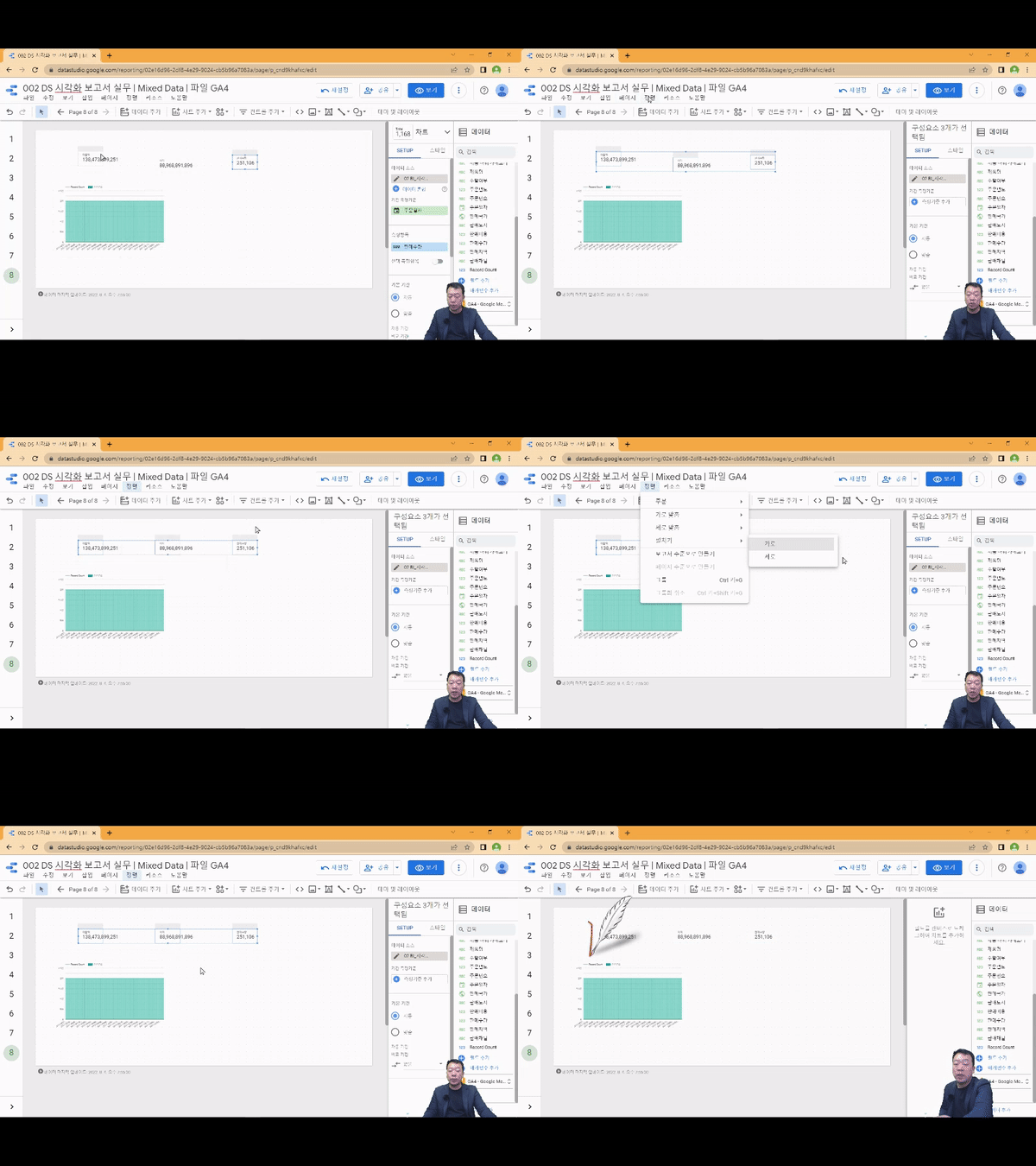
1. Visualize with a combo chart line!

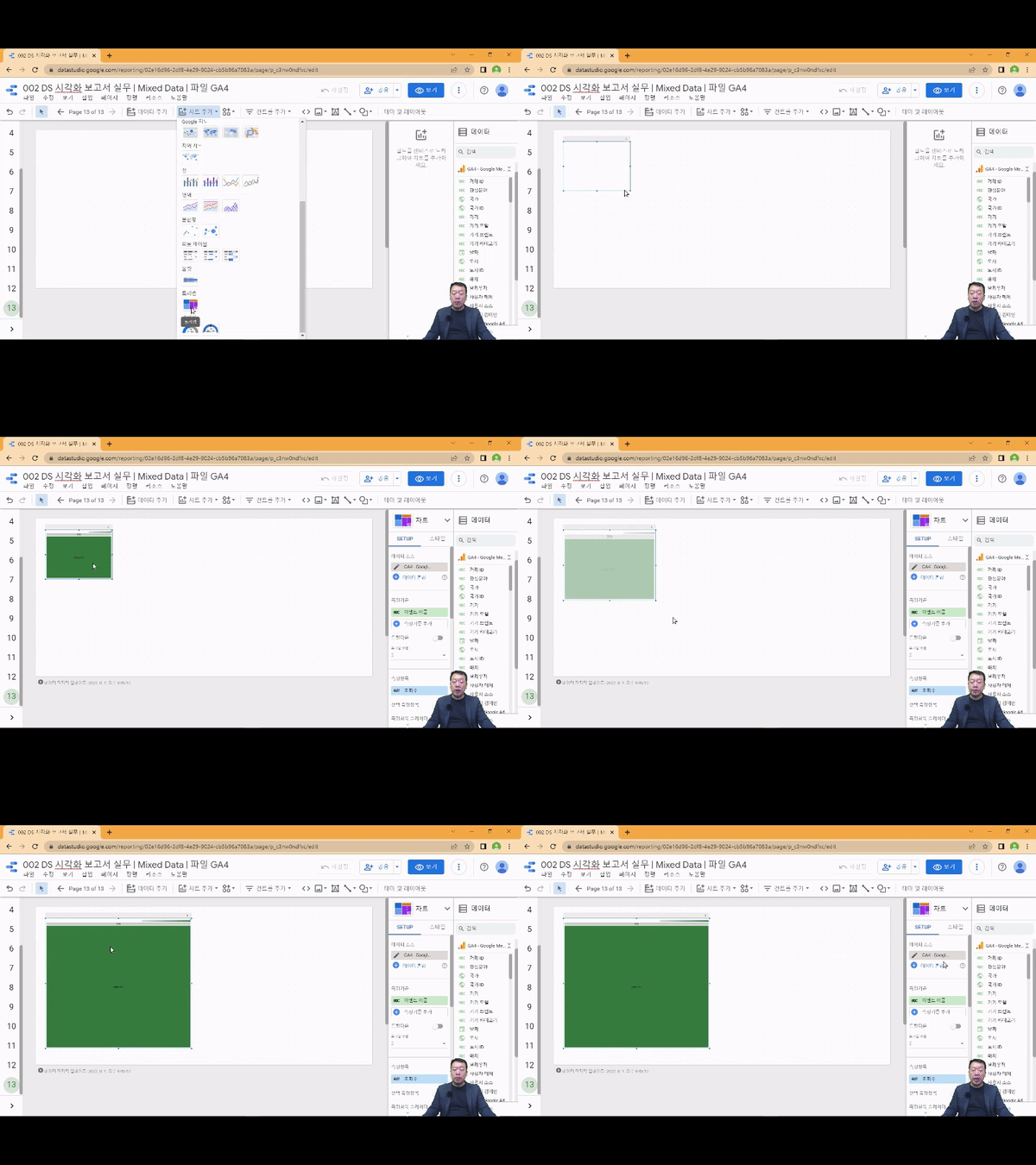
2. Visualize mixed data with treemaps!

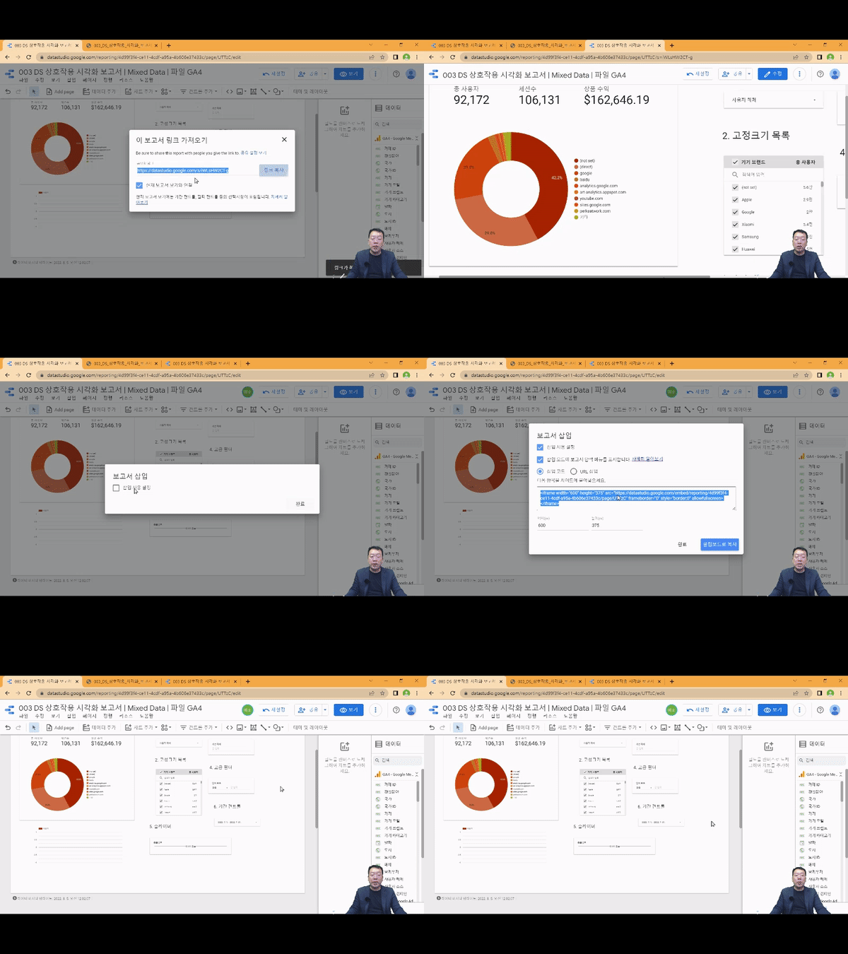
3. Share reports with your team members and collaborate easily!

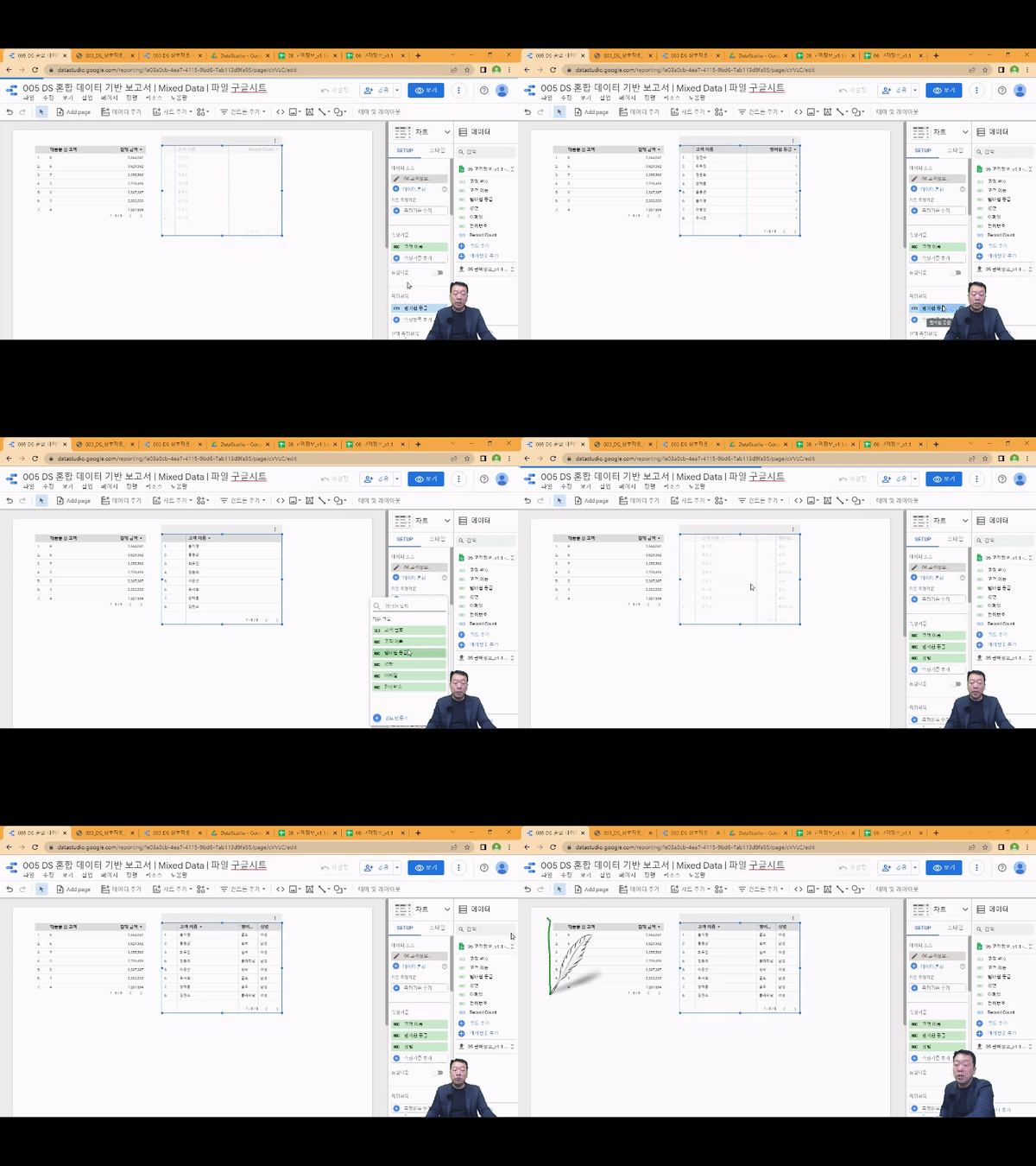
4. Visualize data from different sources and formats at once!

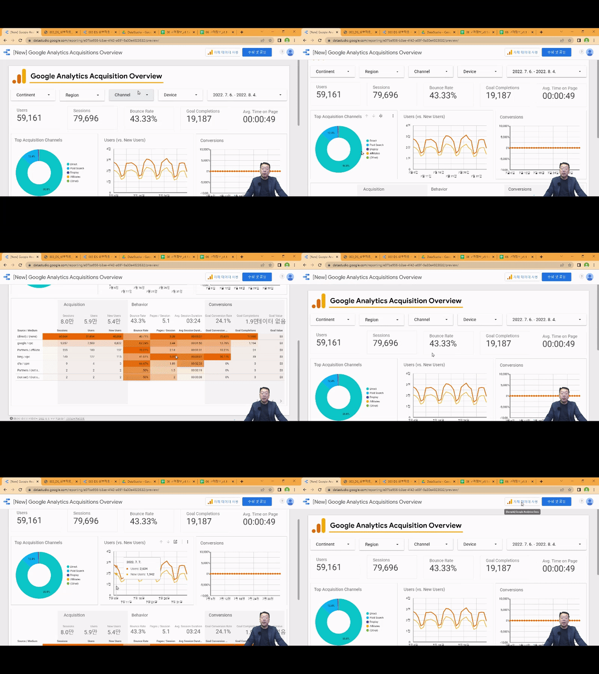
5. Create a GA4 Acquisition Dashboard!


Expected Questions Q&A 💬

Q. Is prior knowledge of data visualization required?

In this course, you'll follow the instructor's step-by-step visualization practice process from the first launch of Google Data Studio, so no prior knowledge is required.

Q. Are there any requirements or prerequisites for taking the course?

Since this is a hands-on course, we recommend bringing a dual monitor or a spare device that allows you to separate the lecture and practice screens. Furthermore, since the practical training will be conducted on a Windows OS, we recommend taking the course in a Windows environment.


Introducing the Knowledge Sharer ✒️


Recommended for
these people

Who is this course right for?

  • Beginner in Data Analytics and Business Intelligence

  • People who want to learn how to build interactive automated dashboard visualization projects.

  • Those who want to get started in the field of data visualization using Google Data Studio

  • For those who want to build an integrated dashboard for business decision making.

Hello
This is

7,224

Learners

897

Reviews

96

Answers

4.7

Rating

86

Courses

"어제보다 성장하겠습니다. 그리고, 어제보다 성장하려는 사람을 돕겠습니다."


마소캠퍼스의 진심과 소망을 담은 Actionable Content로,

2013년부터 온오프라인으로 함께해 온 누적 강의 1억시간!

이 소중한 경험과 시간은 언제나 마소캠퍼스와 수강생 모두의 성장의 원천입니다.


마소캠퍼스 팀은 우리의 모두의 성장을 위해 두 가지 원칙을 반드시 지킵니다.


1. 배우면 반드시 쓸 수 있는 Actionable Content

2. 참여자의 시간과 수고를 존중하는 Time-Saving Curriculum


마소캠퍼스의 Actionable and Time-Saving Curriculum으로 성장의 길을 함께 걸어나가길 기원합니다.

Curriculum

All

40 lectures ∙ (3hr 19min)

Course Materials:

Lecture resources
Published: 
Last updated: 

Reviews

All

4 reviews

4.8

4 reviews

  • 권준화님의 프로필 이미지
    권준화

    Reviews 1

    Average Rating 5.0

    5

    100% enrolled

    데이터 분석을 위한 기능에 대해 체계적으로 설명해주셔서 좋았습니다.

    • Masocampus
      Instructor

      감사합니다! 내용을 잘 이해하실 수 있도록 노력하여 제작하였습니다. 앞으로도 상세하게 설명해드리겠습니다!

  • 김소담님의 프로필 이미지
    김소담

    Reviews 2

    Average Rating 5.0

    5

    100% enrolled

    좋앗어요!

    • Masocampus
      Instructor

      감사합니다! 좋은 강의라고 말씀해주셔서 기쁩니다.

  • 류호준님의 프로필 이미지
    류호준

    Reviews 1

    Average Rating 5.0

    5

    100% enrolled

    도움많이되었습니다. 감사합니다.

    • Masocampus
      Instructor

      도움이 될 수 있어 기쁩니다^^😊원하시는 역량 성취하셨길 바랍니다. 감사합니다!

  • 강신현님의 프로필 이미지
    강신현

    Reviews 2

    Average Rating 3.5

    4

    100% enrolled

    상세한 설명 입문자에게 도움 많이 될 것 같네요.

    • Masocampus
      Instructor

      많은 도움이 되셨다니 기쁩니다😊 궁금하신 점 있으시면 언제든 문의주세요!

$51.70

Masocampus's other courses

Check out other courses by the instructor!