The way we deal with data is better approached through our visual perception than through the sense of what is more beautiful. So, it is more advantageous to understand the perceptual characteristics of data visualization than to notice them through human preferences. Therefore, through this lecture, we aim to build data analysis and graphic communication suitable for practice.
These days, data is increasingly used in practical work. This course will help you develop the skills to analyze and visualize data to improve work efficiency.
By organizing your data, a crucial asset, and developing the ability to analyze it to visualize and derive meaningful information, you will be able to work more efficiently.
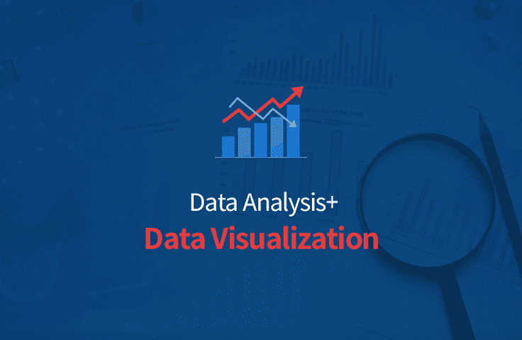
Many people often approach their work using statistical data. However, these statistical data alone can be difficult to understand. Therefore, data visualization can help identify unknown characteristics and identify outliers.
This course is designed to help you understand and apply data visualization using R. We'll use the various functions provided by R to represent data in graphs and plots. Data visualization can enhance work efficiency by clearly expressing data meaning, relationships, differences, and distributions. Furthermore, graphs provide clear and effective information delivery.
Lecture Features ✔️
• We provide lecture introduction, R download, and installation videos so that even beginners can easily follow along. • Easy to understand for anyone with images and diagrams. • You can write scripts that fit the situation through various practices. • Provides basic data. • We provide abundant lecture materials so that even beginners can understand. • You can edit the provided PDF directly and practice in R.
Lecture Preview 👀
Section 0: Introduction to the Course
Starting with the definition of data visualization , we will examine its characteristics, strategies, and current status . Learning how to effectively visualize data is more than just knowing how to write code to generate numbers from data. Additionally, I would like to view the graphs by dividing them into groups based on data or variable type.
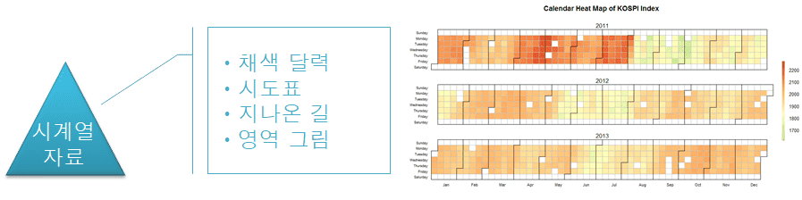
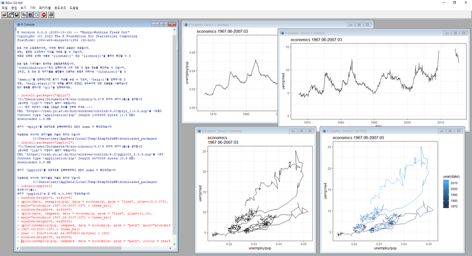
Section 1: Examining Time Series Data
Download and install R, run it, and take a look. We introduce a colored calendar, which is a color-coded representation of series values for each day of the 365 (366) days of the year, and a time series plot, which is a plot of time series data. Additionally, we will use the ggplot2 package to plot the 'path traveled' .
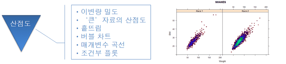
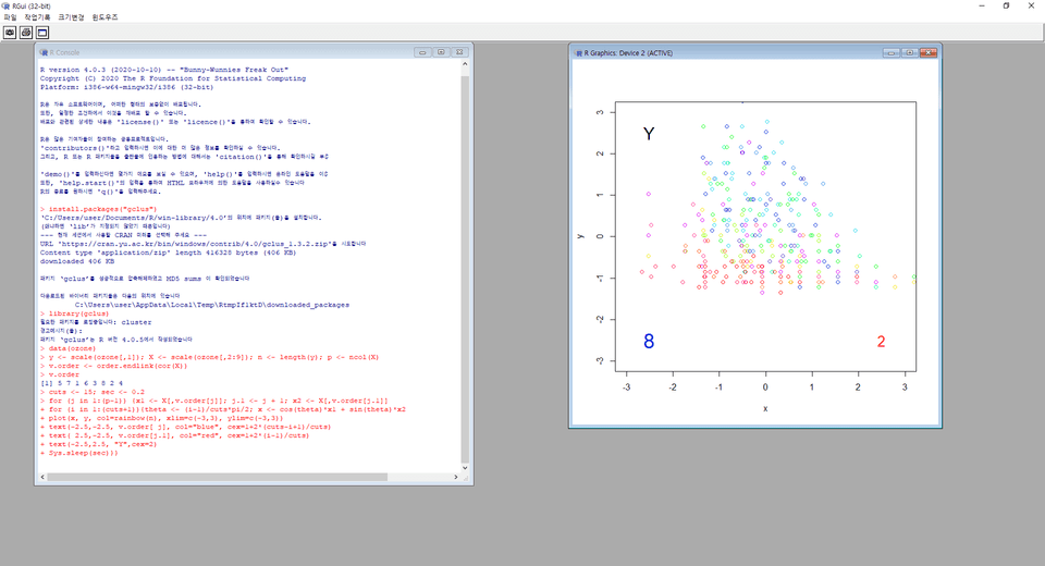
Section 2: Examining Scatterplots
You'll learn about scatterplots, a fundamental and ultimate tool for visualizing bivariate data. This course introduces and illustrates the use of scatterplots for "large" data . When examining bivariate density, a kernel function is used to estimate the density of the parent distribution. Additionally, the identify function can be used to identify outliers. To implement scattering , we can use the beeswarm function to minimize the overlap of data points.
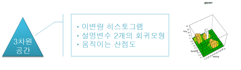
Section 3: Exploring Three-Dimensional Space
You will learn how to create an animated scatterplot to visualize numerical data with three or more variables. Let's assume that there is one dependent variable Y and three or more explanatory variables X1, X2, X3, ⋯. In this case, we can figure out the end-to-end algorithm .
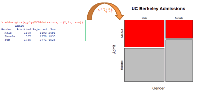
Section 4: Examining Categorical Data
A word cloud composed of nouns in a text can provide an economical and effective summary to potential readers. To implement this, you can write an R script based on the "wordcloud" package.
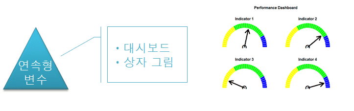
Section 5: Examining Continuous Variables
You'll learn about dashboards , a collection of views that allow you to compare various data simultaneously. You can highlight and select relevant sections of visualized data.
Section 6: Examining the Images
A custom R function can be used to create images of n X m matrices with artistic value, and can help in understanding the special structure of matrices.
Lecture Q&A 🧑💻
Q.Can non-majors also take the course? A. Yes. You can listen even if you don't know R, because we will teach you functions from the basics.
Q.Why should I learn data visualization? A. You can enhance your cognitive effectiveness by processing your own data or visualizing it when you want to know more.
Q.What can I do if I learn data visualization? A. You can build effective presentations in decision-making situations.
Q.Is there anything I need to prepare before attending the lecture? A. No. You just need to have the will to study hard.
Q.What level of content is covered in the class? A. For those new to data visualization, we cover the basics step-by-step through hands-on practice, covering the material to a level that can be applied in practice.
Recommended for these people
Who is this course right for?
For those who want to study data visualization
Those who want to improve work efficiency by utilizing data visualization
For those who want to apply data analysis in practice
MCA Research Center is a company specializing in customized corporate consulting (training and education, data analyst development consulting), cryptographic algorithm research, and blockchain platform development.
- Training for Government Agencies : Statistics and Data Analysis lectures for deputy directors and working-level officials,
- ITGO Co., Ltd. Online Education: Data Analysis and Statistics Lectures, Cryptography Lectures
(Business Big Data Analyst, Financial Big Data Analyst, ADsP, ADP, Statistics for civil service exams, etc.)
- Weave App Solution Co., Ltd. : Technical consulting for advanced statistical techniques and algorithms in app development
- Quant and finance-related app development startup : Technical consulting for algorithm trading, and quants
- Participating Researcher at Sungkyunkwan University Algebra Center (Project: Research on Elliptic Curves and Their Application Problems(Cryptography-related))
- KAIST Participating Researcher (Project: Research on Arithmeticity of Automorphic Forms and Partition Numbers)


![[R for R] R Data VisualizationCourse Thumbnail](https://cdn.inflearn.com/public/courses/327142/cover/f3e01d95-c3af-4003-9a16-0e328594cf8b/327142-eng.png?w=420)