Thank you for wasting your precious talent on this; it was a huge help.
5.0
Ambition
31% enrolled
I'm learning pandas for the first time, and it's easy and fun to learn because the results come out instantly!
5.0
hyeesun1928
62% enrolled
The explanations are detailed and easy to understand, making it very easy to follow along.
What you will gain after the course
How to use pandas, an essential library for Python data analysis
Matplotlib, a visualization library that lets you understand complex data at a glance
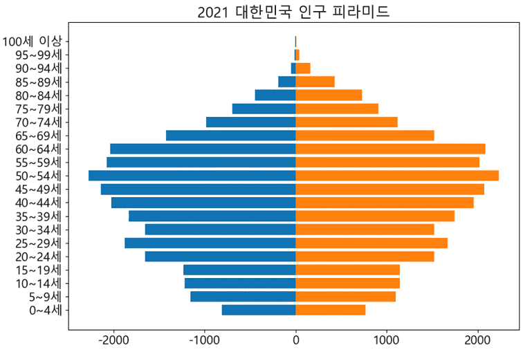
Analysis of the Population Pyramid of South Korea (Practical Project #1)
Analysis of births and total fertility rate (Practical Project #2)
If the basic Python grammar is now easy, Finish your Python learning with data analysis and visualization! 😎
📢 Please check before attending the lecture.
The development environment used in the lecture is Jupyter Notebook and Python 3.x.
Cars on the road too It's all data 🚗
The navigation system in your car can tell you what time, where, and how fast you were moving. As this data accumulates, we can determine the current traffic volume on a road and provide a choice of smooth, slow, or congested conditions. In some cases, if congestion is severe, we can even provide additional detour guidance.
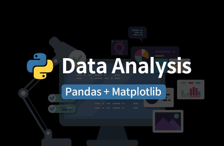
first, Data Analysis with Pandas 👨💻
It is no exaggeration to say that data is overflowing around us, to the point where it is almost impossible to say that everything is data. Analyzing this data can reveal a variety of insights, and Python provides the Pandas library , which allows for easy data analysis, allowing you to slice, paste, and filter data.
second, Data visualization with graphs 📊
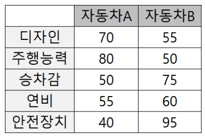
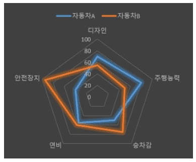
If you're trying to decide which of two cars to buy, the graph on the right might be easier to understand than the table on the left, right? Data visualization, which presents data in graph form so that it can be easily seen with the eyes, is just as important as data analysis.
A picture like the one on the rightis calleda radar chart . Python has a library called M atplotlibfor data visualization .
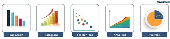
You can create various graphs, such as bar graphs, histograms, and scatter plots. In this way , you will learn how to perform basic data analysis and visualization using Pandas and Matplotlib.
Using real data Let's do a practical project together ✨
[Practical Project #1] South Korea's Population Pyramid by Year
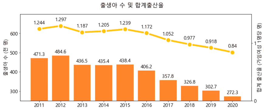
[Practical Project #2] Number of Births and Total Fertility Rate
I'm Nadocoding, and I run a coding education channel on YouTube. I provide lectures with kind explanations and easy examples so that anyone can study coding in a fun and simple way. Shall we code together? 😊


![[Renewed] Python Machine Learning Bootcamp for Beginners (Easy! Learn by Solving Real Kaggle Problems) [Data Analysis/Science Part2]Course Thumbnail](https://cdn.inflearn.com/public/courses/327464/cover/55c4db7b-7764-43cc-ac75-d9e8d08098f1/327464-eng.png?w=420)


![[Side Project After Work] Big Data Analysis Certification Practical Exam (Type 1, 2, 3)Course Thumbnail](https://cdn.inflearn.com/public/courses/329972/cover/dcfb28fd-48c1-4bb1-ab31-d59eac874194/329972-original.png?w=420)