inflearn logo

[For Beginners] Data Visualization with QGIS

In the [Beginner's] Data Visualization with QGIS course, you will learn about basic spatial analysis methods using the QGIS program and spatial data.

(4.5) 73 reviews

2,015 learners

Level Beginner

Course period Unlimited

QGIS
QGIS
QGIS
QGIS

Reviews from Early Learners

4.5

5.0

장진겸

100% enrolled

You can learn the basic usage in a short amount of time.

5.0

김민구

100% enrolled

Let's go

5.0

Jang Jaehoon

100% enrolled

Thank you for the great lecture!

What you will gain after the course

  • Calling, interpreting, and filtering QGIS data

  • Creating QGIS layers and setting coordinate systems

  • Visualization with QGIS layers and data

  • QGIS KMeans Clustering Analysis

Data Visualization with QGIS for Beginners

But, what is QGIS?

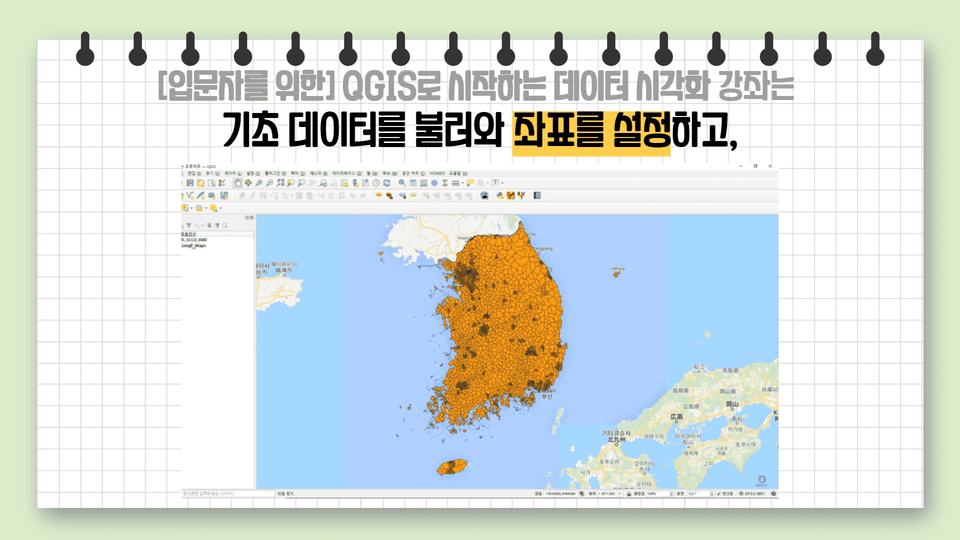
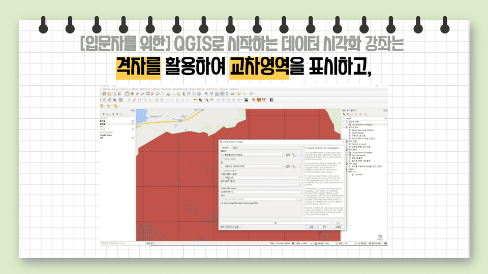
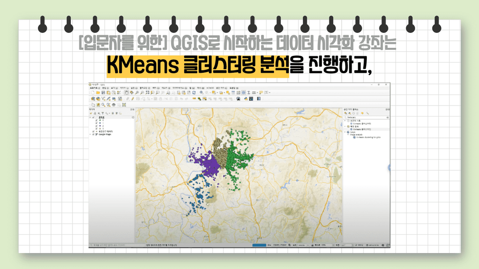
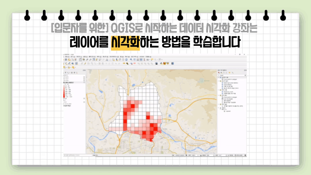
QGIS is a free, open-source geographic information system (GIS) that provides functionality for viewing, editing, and analyzing spatial data. Its numerous features are continuously provided open-source, both as core functionality and as plugins, making it accessible to everyone. QGIS allows you to display, manage, edit, analyze, and create printable maps from a variety of data.

So, where can it be used?

It is primarily used to collect and utilize geographic data. Recently, it has been particularly useful in the context of infectious diseases like COVID-19, visualizing the movement and spread of confirmed cases on maps and analyzing them. QGIS is also being utilized for land and urban development and to address various social issues.

Learning Objectives for This Course 📜

  • Load the basic data and set the coordinate system.
  • Use a grid to display the intersection area.
  • Visualize data through layers, step-by-step classification, and heat maps.
  • Learn KMeans clustering analysis.

How you will look after taking this course 📚

  • You can learn the basics of using QGIS.
  • You can load a data set in CSV format, display the data on a map, and visualize it using the vector layer function.
  • Use data tables and filter functions to process data and use it to suit your needs.
  • Based on the shape file of administrative districts (towns, townships, and districts) of the Republic of Korea, you can align the data with the coordinate system and visualize it through step division, heat map, and KMeans clustering.

What you'll learn in this course 📚

Recommended for
these people

Who is this course right for?

  • For those who want to learn QGIS for the first time

  • Anyone who wants to learn data visualization

Hello
This is dee

15,032

Learners

401

Reviews

17

Answers

4.7

Rating

7

Courses

This is the DIP Daegu Big Data Utilization Center.

Our staff, consisting of data analysts, are conducting the lectures. :)

If you visit the center, we provide data analysis and consulting support free of charge.

Website

YouTube Channel

Homepage YouTube Channel

More

Curriculum

All

4 lectures ∙ (30min)

Course Materials:

Lecture resources
Published: 
Last updated: 

Reviews

All

73 reviews

4.5

73 reviews

  • skkukhjj2935님의 프로필 이미지
    skkukhjj2935

    Reviews 1

    Average Rating 5.0

    5

    100% enrolled

    This is a very helpful video.

    • jjk95hug6277님의 프로필 이미지
      jjk95hug6277

      Reviews 2

      Average Rating 5.0

      5

      100% enrolled

      You can learn the basic usage in a short amount of time.

      • mgkim349042님의 프로필 이미지
        mgkim349042

        Reviews 2

        Average Rating 5.0

        5

        100% enrolled

        Let's go

        • kaynara3121306님의 프로필 이미지
          kaynara3121306

          Reviews 1

          Average Rating 5.0

          5

          100% enrolled

          Thank you for the free lecture. I learned the basics well.

          • jjhgwx님의 프로필 이미지
            jjhgwx

            Reviews 977

            Average Rating 4.9

            5

            100% enrolled

            Thank you for the great lecture!

            dee's other courses

            Check out other courses by the instructor!

            Free