
다시 만들어보니
291
8 asked
span 부분의 밑줄이 없어지지 않네요 ㅜㅜ
<!DOCTYPE html>
<html lang="ko">
<head>
<meta charset="UTF-8">
<title>웹디자인기능사 합격</title>
<link rel="stylesheet" href="css/style.css">
</head>
<body>
<div class="container">
<div class="header-inner">
<header>
<article class="header-logo">로고</article>
<article class="navi">네비게이션</article>
</header>
</div>
<div class="content-inner">
<div class="slide">
<div>이미지슬라이드</div>
</div>
<section class="items">
<article class="news">
<div class="tab-inner">
<div class="btn">
<span>공지사항</span>
</div>
<div class="tab">
<a href="#none">SMS 발송 서비스 개선작업<b>2020.01.09</b></a>
<a href="#none">휴대폰 인증 서비스 개선 작업<b>2020.01.07</b></a>
<a href="#none">카드사 부분 무이자 할부 이벤트<b>2019.12.31</b></a>
<a href="#none">올앳 시스템 작업 안내<b>2019.12.20</b></a>
<a href="#none">휴대폰 결제 시스템 작업 안내<b>2019.12.20</b></a>
</div>
</div>
</article>
<article class="gallery">
<div class="gallery-inner">
<div class="btn">
<span>갤러리</span>
</div>
<div class="tab">
<a href="#none"><img src="images/gallery-01.jpg" alt="gallery-01"></a>
<a href="#none"><img src="images/gallery-02.jpg" alt="gallery-02"></a>
<a href="#none"><img src="images/gallery-03.jpg" alt="gallery-03"></a>
</div>
</div>
</article>
<article class="shortcut">shortcut</article>
</section>
</div>
<div class="footer-inner">
<footer>
<article class="footer-logo">로고</article>
<article class="copyright">copyright</article>
<article class="familysite">familysite</article>
</footer>
</div>
</div>
</body>
</html>
css -------------------------------------
.container {
}
.header-inner {
background-color: #ddd;
}
header {
border: 1px solid #ccc;
width: 1200px;
margin: auto;
height: 100px;
}
header article {
height: 100px;
border: 1px solid #ccc;
}
.header-logo {
width: 200px;
float: left;
text-align: center;
line-height: 100px;
}
.navi {
width: 600px;
float: right;
text-align: center;
line-height: 100px
}
.content-inner {
width: 1200px;
margin: auto;
}
.slide {
width: 1200px;
height: 300px;
text-align: center;
line-height:250px;
border: 1px solid #ccc;
}
.slide article{
height: 300px;
}
.items {
overflow: hidden;
}
.items article{
height: 200px;
border: 1px solid #ccc;
float: left;
box-sizing:border-box;
width: 33.3333%;
}
.news {
border: 1px solid #ccc;
}
.gallery {
border: 1px solid #ccc;
}
.shortcut {
border: 1px solid #ccc;
}
.footer-inner {
background-color: #ccc;
}
footer {
width: 1200px;
margin: auto;
height: 100px;
overflow: hidden;
}
footer article {
height: 100px;
border: 1px solid #000;
float: left;
box-sizing:border-box;
text-align: center;
line-height: 100px;
}
.footer-logo {
width: 200px;
}
.copyright {
width: 800px;
}
.familysite {
width: 200px;
}
.tab-inner,
.gallery-inner{
width: 95%;
margin: auto;
}
.tab-inner .btn {
}
.tab-inner .btn span,
.gallery-inner .btn span {
border: 1px solid #333;
width: 100px;
text-align: center;
padding: 5px;
display:inline-block;
border-radius:5px 5px 0 0;
border-bottom: none;
margin-bottom: -1px;
background-color: #fff;
}
.tab-inner .tab,
.gallery-inner .tab{
border: 1px solid #333;
padding: 0 10px;
height: 155px;
}
.tab-inner .tab a {
display:block;
padding: 4px;
border-bottom:1xp solid #000 ;
}
.tab-inner .tab a:last-child{
border-bottom: none;
}
.tab-inner .tab a b {
float: right;
font-weight:normal;
}
.gallery .tab{
text-align: center;
padding-top: 20px;
box-sizing:border-box;
}
.gallery .tab img {
width: 110px;
}
Answer 1
0
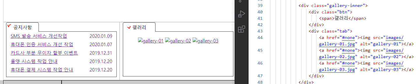
코드 넣어서 해봤는데 span에 밑줄이 원래 없는데요.
아래 캡쳐화면처럼 붉은색 체크된 부분이 span인데 span에는 문제가 없는데요.
참... 제가 만들어 놓은 최종본에서 처럼 하세요.
section, article 태그 사용하지 마세요.
사용에는 전혀 문제는 없는데 w3c 유효성 검사에서 h1태그가 없다고 오류 출력합니다.
그래서 다소나남 감점이 있어요.
시험 보실 때나 지금 연습하실 때나 section, article 태그 사용하지 마시고 div로 하세요.
해당 강의 PDF는 어디에 있나요?
1
83
2
2026 웹디자인개발기능사 실기 보는데 필요한 텍스트에디터는 무엇인가요?
1
119
2
예제파일
1
70
1
섹션10-77번강의 내 와이어프레임 pdf 자료 다운로드 어디서 하나요?
1
106
2
보더를 사용해 와이어프레임만드는 강의 html+css소스 다운로드 받을 수 있나요?
1
69
1
시험 시 슬라이드 작성 관련 문의
0
76
1
강의 질문 있습니다
1
73
1
시험 관련 문의
1
65
1
파워포인트 자료 다운로드 버튼 어디에 있나요?
1
61
1
브라우저 화면 줄일 시 빈 공간 발생
0
73
1
서브메뉴가 유지되지 못하고 사라지는데 무엇이 문제 일까요?
1
84
1
슬라이드 및 완성본 관련 사항
1
74
2
D유형 레이아웃 연습중인데 슬라이드 이미지 크기가 변하지 않습니다
1
95
3
B-4연습중인데 네비게이션의 a태그 두께가 이상하고 슬라이드 다운시 문제가 있습니다.
1
54
2
A2 연습중인데 메뉴 배경색과 서브메뉴 크기, 갤러리 그림 정리에 문제가 있습니다
1
74
2
A1 레이아웃 연습중인데 overflow: hidden이나 box-sizing: border-box;가 적용되지 않는 것 같습니다
1
62
2
레이어 팝업 '닫기' 가 안됩니다
1
71
1
공지사항과 갤러리 탭(안)구성 중 마우스 클릭시 색상변경이 안됩니다.
1
91
2
뷰티파이 설치 관련 문의
1
84
3
웹디자인 기능사 웹디자인개발기능사로 개편 되었는데 이 수업만 들어도 가능?
1
101
2
A유형~C유형 수험자 제공파일 어디서
1
83
1
A1 작업하는데 와이어프레임이 무너지고, hover일부가 적용 안되고 메뉴바가 슬라이드를 밀어냅니다. 탭메뉴도 작동하지 않습니다..
0
124
4
footer 높이 값
1
54
2
div 상하분배?가 안돼요
0
76
2