25%
46,200원
다른 수강생들이 자주 물어보는 질문이 궁금하신가요?
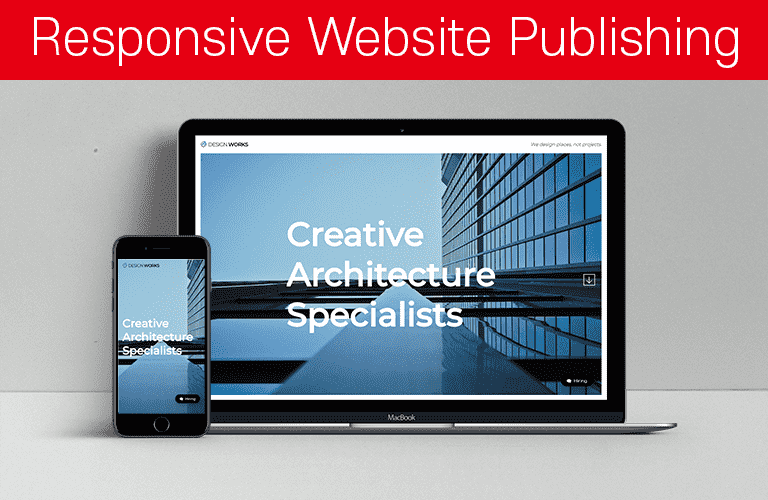
- 미해결반응형 웹사이트 포트폴리오(Architecture Agency)
선생님! project-info 안에 별도의 div를 넣지 않고 padding으로 처리하신 이유가 있을까요?
선생님! project-info 안에 별도의 div를 넣지 않고 padding으로 처리하신 이유가 있을까요? 그 기준이 궁금합니다! 퍼블리셔가 상황에 맞게 그냥 하면 되는건지요 !
- 해결됨반응형 웹사이트 포트폴리오(Architecture Agency)
컨텐츠 변경해서 웹사이트 포트폴리오로 사용해도 될까요?
선생님 안녕하세요~ 이 작업물을 컨텐츠 변경 후 웹사이트 폴트폴리오로 사용해도 될까요?? (개인 포폴 홈페이지 x)
- 해결됨반응형 웹사이트 포트폴리오(Architecture Agency)
slick 적용 시 슬라이더 페이지마다 높이가 다를 경우 질문드립니다.ㅠㅠ
안녕하세요 반응형 웹 작업하다가 궁금한게 있어서 질문 드립니다. project 섹션 안에 tab 메뉴 슬라이더 적용했을 때 인데요, tab 안에 project-info 내용들이 각 슬라이드 마다 차이가 있어서 내용이 제일 많은 슬라이드 기준으로 여백?이 생기는 문제가 발생했습니다..ㅠㅠ 제가 잘못 작업한걸까요... 아니면 각 슬라이드 height를 동일하게 맞출 수 있는 방법이 있을까요..ㅠㅠ
- 미해결반응형 웹사이트 포트폴리오(Architecture Agency)
안녕하세요. source text에 font에 대한 부분이 없어요.
안녕하세요.~ 선생님 말씀대로 windows font등을 따로 넣어주긴 했는데 source text에 font가 없어서요. 따로 font code를 올려주실 수 있나요? CSS 넣는데 사용하고 싶어요.
- 미해결반응형 웹사이트 포트폴리오(Architecture Agency)
안녕하세요. 제가 CSS Peek을 설치를 했는데, ctrl 하고 코딩 단어에 갔는데, 변하지 않아서 어떻게 해결해야 할까요?
안녕하세요. 제가 CSS Peek을 설치를 했는데, ctrl 하고 코딩 단어에 갔는데, 변하지 않아서 어떻게 해결해야 할까요?
- 미해결반응형 웹사이트 포트폴리오(Architecture Agency)
에밋 pdf 단축키 파일은 어디서 받나요?
안녕하세요. 에밋 pdf 단축키 파일은 어디서 받나요? 궁금합니다.
- 미해결반응형 웹사이트 포트폴리오(Architecture Agency)
모달창 맨 밑에 흰색 프레임
모달창 맨 밑에 흰색 프레임 .featherlight .featherlight-content 여기에 border-bottom: 25px solid transparent; 이렇게 투명으로 두꺼운 보더 들어가 있어서 그런거였네요. 이거 없애주시면 밑에 프레임까지 없어집니다. 참고하세요~~ㅎㅎ
- 해결됨반응형 웹사이트 포트폴리오(Architecture Agency)
.gototop 에 display: block;
안녕하세요 선생님 강의 12:47 에서 a태그인 .gototop 에 display: block 을 주셨는데 위에 position: fixed 가 있으니 안줘도 되는거죠?
- 미해결반응형 웹사이트 포트폴리오(Architecture Agency)
두가지 오류사항 질문드립니다. (live server Full Reload 오류 / position: relative 관련)
1. 첫번째 질문입니다. (live server Full Reload 스크롤 위로 올라가는 현상) 라이브서버 세팅을 할때 Full Reload 체크를 하고 재시동을 했을 때 문제없이 작동을 했습니다. 그런데 이번 강의[섹션 4. 섹션 상세 퍼블리싱(Awards Section) - PC 레이아웃 섹션 상세 퍼블리싱(Awards Section) - #01 ] 부터 Awards section을 수정하다가 라이브로 확인하려고 했으나 계속해서 상단 부분으로 스크롤이 올라가는 바람에 수정하며 바로확인하는 과정에 불편함을 겪었습니다. 이 부분을 해결하고자, 각 섹션별 display: none; 도 주었지만- 역시나 작동하지 않아서 구글링을 한 끝에 https://github.com/tapio/live-server/issues/273 저와 같은 이슈를 갖고 있는 분들을 발견했음에도 불구- 해결을 하지 못한 상태입니다. 혹시나 싶어서 라이브서버를 unstall 하고 재설치를 한 후에, 다시 세팅을 하고 재시동을 하는 과정을 몇번이고 반복했으나 여전히 같은 이슈가 발생했습니다. 앞서 말씀드린.. VS code 의 Live Server Full Reload 오류현상을 해결하는 방법을 혹시 아실까 싶어 선생님께 질문을 드리고 싶었습니다(: 2. 두번째 질문입니다. ( position: relative 관련) .victory-jump img 에 position: absolute;를 적용할 때 선생님께서 말씀하시길, 그 위의 부모인 .victor-jump 에 position: relative;를 적용하지 않아도 되는 이유가 .awards-inner 안에 있는 div에 이미 position: relative;를 주었기 때문이라고 하셨습니다. 제가 잘 모르는 것일 수도 있겠지만- 지금까지 공부한 바로 .awards-inner > div 에서 '>' 표시는 그 부모 바로 밑에 있는 첫번째 자식 에게 적용되는 것으로 알고 있습니다. 때문에 .awards-inner의 두번째 자식인 .vicotry-jump 가 아닌 첫번째 자식 .about-awards 에만 적용되는 것으로 알았습니다. 제가 잘 못 알고 있는건지 궁금합니다(: 더불어, 두번째 자식인 .victory-jump 에 position: relative; 를 적용하지 않아도 .victory-jump 의 자식인 .victory-jump img 에 position: absolute; 만 적용해도 화면에 문제없이 잘 나타나는 이유도 궁금합니다.:) 감사합니다.
- 미해결반응형 웹사이트 포트폴리오(Architecture Agency)
logo 이미지가 없어요
logo 의 이미지가 없어요ㅜㅡㅜ 섹션 이미지 7개밖에없어요..
- 미해결반응형 웹사이트 포트폴리오(Architecture Agency)
아무리 버튼을 눌러도 모달이 뜨지를 않네요 ㅠㅠ
분명 호버를 하거나 클릭을 하면 저렇게 하단에 표시는 되는데 직접적으로 모달이 뜨질 않네요 ㅠㅠㅠ 다른 a태그에서는 됩니다 그런데 이것만 그렇네요? active로 toggleclass해봐도 열리지를 않습니다 ㅠㅠㅠㅠ <a href="modal.html" class="contact_btn" data-featherlight="iframe" ><i class="fas fa-comment-dots"></i>Contact</a > <style> /* contact modal */ body { background-color: #f5df4dee; } .c_modal { position: fixed; left: 50%; top: 50%; transform: translate(-50%, -50%); text-align: center; color: #555; border-radius: 10px; } .c_modal img { width: 200px; height: auto; } .c_modal p { font-size: 1.6rem; font-weight: bold; } .c_modal p span { font-weight: normal; } </style> </head> <body> <!-- contact madal --> <div class="c_modal"> <img src="img/me.png" alt="my face" data-aos="fade-up" data-aos-delay="100" /> <p>E-mail : <span>....@naver.com</span></p> <p>phone : <span>010 ..... .....</span></p> </div> /* contact */ .contact_btn { position: fixed; font-size: 1.6rem; font-weight: 600; left: 50px; bottom: 50px; color: #222; background-color: #fff; padding: 0.8em 2em; border-radius: 30px; box-shadow: 0px 2px 10px rgba(0, 0, 0, 0.5); transition: 0.1s; z-index: 999; } .contact_btn i { color: #000; margin-right: 0.5em; transform: rotateY(180deg); } .contact_btn:active { transform: scale(0); }
- 해결됨반응형 웹사이트 포트폴리오(Architecture Agency)
Slick js 적용 후 슬라이드 이미지 크기 변경 질문 드립니다.
안녕하세요.. 복습 후에 강의 내용 바탕으로 포폴 제작중인데, 예제랑 다르게 제작하다 보니 문제점이 생겼습니다.ㅠㅠ project 강의 파트에서 오른쪽 슬라이드에 사용할 이미지 크기가 너무 커 포지션, 퍼센트 등을 적용해서 잘 배치했다고 생각했는데 ,, Slick js를 적용하면 position 이 충돌했는지, 제가 코드를 잘못 작성했는지.. 이미지가 overflow 되버립니다. 문제점 한번 봐주시면 감사하겠습니다..ㅠㅠ 아직 많이 초보라..죄송합니다..ㅠ <!doctype html> <html lang="ko"> <head> <meta charset="UTF-8"> <meta name="viewport" content="width=device-width, initial-scale=1.0"> <title>Nespresso</title> <script src="Js/jquery-2.1.4.js"></script> <!-- Page Scroll Effects JS & CSS --> <!--<script src="Js/velocity/modernizr.js"></script>--> <script src="Js/velocity/velocity.min.js"></script> <script src="Js/velocity/velocity.ui.min.js"></script> <script src="Js/velocity/main.js"></script> <link rel="stylesheet" href="Js/velocity/velocity.css"> <!-- Smooth Scrolling --> <script src="Js/jquery.scrollTo.min.js"></script> <!-- Slick.js --> <script src="Js/slick/slick.min.js"></script> <link rel="stylesheet" href="Js/slick/slick-theme.css"> <link rel="stylesheet" href="Js/slick/slick.css"> <!-- Custom JS & CSS --> <script src="custom.js"></script> <link rel="stylesheet" href="style.css"><!-- pc. ver--> <link rel="stylesheet" href="responsive.css"><!-- mobile. ver--> </head> <!-- hijacking: on/off - animation: none/scaleDown/rotate/gallery/catch/opacity/fixed/parallax --> <body data-hijacking="on" data-animation="rotate"> <div class="container"> <section class="cd-section" id="home"> <div> <div class="content"> <div class="home-inner"></div> </div> </div> </section> <section class="cd-section" id="about"> <div> <div class="content"> <div class="about-inner"> <div class="about-items"> <div class="item"> <a href="#"><img src="img/NES-about-icon%20(3).png" alt=""></a> <span> <a href="#"> <h3>SUSTAINABLE QUALITY</h3> </a> <p>Because a Nespresso cup of coffee can deliver an extraordinary experience while creating greater value for society and the environment.</p> </span> </div> <div class="item"> <a href="#"><img src="img/NES-about-icon%20(4).png" alt=""></a> <span> <a href="#"> <h3>ORIGINS AND BLENDS</h3> </a> <p>From Master Origins to Blends, we have selected a few of our coffees so you can discover the countless uncompromising choices that go into every cup.</p> </span> </div> <div class="item"> <a href="#"><img src="img/NES-about-icon%20(1).png" alt=""></a> <span> <a href="#"> <h3>THE COFFEE EXPERIENCE</h3> </a> <p>From the cherries we pick to the coffee you drink, we are committed to convey our expertise, savoir-faire and passion every step of the way.</p> </span> </div> </div> </div> </div> </div> </section> <section class="cd-section" id="product"> <div> <div class="content"> <div class="product-inner"> <input type="radio" name="tabmenu" id="tab1" checked> <input type="radio" name="tabmenu" id="tab2"> <input type="radio" name="tabmenu" id="tab3"> <input type="radio" name="tabmenu" id="tab4"> <div class="tabs"> <div class="tab"> <div class="product-info" data-text="VERTUO"> <h3>YOUR COMPLETE RANGE OF COFFEE STYLES</h3> <p>With Vertuo, explore all the different coffee styles from espresso to Alto adapting to every mood. Coffee pleasure is no accident: it must be deliberately created, consistently and without compromise, cup after cup from coffee origins to capsules, by living our principles.</p> <ul> <li><b>FRUITY & FLOWERY</b> : Flowery, Citrus, Fruity-winy</li> <li><b>BALANCED</b> : Honey, Cereals, Roasted</li> <li><b>INTENSE</b> : Cocoa, Spicy, Woody,Intensely roasted</li> </ul> <div class="detail"> <div> <img src="img/nes-product-vertuo-alto.png" alt=""><span>ALTO</span>414ml </div> <div> <img src="img/nes-product-vertuo-coffee.png" alt=""><span>COFFEE</span>237ml </div> <div> <img src="img/nes-product-vertuo-lungo.png" alt=""><span>GRAN LUNGO</span>150ml </div> <div> <img src="img/nes-product-vertuo-espresso.png" alt=""><span>ESPRESSO</span>40ml </div> </div> <a class="discover-more" href="">DISCOVER MORE <i class="fa fa-long-arrow-right"></i></a> </div> <div class="product-photo"> <img src="img/nes-product-vertuo-coffee-01.jpg" alt=""> <img src="img/nes-product-vertuo-coffee-02.jpg" alt=""> <img src="img/nes-product-vertuo-coffee-03.jpg" alt=""> <img src="img/nes-product-vertuo-coffee-04.jpg" alt=""> </div> </div> <div class="tab"> <div class="product-info" data-text="ORIGINAL"> <h3>YOUR CLASSIC ESPRESSO EXPERIENCE</h3> <p>With original, live your authentic espresso experience from a milder fruity espresso to the Neapolitan style short Ristretto, with or without milk. Coffee pleasure is no accident: it must be deliberately created, consistently and without compromise, cup after cup from coffee origins to capsules, by living our principles.</p> <ul> <li><b>BODY</b> : Go full-bodied for a powerful experience or keep it gentle and light-bodied. Take your pick.</li> <li><b>BITTERNESS</b> : Dark or distinguished. Find out what level of bitterness is for you.</li> <li><b>ROASTING</b> : Choose what level of fuller, roast flavours you prefer in your Nespresso Vertuo coffee.</li> </ul> <div class="detail"> <div> <img src="img/nes-product-original-ristretto_L.png" alt=""><span>RISTRETTO</span>25ml </div> <div> <img src="img/nes-product-original-espresso_L.png" alt=""><span>ESPRESSO</span>40ml </div> <div> <img src="img/nes-product-original-lungo_L.png" alt=""><span>LUNGO</span>110ml </div> </div> <a class="discover-more" href="">DISCOVER MORE <i class="fa fa-long-arrow-right"></i></a> </div> <div class="product-photo"> <img src="img/nes-product-original-coffee-01.jpg" alt=""> <img src="img/nes-product-original-coffee-02.jpg" alt=""> <img src="img/nes-product-original-coffee-03.jpg" alt=""> <img src="img/nes-product-original-coffee-04.jpg" alt=""> </div> </div> <div class="tab"> <div class="product-info" data-text="VERTUO"> <h3>VERTUO COFFEE MACHINES</h3> <p>Prepare your small or large coffee style with generous crema, all at the touch of a button. Here’s the secret: each Vertuo machine uses barcode recognition and a patented extraction system to create your favourite coffee. You can also electronically open and close the head of the machine and conveniently position the water tank with VertuoPlus.</p> <ul> <li>EXTRACTION BY CENTRIFUSION™</li> <li>GENEROUS AND SMOOTH CREMA</li> <li>INNOVATIVE COFFEE SYSTEM</li> <li>EXCEPTIONAL COFFEE QUALITY</li> </ul> <div class="detail"> <div> <img src="img/nes-product-vertuo-matteeblack.png" alt=""><span>vertuo plus<br>matte black</span>₩ 299,000 </div> <div> <img src="img/nes-product-vertuo-white.png" alt=""><span>vertuo plus<br>white</span>₩ 299,000 </div> <div> <img src="img/nes-product-vertuo-black.png" alt=""><span>vertuo plus<br>black</span>₩ 299,000 </div> <div> <img src="img/nes-product-vertuo-sliver.png" alt=""><span>vertuo plus<br>silver</span>₩ 299,000 </div> </div> <a class="discover-more" href="">DISCOVER MORE <i class="fa fa-long-arrow-right"></i></a> </div> <div class="product-photo"> <img src="img/nes-product-vertuo-machine-01.jpg" alt=""> <img src="img/nes-product-vertuo-machine-02.jpg" alt=""> <img src="img/nes-product-vertuo-machine-03.jpg" alt=""> <img src="img/nes-product-vertuo-machine-04.jpg" alt=""> </div> </div> <div class="tab"> <div class="product-info" data-text="ORIGINAL"> <h3>DISCOVER THE ORIGINAL <br>COFFEE MACHINES</h3> <p>Use the versatile level of settings to create a variety of coffee and milk recipes using barista-like customisation or one-touch systems. Indulge yourself in Creatista or Lattissima.</p> <ul> <li>pressure extraction system</li> <li>creamy and dense crema</li> <li>exceptional coffee choice</li> <li>espresso-based and milk recipes</li> </ul> <div class="detail"> <div> <img src="img/nes-product-lattissima-silkywhite.png" alt=""><span>lattissima one f111<br>silky white</span>₩ 379,000 </div> <div> <img src="img/nes-product-lattissima-black.png" alt=""><span>lattissima one f111<br>black</span>₩ 379,000 </div> <div> <img src="img/nes-product-lattissima-white.png" alt=""><span>gran lattissima f531<br>white</span>₩ 479,000 </div> <div> <img src="img/nes-product-Creatista-Stainless.png" alt=""><span>creatista plus j520<br>stainless steel</span>₩ 749,000 </div> </div> <a class="discover-more" href="">DISCOVER MORE <i class="fa fa-long-arrow-right"></i></a> </div> <div class="product-photo"> <img src="img/nes-product-original-machine-01.jpg" alt=""> <img src="img/nes-product-original-machine-02.jpg" alt=""> <img src="img/nes-product-original-machine-03.jpg" alt=""> <img src="img/nes-product-original-machine-04.jpg" alt=""> </div> </div> </div> <div class="btn"> <label for="tab1"></label> <label for="tab2"></label> <label for="tab3"></label> <label for="tab4"></label> </div> </div> </div> </div> </section> <section class="cd-section visible" id="business"> <div> <div class="content"> <div class="business-inner"> <div class="business-feature"> <div class="business-info"> <div class="business-heading"> <h2>SOLUTIONS ADAPTED<br>TO YOUR BUSINESS</h2> <hr class="bar"> <p> Nespresso coffee solutions for professionals are tailored to your specific business needs. Discover our Business Solutions to find out more. </p> </div> <div class="business-photo"> <img src="img/Nes-business-main.jpg" alt=""> </div> </div> <div class="business-pro"> <h2>TAILORED COFFEE SOLUTIONS<br> FOR EVERY BUSINESS AND VENUES</h2> <hr class="bar"> <div class="business-slider"> <div class="slider-card"> <div class="slider-photo"> <img src="img/nes-business-office.jpg" alt=""> </div> <a href="#"> <div class="slider-content"> <h4>office <br><span>The very best for your workplace</span></h4> <p>You care about quality at every level of your business. When you offer <strong>Nespresso</strong> coffees, you show your employees, customers and business partners a truly positive image.</p> </div> </a> </div> <div class="slider-card"> <div class="slider-photo"> <img src="img/nes-business-hotel.jpg" alt=""> </div> <a href="#"> <div class="slider-content"> <h4>Hotel <br><span>Offer memorable experiences</span></h4> <p>As part of an unforgettable stay at your hotel, your guests will remember an exceptional cup of coffee. The choice of <strong>Nespresso</strong> coffees reveals your passion for excellence in every detail and your commitment to your guest's enjoyment.</p> </div> </a> </div> <div class="slider-card"> <div class="slider-photo"> <img src="img/nes-business-cafe.jpg" alt=""> </div> <a href="#"> <div class="slider-content"> <h4>Restaurant & café <br><span>Be inspired by our creative coffee recipes</span></h4> <p>Serving delicious and bespoke beverages can significantly contribute to the success of your establishment.</p> </div> </a> </div> <div class="slider-card"> <div class="slider-photo"> <img src="img/nes-business-dining.png" alt=""> </div> <a href="#"> <div class="slider-content"> <h4>Fine dining <br><span>Offer customers a moment to remember</span></h4> <p><strong>Nespresso</strong> is the perfect partner for fine dining establishments that strive to enhance their guests' experience through an exceptional cup of coffee.</p> </div> </a> </div> <div class="slider-card"> <div class="slider-photo"> <img src="img/nes-business-airplane.jpg" alt=""> </div> <a href="#"> <div class="slider-content"> <h4>Airlines <br><span>Take passenger hospitality to new heights</span></h4> <p>With <strong>Nespresso</strong> , you can show your commitment to excellence by serving one of the coffees blended to satisfy even the most refined tastes.</p> </div> </a> </div> </div> </div> </div> </div> </div> </div> </section> <section class="cd-section" id="store"> <div> <div class="content"> <div class="store-inner"> <div class="feature"> <div class="office"> <div class="headquarters"> <b>OUR GLOBAL PRESENCE</b> <h2>Headquarters</h2> <p> Every single Nespresso capsule sold in the world is carefully produced at one of our three factories based in Switzerland. Using the latest technology, our team of more than 700 production experts carefully transform the highest quality sustainable coffee beans into our capsules that are exported worldwide. </p> <span>Address : Avenue d’Ouchy 4-6, 1006 Lausanne, Switzerland / Phone : +41 21 796 96 96</span> </div> <div class="customer"> <b>Assistance 24/7</b> <h2>Customer Service</h2> <p> Our Technical Specialists can give you an immediate diagnosis over the phone. If your machine requires a repair, we offer an Assistance Service Program which includes: Collecting your machine from an address of your choice. Loaning a machine for the repair period (subject to availability) Returning your machine to the same collection address 6 month guarantee on the repair of your machine. </p> <span>Address : 16th Floor, 70, Chungjeong-ro, Seodaemun-gu, Seoul, Republic of Korea / Phone : +82 2 3277 1398</span> </div> </div> <div class="service"> <div class="service-item"> <a href="#"><img src="img/nes-orderitem%20(1).png" alt=""></a> <h3>Discover a host of privileges online.</h3> <p> Connect using the Nespresso mobile applications on iPhone, iPad and Android devices and enjoy Nespresso services anywhere. </p> </div> <div class="service-item"> <a href="#"><img src="img/nes-orderitem%20(2).png" alt=""></a> <h3>Order by phone</h3> <p> Our Coffee Specialists are on hand 24/7 to advise you on your selection of Grands Crus and your machine and to provide you with a delivery service suited to your individual needs. </p> </div> <div class="service-item"> <a href="#"><img src="img/nes-orderitem%20(3).png" alt=""></a> <h3>Order in Boutiques</h3> <p> Step into the aromatic, colourful world of Nespresso at your nearest boutique. Here you're invited to discover and taste the full range of Nespresso coffee with our team of coffee experts. </p> </div> </div> </div> </div> </div> </div> </section> <section class="cd-section" id="contact"> <div> <div class="content"> <div class="contact-inner"> <div class="contact-feature"> <div class="contact-form"> <h3><b>Contact</b> Us</h3> <p>Feel free to ask for details, dont’save any questions.</p> <form class="send-box"> <label>Name <span>*</span></label> <input type="text"> <label>Email <span>*</span></label> <input type="email"> <label>Subject <span>*</span></label> <input type="text"> <label>Message <span>*</span></label> <textarea cols="30" rows="10"></textarea> <button>SEND MESSAGE</button> </form> </div> <div class="contact-info"> <h4>Our <b>Office</b></h4> <ul> <li>Address : 70, Chungjeong-ro, Seodaemun-gu, Seoul, Republic of Korea</li> <li>Phone : +82 080 734 1111</li> <li>Email : club.korea@nespresso.com</li> </ul> <h4>Business <b>Hours</b></h4> <ul> <li><i class="fa fa-clock-o"></i> Monday - Friday : 9am to 6pm</li> <li><i class="fa fa-clock-o"></i> Saturday : 9am to 2pm</li> <li><i class="fa fa-clock-o"></i> Sunday : Closed</li> </ul> <h4>Get in <b>Touch</b></h4> <p> Nespresso respects your right to privacy in the online world when you use our websites and communicate electronically with us. We put in place all necessary measures to keep secure any personal information you give us. Read more information about the protection of your data at Nespresso. </p> </div> </div> </div> </div> </div> </section> <!-- Header --> <header> <div class="gnb-inner"> <div class="logo pc"> <a href="#none"><img src="img/NES-logo-bk3.png"></a> </div> <div class="logo mobile"> <a href="#none"><img src="img/NES-logo-wh3.png"></a> </div> <div class="gnb"> <div class="menu"> <a href="#home">Home</a> <a href="#about">About</a> <a href="#product">Product</a> <a href="#business">Business</a> <a href="#store">Store</a> <a href="#contact">Contact</a> </div> <div class="slogan">What Else? | Nespresso.</div> </div> <div class="trigger"> <span></span> <span></span> <span></span> </div> </div> </header> </div> <a href="#" class="gototop"><img src="img/gototop.png" alt=""></a> <a href="https://www.nespresso.com/kr/ko/order/capsules/original" target="_blank" class="btn-order"><i class="fa fa-shopping-cart"></i> Order</a> <nav> <ul class="cd-vertical-nav"> <li><a href="#0" class="cd-prev inactive">Next</a></li> <li><a href="#0" class="cd-next">Prev</a></li> </ul> </nav> </body></html> /* Google web Font */ @import url('https://fonts.googleapis.com/css?family=Montserrat:200,300,400,500&display=swap'); @import url('https://fonts.googleapis.com/css2?family=Josefin+Sans:wght@100;200;300;400;500;600;700&display=swap'); @import url('https://fonts.googleapis.com/css2?family=Roboto:wght@100;300;400;500&display=swap'); @import url('https://fonts.googleapis.com/css?family=Manrope:300,400,500,600&display=swap'); @import url('https://fonts.googleapis.com/css2?family=Source+Sans+Pro:wght@200;300;400;600;700;900&display=swap'); @import url('https://fonts.googleapis.com/css2?family=Overpass&display=swap'); @import url('https://fonts.googleapis.com/css2?family=Josefin+Sans:wght@100;200;300;400;500;600;700&family=Maven+Pro:wght@400;500;600;700&display=swap'); /* FontAwesome CDN 4.7 */ @import url('https://stackpath.bootstrapcdn.com/font-awesome/4.7.0/css/font-awesome.min.css'); /* Reset CSS */ * { box-sizing: border-box; } ul { list-style: none; padding: 0; } a { text-decoration: none; } .mobile { display: none; } /* Default CSS */ body { font-family: 'Josefin Sans', sans-serif; color: #222; font-size: 15px; margin: 0; height: 100vh; background-color: #fff; } /* Entire Layout */ .cd-section { height: 100vh; } .cd-section > div { height: 100%; position: relative; } .content { background-color: #ddd; position: absolute; width: calc(100% - 40px); height: calc(100% - 80px); left: 20px; bottom: 20px; overflow: hidden; } /* Header */ header { position: fixed; top: 0; left: 0; width: 100%; /* background-color: #fff;*/ } .gnb-inner { width: calc(100% - 40px); margin: auto; margin-top: 10px; height: 60px; line-height: 60px; } .logo { float: left; } .logo img { padding-top: 0px; } .gnb { float: right; } .menu { display: none; } .menu a {} .slogan { font-size: 18px; } .trigger { display: none; } /* Store Button */ .btn-order { position: fixed; right: 50px; bottom: 50px; color: #fff; background-color: #466268; padding: 10px 20px; border-radius: 20px; box-shadow: 5px 5px 20px rgba(0, 0, 0, 0.5); transition: 0.3s; } .btn-order .fa { margin-right: 5px; } .btn-order:active { transform: scale(0); } /* ################### Section : about ################### */ .about-inner { background: url(img/NES-about-bg1.jpg) no-repeat center center; background-size: cover; height: 100%; } .about-items { width: 50%; color: #f7f7f7; position: absolute; top: 50%; transform: translateY(-50%); left: 200px; } .item { overflow: hidden; margin-bottom: 20px; } .item:hover img { filter: invert(1); } .item:hover h3 { letter-spacing: 2px; } .item img { height: 150px; float: left; margin-right: 20px; filter: invert(50%); padding-top: 20px; transition: 0.5s; } .item span {} .item h3 { font-size: 30px; transition: 0.5s; color: #f7f7f7; } .item p { overflow: hidden; font-size: 22px; font-weight: 300; } /* .about-btn { float: left; margin-left: 150px; width: 200px; height: 50px; background-color: rgba(255, 255, 255, 0.2); border: 3px solid #466268; border-radius: 50; } */ /* ################### Section : product ################### */ .product-inner { height: 100%; overflow: hidden; background-color: #5f373b; } .tabs { height: 100%; width: 400%; transition: 0.5s; } .tab { height: 100%; width: 25%; float: left; position: relative; } .tab > div { height: 100%; float: left; } .product-info { width: 50%; } .product-photo { position: absolute; width: 70%; float: right; left: 51%; /*overflow: hidden;*/ } .product-photo img { width: 70%; } input[name=tabmenu] { display: none; } .btn {; position: absolute; left: 0px; bottom: 30px; width: 51%; text-align: center; } .btn label { cursor: pointer; width: 8px; height: 8px; border-radius: 50%; background-color: #f7f7f7; display: inline-block; margin: 10px; position: relative; } .btn label:before { content: ''; display: inline-block; border: 1px solid transparent; width: 20px; height: 20px; border-radius: 50%; position: absolute; left: -6px; top: -6px; transition: 0.3s; } .btn label:hover:before { border: 1px solid #f7f7f7; } input[id=tab1]:checked ~ .btn label[for=tab1]:before, input[id=tab2]:checked ~ .btn label[for=tab2]:before, input[id=tab3]:checked ~ .btn label[for=tab3]:before, input[id=tab4]:checked ~ .btn label[for=tab4]:before { border: 1px solid #f7f7f7; } input[id=tab1]:checked ~ .tabs { margin-left: 0; } input[id=tab2]:checked ~ .tabs { margin-left: -100%; } input[id=tab3]:checked ~ .tabs { margin-left: -200%; } input[id=tab4]:checked ~ .tabs { margin-left: -300%; } /* Product-info */ .product-info { padding: 50px; color: #f7f7f7; margin-left: 10px; text-align: center; position: relative; } .product-info h3 { font-size: 36px; margin: 0; position: relative; } .product-info p { font-size: 22px; line-height: 1.5em; font-weight: 300; text-align: left; } .product-info ul { font-size: 18px; line-height: 2em; margin: 20px 0; text-align: left; } .product-info ul li:before { content:"\f105"; font-family: fontawesome; font-size: 20px; margin-right: 10px; } .product-info ul li b { font-size: 20px; margin-right: 10px; } .detail { margin: 40px 0; } .detail div { display: inline-block; text-align: center; width: 24%; color: #999; font-size: 18px; } .detail img { width: 180px; margin-bottom: 10px; } .tab:nth-of-type(1) .detail, .tab:nth-of-type(2) .detail { margin-top: 60px; } .tab:nth-of-type(1) .detail div:nth-child(2) img { width: 220px; } .tab:nth-of-type(1) .detail div:nth-child(4) img { width: 160px; } .tab:nth-of-type(2) .detail > div { padding-right: 20px; } .tab:nth-of-type(2) .detail img { margin-left: 30px; margin-bottom: 20px; } .tab:nth-of-type(2) .detail div:nth-child(1) img { width: 120px; } .tab:nth-of-type(2) .detail div:nth-child(2) img { width: 140px; } .tab:nth-of-type(3) .detail img { width: 150px; } .tab:nth-of-type(4) ul { text-transform: uppercase; } .tab:nth-of-type(4) .detail img { width: 130px; } .detail div span { font-size: 20px; font-weight: 400; display: block; color: #fff; margin-bottom: 10px; } .discover-more { background-color: #595049; color: #f7f7f7; text-transform: uppercase; font-size: 15px; width: 250px; display: inline-block; padding: 10px; text-align: center; transition: 0.3s; } .discover-more:hover { background-color: #f7f7f7; color: #595049; } .discover-more .fa { transition: 0.3s; } .discover-more:hover .fa { margin-left: 20px; } .product-info:before { content: attr(data-text); font-size: 100px; color: rgba(221, 221, 221, 0.12); position: absolute; top: 370px; left: 400px; } /* Slick.js Custom CSS */ .product-photo .slick-arrow { display: none !important; } .product-photo .slick-dots li button:before { color: #f7f7f7; font-size: 40px; } /* ################### Section : business ################### */ .business-inner { background-color: #466268; height: 100%; } .business-feature { width: 85%; position: absolute; top: 50%; left: 50%; transform: translate(-50%, -50%); margin-top: -20px; } .business-feature > div { height: 320px; color: #f7f7f7; } .business-info {} .business-info div { float: left; } .business-heading { width: 70%; padding-right: 200px; } .business-heading h2, .business-pro h2{ color: #f7f7f7; margin: 0; font-weight: 600; font-size: 36px; } .business-heading p { font-size: 22px; line-height: 1.5em; font-weight: 300; margin-top: 50px; } .business-heading hr.bar, .business-pro hr.bar { /* display: inline-block;*/ width: 250px; height: 4px; border: none; background-color: #f7f7f7; margin: 20px 0; } .business-photo { width: 30%; } .business-photo img { margin-left: -50px; margin-top: -20px; width: 500px; } .business-pro {} .business-slider { position: absolute; width: 100%; height: 300px; } .slider-card { /* border: 5px solid yellow;*/ background-color: #000; position: relative; margin: 0 50px; } .slider-card div { float: left; } .slider-photo { width: 400px; height: 300px; overflow: hidden; } .slider-photo img { position: absolute; width: 100%; height: 100%; top: 50%; left: 50%; transform: translate(-50%, -50%); filter: opacity(0.4) } .business-slider .slider-content { position: absolute; width: 100%; color: #f7f7f7; text-align: center; } .slider-content h4 { font-size: 34px; margin: 30px; text-transform: uppercase; font-style: italic; } .slider-content span { font-weight: normal; font-size: 18px; font-style: normal; } .slider-content p { font-size: 18px; margin: 20px 10px; line-height: 2.2rem; font-weight: 200; } .business-slider .slick-prev:before, .slick-next:before{ font-size: 40px; } /* ################### Section : store ################### */ .store-inner { background: url(img/NES-store-bg.jpg) no-repeat center center; background-size: cover; height: 100%; } .store-inner:before { /* 기본 inline 요소 */ content: ''; background-color: rgba(0, 0, 0, 0.8); position: absolute; /* 중요!! */ width: 100%; height: 100%; } .feature { width: 80%; position: absolute; top: 50%; left: 50%; transform: translate(-50%, -50%); color: #f7f7f7; } .feature > div { float: left; } .office { width: 60%; padding-top: 40px; padding-right: 60px; } .service { width: 40%; padding-top: 30px; } .office b { font-size: 30px; font-weight: 300; text-transform: uppercase; } .office h2 { font-size: 50px; color: #466268; text-shadow: 1px 1px 1px #fff; font-weight: bold; margin: 0; margin-top: 20px; } .office p { font-size: 18px; font-weight: 300; line-height: 1.3em; padding-bottom: 10px; } .office span { font-size: 16px; font-weight: 400; } .customer { margin-top: 80px; } .service-item { margin-bottom: 40px; } .service-item img { filter: invert(1); height: 60px; transition: 0.3s; } .service-item img:hover { transform: scale(1.1); } .service-item h3 { color: #f7f7f7; font-size: 26px; margin: 0; margin-top: 10px; } .service-item p { font-weight: 300; font-size: 18px; } /* ################### Section : contact ################### */ .contact-inner { background: #595049 url(img/NES-sub-about-bg.png) no-repeat right bottom; height: 100%; background-size: 40%; } .contact-feature { width: 70%; position: absolute; top: 50%; left: 50%; transform: translate(-50%, -50%); } .contact-feature > div { float: left; width: 40%; padding: 20px; margin-right: 60px; color: #f7f7f7; font-weight: 300; } .contact-form {} .contact-form h3 { font-size: 30px; font-weight: normal; margin: 0; text-transform: uppercase; } .send-box {} .send-box label { display: block; font-weight: bold; font-size: 16px; margin: 10px 0; margin-top: 20px; } .send-box label span { color: crimson; font-weight: normal; } .send-box input[type=email], .send-box input[type=text], .send-box textarea { border: 1px solid #000; padding: 10px; border-radius: 3px; outline: none; width: 100%; transition: 0.5s; } .send-box input[type=email]:hover, .send-box input[type=text]:hover, .send-box textarea:hover { border: 2px solid #466268; } .send-box input[type=email]:focus, .send-box input[type=text]:focus, .send-box textarea:focus { background-color: #bbb; } .send-box button { background-color: #466268; color: #f7f7f7; text-transform: uppercase; padding: 12px 20px; border: none; border-radius: 3px; cursor: pointer; transition: 0.3s; margin-top: 10px; } .send-box button:hover { background: #5f373b; } .contact-info { margin-top: 30px; } .contact-info h4 { font-weight: normal; font-size: 25px; margin: 0; margin-top: 30px; } .contact-info ul {} .contact-info ul li { line-height: 2em; } .contact-info ul li:nth-child(3) { font-weight: bold; } .contact-info p { line-height: 1.5em; } .contact-info ul li fa {} $(function () { // Trigger $('.trigger').click(function () { $(this).toggleClass('active') $('.gnb').toggleClass('active') }) $('section, .menu a').click(function () { $('.gnb').removeClass('active') $('.trigger').removeClass('active') }) // Smooth Scrolling $('.menu a, .gototop').click(function (e) { $.scrollTo(this.hash || 0, 900) }) // Change CSS with Scroll $(window).scroll(function () { if ($(window).scrollTop() > 50) { $('header, .gototop').addClass('active') } else { $('header, .gototop').removeClass('active') } }) // Slick.js : business $('.business-slider').slick({ slidesToShow: 3, slidesToScroll: 1, autoplay: true, autoplaySpeed: 3500, }) // Slick.js : product photo /*$('.product-photo').slick({ dots: true, infinite: true, speed: 500, fade: true, autoplay: true, autoplaySpeed: 3500, cssEase: 'linear', }) */ }) slick js 적용 전 slick js 적용 후 (autoplay 적용)
- 해결됨반응형 웹사이트 포트폴리오(Architecture Agency)
선생님 project 섹션 2개로 늘렸는데 2개의 섹션중 하나만 checked가 적용됩니다. 이럴땐 어떻게해야할까요?
<!-- work : responsive --> <section class="cd-section" id="works1"> <div> <div class="content"> <article class="work_inner"> <input type="radio" name="tabmenu" id="tab1" checked /> <input type="radio" name="tabmenu" id="tab2" /> <input type="radio" name="tabmenu" id="tab3" /> <input type="radio" name="tabmenu" id="tab4" /> <input type="radio" name="tabmenu" id="tab5" /> <input type="radio" name="tabmenu" id="tab6" /> <div class="r_tabs"> <div class="tab"> <div class="work_info" data-text="01"> <h3>WORK<span>_반응형</span></h3> <ul> <li><b>Topic</b> : Food</li> <li><b>Name of work</b> : <span>육쌈냉면</span></li> <li><b>Tool</b> : Visual Studio Code / Figma</li> </ul> <div class="detail"> <div><span>21.04</span>Completed Date</div> <div><span>100%</span>Contribution</div> </div> <a href="detail_yookssam.html" class="viewmore" >VIEW MORE <i class="fas fa-arrow-right"></i ></a> </div> <div class="work_pic"> <div class="r_pic1"></div> <div class="r_pic2"></div> </div> </div> <div class="tab"> <div class="work_info" data-text="02"> <h3>WORK<span>_반응형</span></h3> <ul> <li><b>Topic</b> : Fashion</li> <li> <b>Name of work</b> : <span>메종 마르지엘라</span> </li> <li><b>Tool</b> : Visual Studio Code / Figma</li> </ul> <div class="detail"> <div><span>21.01</span>Completed Date</div> <div><span>100%</span>Contribution</div> </div> <a href="detail_mm.html" class="viewmore" >VIEW MORE <i class="fas fa-arrow-right"></i ></a> </div> <div class="work_pic"> <div class="r_pic3"></div> <div class="r_pic4"></div> </div> </div> <div class="tab"> <div class="work_info" data-text="03"> <h3>WORK<span>_반응형</span></h3> <ul> <li><b>Topic</b> : Cosmetics</li> <li><b>Name of work</b> : <span>시드물</span></li> <li><b>Tool</b> : Visual Studio Code / Figma</li> </ul> <div class="detail"> <div><span>21.04</span>Completed Date</div> <div><span>100%</span>Contribution</div> </div> <a href="detail_sidmool.html" class="viewmore" >VIEW MORE <i class="fas fa-arrow-right"></i ></a> </div> <div class="work_pic"> <div class="r_pic5"></div> <div class="r_pic6"></div> </div> </div> <div class="tab"> <div class="work_info" data-text="04"> <h3>WORK<span>_반응형</span></h3> <ul> <li><b>Topic</b> : Art</li> <li><b>Name of work</b> : <span>성남아트센터</span></li> <li><b>Tool</b> : Visual Studio Code / Figma</li> </ul> <div class="detail"> <div><span>21.04</span>Completed Date</div> <div><span>100%</span>Contribution</div> </div> <a href="detail_seongnam.html" class="viewmore" >VIEW MORE <i class="fas fa-arrow-right"></i ></a> </div> <div class="work_pic"> <div class="r_pic7"></div> <div class="r_pic8"></div> </div> </div> <div class="tab"> <div class="work_info" data-text="05"> <h3>WORK<span>_반응형</span></h3> <ul> <li><b>Topic</b> : Products</li> <li><b>Name of work</b> : <span>자코모</span></li> <li><b>Tool</b> : Visual Studio Code / Figma</li> </ul> <div class="detail"> <div><span>21.03</span>Completed Date</div> <div><span>100%</span>Contribution</div> </div> <a href="detail_jacomo.html" class="viewmore" >VIEW MORE <i class="fas fa-arrow-right"></i ></a> </div> <div class="work_pic"> <div class="r_pic9"></div> <div class="r_pic10"></div> </div> </div> <div class="tab"> <div class="work_info" data-text="06"> <h3>WORK<span>_반응형</span></h3> <ul> <li><b>Topic</b> : Fashion</li> <li><b>Name of work</b> : <span>반스</span></li> <li><b>Tool</b> : Visual Studio Code / Figma</li> </ul> <div class="detail"> <div><span>21.04</span>Completed Date</div> <div><span>100%</span>Contribution</div> </div> <a href="detail_vans.html" class="viewmore" >VIEW MORE <i class="fas fa-arrow-right"></i ></a> </div> <div class="work_pic"> <div class="r_pic11"></div> <div class="r_pic12"></div> </div> </div> </div> <div class="btn"> <label for="tab1"><!-- tab1 --></label> <label for="tab2"><!-- tab2 --></label> <label for="tab3"><!-- tab3 --></label> <label for="tab4"><!-- tab4 --></label> <label for="tab5"><!-- tab5 --></label> <label for="tab6"><!-- tab6 --></label> </div> </article> </div> </div> </section> <!-- work : adaptive --> <section class="cd-section" id="works2"> <div> <div class="content"> <article class="work_inner"> <input type="radio" name="tabmenu" id="tab10" checked /> <input type="radio" name="tabmenu" id="tab11" /> <input type="radio" name="tabmenu" id="tab12" /> <input type="radio" name="tabmenu" id="tab13" /> <div class="a_tabs"> <div class="tab"> <div class="work_info" data-text="01"> <h3>WORK<span>_적응형</span></h3> <ul> <li><b>Topic</b> : Place</li> <li><b>Name of work</b> : <span>쌈지길</span></li> <li><b>Tool</b> : Visual Studio Code / Figma</li> </ul> <div class="detail"> <div><span>20.12</span>Completed Date</div> <div><span>100%</span>Contribution</div> </div> <a href="detail_ssamzi.html" class="viewmore" >VIEW MORE <i class="fas fa-arrow-right"></i ></a> </div> <div class="work_pic"> <div class="a_pic1"></div> <div class="a_pic2"></div> </div> </div> <div class="tab"> <div class="work_info" data-text="02"> <h3>WORK<span>_적응형</span></h3> <ul> <li><b>Topic</b> : Person</li> <li><b>Name of work</b> : <span>데이비드 간디</span></li> <li><b>Tool</b> : Visual Studio Code / Figma</li> </ul> <div class="detail"> <div><span>21.12</span>Completed Date</div> <div><span>100%</span>Contribution</div> </div> <a href="detail_gandy.html" class="viewmore" >VIEW MORE <i class="fas fa-arrow-right"></i ></a> </div> <div class="work_pic"> <div class="a_pic3"></div> <div class="a_pic4"></div> </div> </div> <div class="tab"> <div class="work_info" data-text="03"> <h3>WORK<span>_적응형</span></h3> <ul> <li><b>Topic</b> : Cosmetics</li> <li><b>Name of work</b> : <span>조 말론 코오롱</span></li> <li><b>Tool</b> : Visual Studio Code / Figma</li> </ul> <div class="detail"> <div><span>20.11</span>Completed Date</div> <div><span>100%</span>Contribution</div> </div> <a href="detail_jm.html" class="viewmore" >VIEW MORE <i class="fas fa-arrow-right"></i ></a> </div> <div class="work_pic"> <div class="a_pic5"></div> <div class="a_pic6"></div> </div> </div> <div class="tab"> <div class="work_info" data-text="04"> <h3>WORK<span>_적응형</span></h3> <ul> <li><b>Topic</b> : Food</li> <li><b>Name of work</b> : <span>하겐다즈</span></li> <li><b>Tool</b> : Visual Studio Code / Figma</li> </ul> <div class="detail"> <div><span>21.03</span>Completed Date</div> <div><span>100%</span>Contribution</div> </div> <a href="detail_haagan.html" class="viewmore" >VIEW MORE <i class="fas fa-arrow-right"></i ></a> </div> <div class="work_pic"> <div class="a_pic7"></div> <div class="a_pic8"></div> </div> </div> </div> <div class="btn"> <label for="tab10"><!-- tab1 --></label> <label for="tab11"><!-- tab2 --></label> <label for="tab12"><!-- tab3 --></label> <label for="tab13"><!-- tab4 --></label> </div> </article> </div> </div> </section> /* ㅡㅡㅡㅡㅡㅡㅡㅡㅡㅡㅡㅡㅡㅡㅡ section : works */ .work_inner { height: 100%; border: 2px solid #ddd; overflow: hidden; } /* 속성선택자 */ input[name="tabmenu"] { display: none; } .btn { /* border: 2px solid #000; */ position: absolute; left: 0px; bottom: 100px; width: 30%; text-align: center; } .btn label { cursor: pointer; width: 5px; height: 5px; border-radius: 50%; background-color: #000; display: inline-block; margin-right: 15px; position: relative; } .btn label::before { content: ""; display: inline-block; border: 1px solid transparent; width: 15px; height: 15px; border-radius: 50%; position: absolute; left: -6px; top: -6px; transition: 0.3s; } .btn label:hover::before { border: 1px solid #aaa; } /* 반응형 */ input[id="tab1"]:checked ~ .btn label[for="tab1"]::before, input[id="tab2"]:checked ~ .btn label[for="tab2"]::before, input[id="tab3"]:checked ~ .btn label[for="tab3"]::before, input[id="tab4"]:checked ~ .btn label[for="tab4"]::before, input[id="tab5"]:checked ~ .btn label[for="tab5"]::before, input[id="tab6"]:checked ~ .btn label[for="tab6"]::before { border: 1px solid #222; } input[id="tab1"]:checked ~ .r_tabs { margin-left: 0; } input[id="tab2"]:checked ~ .r_tabs { margin-left: -100%; } input[id="tab3"]:checked ~ .r_tabs { margin-left: -200%; } input[id="tab4"]:checked ~ .r_tabs { margin-left: -300%; } input[id="tab5"]:checked ~ .r_tabs { margin-left: -400%; } input[id="tab6"]:checked ~ .r_tabs { margin-left: -500%; } /* 적응형 */ input[id="tab10"]:checked ~ .btn label[for="tab10"]::before, input[id="tab11"]:checked ~ .btn label[for="tab11"]::before, input[id="tab12"]:checked ~ .btn label[for="tab12"]::before, input[id="tab13"]:checked ~ .btn label[for="tab13"]::before { border: 1px solid #222; } input[id="tab10"]:checked ~ .a_tabs { margin-left: 0; } input[id="tab11"]:checked ~ .a_tabs { margin-left: -100%; } input[id="tab12"]:checked ~ .a_tabs { margin-left: -200%; } input[id="tab13"]:checked ~ .a_tabs { margin-left: -300%; } .r_tabs { width: 600%; height: 100%; /* border: 2px solid green; */ transition: 0.5s; } .r_tabs .tab { height: 100%; /* width: 100%; 로 하면 안되는이유 : 300의 100을 받아오는거임 그래서 300으로 생각하기 때문에 걍 300의 3등분이라 생각해서 33.3333을 써줘야하는 것 */ width: calc(100% / 6); float: left; } .a_tabs { width: 400%; height: 100%; /* border: 2px solid green; */ transition: 0.5s; } .a_tabs .tab { height: 100%; /* width: 100%; 로 하면 안되는이유 : 300의 100을 받아오는거임 그래서 300으로 생각하기 때문에 걍 300의 3등분이라 생각해서 33.3333을 써줘야하는 것 */ width: 25%; float: left; } .tab > div { /* border: 2px solid yellow; */ height: 100%; float: left; }
- 미해결반응형 웹사이트 포트폴리오(Architecture Agency)
선생님 그런데 custom.js에서 왜 autoplay가 안먹을까요?
삭제된 글입니다
- 미해결반응형 웹사이트 포트폴리오(Architecture Agency)
선생님 왜 input btn tabs 순서가 아니라 input tabs btn 순서인가요?
삭제된 글입니다
- 미해결반응형 웹사이트 포트폴리오(Architecture Agency)
선생님 float left말고 display inlineblock 으로
삭제된 글입니다
- 미해결반응형 웹사이트 포트폴리오(Architecture Agency)
img에 svg를 넣는 것과 png를 넣는 것에 차이가 있나요?
삭제된 글입니다
- 미해결반응형 웹사이트 포트폴리오(Architecture Agency)
자식 플롯되면 부모에 높이 줘야하는건가요?
안녕하세여, 쌤 ^^ 다시 복습하다가 궁금한점 문의드려요~ 아래와 같이 .contact-feature의 div를 플롯레프트 했는데 부모contact-feature 에게는 높이를 않줘도 되는게 조상contact-inner에 높이가 있어서인가요? 그리고 영상에서는 부모에 overflow: hidden을 안주셨던데 안줘도 될때가 있나요? 넘 감사합니다~! contact-inner{ background-color: #fff; position: relative; height: 100%; } .contact-feature{ position: absolute; top: 50%; left: 50%; transform: translate(-50%, -50%); width: 70%; overflow: hidden; color: #222; } .contact-feature>div{ float: left; width: 50%; padding: 20px; }
- 미해결반응형 웹사이트 포트폴리오(Architecture Agency)
모니터크기,해상도 따라서 라이브화면이 넘 다르게 보여요~
PC 레이아웃 서브페이지(project detail)-#01 안녕하세요, 쌤~답변 넘 도움되었어요 감사드립니다. ^^ 쌤수업이 넘 좋아서 하나씩 다 듣고 포폴로 활용하려구해요. 현재 pc페이지 다 완성했는데, 맥북13.3/21인치 모니터 두개 라이브 화면이 너무 달라서 문의드립니다 ㅜㅜ 1. hiring 모달페이지 img 아래 margin-bottom: 30px준거 때문에 project detail 페이지 사진 사이가 떠서 margin-bottom:0 줘야하는데요. 맥북 13.3에서 라이브로보면 캡쳐와 같이 안맞아요. 하지만 21인치 모니터에서는 맞게 붙어 있습니다. 왜그런건가요? 혹시해서 hiring-photo img에 추가로 height: 100%를 주니 맥북에서도 사진 모서리가 맞아보이는데 비율도 통통하고..원래는 width만 주셨쟎아요. 또한, 13.3맥북에서는 headign h1도 2줄로 내려가게 되는데 실제 작업시 사양에따라 내려가게 냅두나요? 2. 전체적으로 문제가 라이브는 큰모니터로보고 코딩만 맥북13.3인치로하다가 피시끝나서 맥북으로 라이브 제대로보니 다른 섹션들 모두 마진탑이나 버튼들이 사진등이 짤리거나 겹쳐 있습니다..어떻게 해야할까요? 쌤수업 코딩은 똑같이 하고 큰모니터에서는 정상으로 보인다고해도 작은맥북에서 깨져보여서요. 맥북 해상도는 1280*600 으로 쓰고 있고 최대 1680으로 바꾸면 큰모니터처럼 거의 비슷하게 보이지만 그래도 마진등이 붙어있는등 또 눈아파서 볼수없구요. 13.3은 보통 노트북사이즈인데…작은해상도문제인건지… 3. 혹시 모든사이즈, 패딩 마진을 피시에서부터 %로 안줘서 그렇다고도 하는데 어떻게 pc페이지 정리를 해야할까요? 나중에 피시를 바꾸기넘 어렵다고 하던데 혹시 모바일 변환영상에서 피시를 %로 바꾸시나요? 알려주세용~ 미리 감사드립니다. ^^ 사진: 13.3 맥북에서 캡쳐한 모달, 섹션 페이지들. 사진: 21인치 모니터에서 정상적으로 보이는 캡쳐 index.html <!doctype html> <html lang="ko"> <head> <meta charset="UTF-8"> <meta name="viewport" content="width=device-width, initial-scale=1.0"> <title>DesignWorks Architecture Agency</title> <link rel="icon" href="images/favicon.png"><!-- 파비콘 넣는법 --> <script src="https://kit.fontawesome.com/a69c137eb6.js" crossorigin="anonymous"></script> <script src="js/jquery-2.1.4.js"></script> <!-- Page Scroll Effects JS & CSS --> <script src="./js/velovity/modernizr.js"></script> <script src="./js/velovity/velocity.min.js"></script> <script src="./js/velovity/velocity.ui.min.js"></script> <script src="./js/velovity/main.js"></script> <link rel="stylesheet" href="./js/velovity/velocity.css"> <!-- Smooth Scrolling --> <script src="js/jquery.scrollTo.min.js"></script> <!-- Slick.js --> <script src="js/slick/slick.min.js"></script> <link rel="stylesheet" href="js/slick/slick-theme.css"> <link rel="stylesheet" href="js/slick/slick.css"> <!-- Custom JS & CSS --> <script src="custom.js"></script> <link rel="stylesheet" href="style.css"> <link rel="stylesheet" href="responsive.css"> </head> <!-- hijacking: on/off - animation: none/scaleDown/rotate/gallery/catch/opacity/fixed/parallax --> <body data-hijacking="on" data-animation="none"> <div class="container"><!-- container --> <!-- ########## section ########## --> <section class="cd-section visible" id="home"><!-- ########## Section: home ########## --> <div> <div class="content"> <div class="home-inner"> <h3 class="welcome-text">You can do it <span>with CodingWorks<i class="fas fa-heart"></i></span></h3> <div class="opacity-image"></div> <div class="home-heading"> <span>Creative</span> <span>Architecture</span> <span>Specialists</span> </div> </div> </div> </div> </section><!-- Section: home end--> <section class="cd-section" id="about"><!-- ########## Section: about ########## --> <div> <div class="content"> <div class="about-inner"> <div class="about-items"> <div class="item"> <img src="images/careers-main-01.png" alt="career01"> <span> <h3>Together we can make an impact</h3> <p> Design Works the excitement of an entrepreneurial environment with the stability of an established practice. Principals and senior leadership work side-by-side with junior designers to create innovative, workable designs. </p> </span> </div> <div class="item"> <img src="images/careers-main-02.png" alt="career02"> <span> <h3>We’re always looking for talent</h3> <p> If you don’t see an open position that fits your talents, send us your resume. We’re always looking for smart, self-starters and will reach out to you if something becomes available. </p> </span> </div> <div class="item"> <img src="images/careers-main-03.png" alt="creer03"> <span> <h3>Fellowship</h3> <p>Every summer we offer a Fellowship to a select group of students in architecture, planning and landscape architecture. Read about our 2019 Fellowship winners and learn more about what the Fellowship has to offer.</p> </span> </div> </div> </div> </div> </div> </section><!-- Section: about end--> <section class="cd-section" id="project"><!-- ########## Section: project ########## --> <div> <div class="content"> <div class="project-inner"><!-- project-inner--> <!-- input type=radio 버튼은 안보임 --> <input type="radio" name="tabmenu" id="tab1" checked> <!-- checked: 기본을 넣은 레디오만 체크로 보이게함 --> <input type="radio" name="tabmenu" id="tab2"> <input type="radio" name="tabmenu" id="tab3"> <div class="tabs"><!-- tabs --> <div class="tab"><!-- tab1 --> <div class="project-info" data-text="01"><!-- project-info--> <!-- 사용자정의속성 data-text:"보여지는 텍스트"--> <h3>Project : Glass Wall Architecture</h3> <p> Lorem ipsum, dolor sit amet consectetur adipisicing elit. In ipsum consequuntur cum ad, eum deserunt atque est corporis iusto temporibus a dignissimos asperiores fugit! Saepe nemo ab molestiae facilis doloribus, corrupti quod, maxime mollitia odio tenetur deleniti suscipit optio rem? </p> <ul> <li><b>Area</b> : 1670 m2</li> <li><b>Completed Date </b>: September 2018</li> <li><b>Architect</b> : Andrew Yu</li> </ul> <div class="detail"> <div><span>225</span> WORKING DAY</div> <div><span>320</span> MEMBERS</div> <div><span>3M</span> BUDGET</div> </div> <a class="view-project" href="">view project<i class="fas fa-long-arrow-alt-right"></i></a> </div><!-- project-info end--> <div class="project-photo"><!--project-photo1--> <img src="images/project-main-01-01.jpg" alt=""> <img src="images/project-main-01-02.jpg" alt=""> <img src="images/project-main-01-03.jpg" alt=""> <img src="images/project-main-01-04.jpg" alt=""> </div> </div> <div class="tab"><!-- tab2 --> <div class="project-info" data-text="02"><!-- project-info--> <h3>Project : Hallway of Architecture</h3> <p> Lorem ipsum dolor sit amet, consectetur adipisicing elit. Ea molestiae quae quas eligendi dicta vel fugiat, tempore amet eveniet assumenda quis, quidem ullam, in velit laborum nihil autem culpa rerum quaerat commodi unde eius quisquam. Provident perferendis quisquam doloribus magni neque dicta et eum vero. </p> <ul> <li><b>Area</b> : 2345 m2</li> <li><b>Completed Date </b>: April 2019</li> <li><b>Architect</b> : Robert Matteus</li> </ul> <div class="detail"> <div><span>321</span> WORKING DAY</div> <div><span>420</span> MEMBERS</div> <div><span>8M</span> BUDGET</div> </div> <a class="view-project" href="">view project<i class="fas fa-long-arrow-alt-right"></i></a> </div><!-- project-info end--> <div class="project-photo"><!--project-photo2--> <img src="images/project-main-02-01.jpg" alt=""> <img src="images/project-main-02-02.jpg" alt=""> <img src="images/project-main-02-03.jpg" alt=""> <img src="images/project-main-02-04.jpg" alt=""> </div> </div> <div class="tab"><!-- tab3--> <div class="project-info" data-text="03"><!-- project-info--> <h3>Project : Outside Stairs Architecture</h3> <p> Lorem ipsum, dolor sit amet consectetur adipisicing elit. In ipsum consequuntur cum ad, eum deserunt atque est corporis iusto temporibus a dignissimos asperiores fugit! Saepe nemo ab molestiae facilis doloribus, corrupti quod, maxime mollitia odio tenetur deleniti suscipit optio rem? </p> <ul> <li><b>Area</b> : 1200 m2</li> <li><b>Completed Date </b>: May 2020</li> <li><b>Architect</b> : Christine Jung</li> </ul> <div class="detail"> <div><span>132</span>WORKING DAY</div> <div><span>202</span>MEMBERS</div> <div><span>5M</span>BUDGET</div> </div> <a class="view-project" href="">view project<i class="fas fa-long-arrow-alt-right"></i></a> </div><!-- project-info end--> <div class="project-photo"><!--project photo3--> <img src="images/project-main-03-01.jpg" alt=""> <img src="images/project-main-03-02.jpg" alt=""> <img src="images/project-main-03-03.jpg" alt=""> <img src="images/project-main-03-04.jpg" alt=""> </div> </div> </div><!-- tabs end--> <div class="btn"><!-- btn --> <label for="tab1"></label> <label for="tab2"></label> <label for="tab3"></label> </div> </div><!-- project-inner end--> </div> </div> </section><!-- Section: project end--> <section class="cd-section" id="plan"><!-- ########### Section: plan ######### --> <div> <div class="content"> <div class="plan-inner"> <div class="plan-feature"> <div class="plan-info"> <div class="plan-heading"> <h2>Planning<br> For the Next Project</h2> <hr class="bar"> <p> Lorem ipsum dolor sit amet, consectetur adipisicing elit. Quisquam temporibus error numquam animi quas architecto doloribus hic accusantium, officia accusamus fugiat quae rem reprehenderit repellat placeat vel, perspiciatis quia harum fugit eligendi nam. Fuga praesentium pariatur temporibus, natus, explicabo expedita quaerat magnam aliquid similique autem iure iste. Officiis repellat, repellendus. </p> </div> <div class="plan-photo"> <img src="images/plan-main-01.jpg"> </div> </div> <div class="history-info"> <h2>History</h2> <hr class="bar"> <div class="history-slider"> <div> <h4>The Project <br>of Architect for the <span>2013</span></h4> <p> Lorem ipsum dolor sit amet, consectetur adipisicing elit. Quos eveniet modi totam ratione dolores accusantium sapiente cupiditate ipsum, non repudiandae! </p> </div> <div> <h4>The Project <br>of Architect for the <span>2014</span></h4> <p> Lorem ipsum dolor sit amet, consectetur adipisicing elit. Quos eveniet modi totam ratione dolores accusantium sapiente cupiditate ipsum, non repudiandae! </p> </div> <div> <h4>The Project <br>of Architect for the <span>2015</span></h4> <p> Lorem ipsum dolor sit amet, consectetur adipisicing elit. Quos eveniet modi totam ratione dolores accusantium sapiente cupiditate ipsum, non repudiandae! </p> </div> <div> <h4>The Project <br>of Architect for the <span>2016</span></h4> <p> Lorem ipsum dolor sit amet, consectetur adipisicing elit. Quos eveniet modi totam ratione dolores accusantium sapiente cupiditate ipsum, non repudiandae! </p> </div> <div> <h4>The Project <br>of Architect for the <span>2017</span></h4> <p> Lorem ipsum dolor sit amet, consectetur adipisicing elit. Quos eveniet modi totam ratione dolores accusantium sapiente cupiditate ipsum, non repudiandae! </p> </div> <div> <h4>The Project <br>of Architect for the <span>2018</span></h4> <p> Lorem ipsum dolor sit amet, consectetur adipisicing elit. Quos eveniet modi totam ratione dolores accusantium sapiente cupiditate ipsum, non repudiandae! </p> </div> <div> <h4>The Project <br>of Architect for the <span>2019</span></h4> <p> Lorem ipsum dolor sit amet, consectetur adipisicing elit. Quos eveniet modi totam ratione dolores accusantium sapiente cupiditate ipsum, non repudiandae! </p> </div> <div> <h4>The Project <br>of Architect for the <span>2020</span></h4> <p> Lorem ipsum dolor sit amet, consectetur adipisicing elit. Quos eveniet modi totam ratione dolores accusantium sapiente cupiditate ipsum, non repudiandae! </p> </div> </div> </div> </div> </div> </div> </div> </section> <section class="cd-section" id="awards"><!-- ########## Section: awards ########## --> <div> <div class="content"> <div class="awards-inner"> <div class="about-awards"> <div class="about-heading"> <h2>2020<br>Architecture Award<br> Winner</h2> <hr class="bar"> <p> The mission of the Architecture MasterPrize (AMP) is to advance the appreciation and exposure of quality architectural design worldwide. The AMP architecture award celebrates creativity and innovation in the fields of architectural design, landscape architecture, and interior design. Submissions from architects all around the world are welcome. </p> <a class="view-awards" href="https://architectureprize.com/" target="_blank">View the awards</a> </div> </div> <div class="victory-jump"> <img src="images/victory-jump.png" alt="victory"> </div> </div> </div> </div> </section> <section class="cd-section" id="location"><!-- ########## Section: location ########## --> <div> <div class="content"> <div class="location-inner"> <div class="feature"> <div class="office"> <div class="headquarters"> <b>CREATIVE DESGIN GROUP</b> <h2>Headquarters</h2> <p> Lorem ipsum, dolor sit amet consectetur adipisicing elit. Minima alias voluptatibus aspernatur accusamus sapiente esse quo iure voluptatem laudantium, tempore libero reprehenderit voluptate ipsam eum error mollitia sunt ducimus autem? </p> <span> Address : Address: 309, New Cavendish St, EC1Y 3WK / Tel : 0800 214 5252 </span> </div> <div class="customer"> <b>THE PERFECT WAY</b> <h2>Customer Service</h2> <p> Lorem ipsum dolor sit amet, consectetur adipisicing elit. Exercitationem laboriosam accusamus tenetur dolore temporibus explicabo odio sint ullam officia porro. Amet eos molestiae omnis tenetur culpa iste non dignissimos expedita! </p> <span>Address : 11 Fifth Ave - New York, US / Tel : 0800 809 3400</span> </div> </div> <div class="service"> <div class="service-item"> <i class="fas fa-leaf"></i> <h3>Built and natural contexts</h3> <p> Lorem ipsum dolor sit, amet consectetur adipisicing elit. Nihil in ipsum suscipit nobis sint totam. </p> </div> <div class="service-item"> <i class="fas fa-bullseye"></i> <h3>Landscape design</h3> <p> Lorem ipsum dolor sit, amet consectetur adipisicing elit. Nihil in ipsum suscipit nobis sint totam. </p> </div> <div class="service-item"> <i class="fas fa-cube"></i> <h3>Every building site unique </h3> <p> Lorem ipsum dolor sit, amet consectetur adipisicing elit. Nihil in ipsum suscipit nobis sint totam. </p> </div> </div> </div> </div> </div> </div> </section> <section class="cd-section" id="contact"><!--########## Contact ########## --> <div class="content"> <div class="contact-inner"><!--Contact Inner--> <div class="contact-feature"><!--Contact feature--> <div class="contact-form"><!--Contact-form--> <h3><b>Contact</b>Us</h3> <p>Feel free to ask for details, dont’save any questions. </p> <form class="send-box"><!--send-box--> <label>Email<span>*</span></label> <input type="email"> <label>Subject<span>*</span></label> <input type="text"> <label>Message<span>*</span></label> <textarea cols="30" rows="10"></textarea> <!-- <input type="button" value="send message"> input type은 가상태그 못하니까 버튼태그사용--> <button>send message</button> </form> </div> <div class="contact-info"><!--contact-info--> <h4>Our <b>Office</b></h4> <ul> <li>Address : Address: 309, New Cavendish St, EC1Y 3WK</li> <li>Phone : 0800 214 5252</li> <li>Email : designworks@designworks.com</li> </ul> <h4>Business <b>Hours</b></h4> <ul> <li><i class="far fa-clock"></i>Monday - Friday : 9am to 5pm</li> <li><i class="far fa-clock"></i>Saturday : 9am to 2pm</li> <li><i class="far fa-clock"></i>Sunday : Closed</li> </ul> <h4>Get in <b>Touch</b></h4> <p>Lorem ipsum dolor sit amet consectetur adipisicing elit. Ipsa debitis delectus fugit minus! Rem, quod rerum! Reiciendis sed doloremque totam natus! Consequatur voluptas reprehenderit, error excepturi nulla dolores odit fugit eaque! Laboriosam placeat consequuntur incidunt est autem quos harum labore expedita, nulla aperiam? Atque corrupti perferendis illum, sit ad distinctio?Lorem ipsum dolor sit amet consectetur adipisicing elit. Libero illum culpa numquam nobis fugiat corporis officia saepe soluta id distinctio?</p> </div> </div> </div> </div> </section><!--Contact end--> <header><!-- ########## Header ########## --> <div class="gnb-inner"><!-- gnb-inner --> <div class="logo"><!-- logo--> <a href="#none"><img src="images/logo.png" alt="logo"></a> </div> <div class="gnb"><!-- gnb --> <div class="menu"><!-- menu --> <a href="#home">Home</a> <a href="#about">About</a> <a href="#project">Project</a> <a href="#plan">Plan & History</a> <a href="#awards">Awards</a> <a href="#location">Location</a> <a href="#contact">Contact</a> </div> <div class="slogan">We design places, not projects.</div> </div><!-- gnb end --> <div class="trigger"><!--toggle button: active 추가는 responsive.css 제어는 jquery --> <span></span> <span></span> <span></span> </div><!-- trigger end--> </div><!-- gnb-inner end--> </header><!-- Header end --> </div><!-- container end --> <!-- Container end --> <a href="#" class="gototop"><!-- ########## gototop ########## --> <img src="images/gototop.png" alt=""> </a><!--a="#"" 문서의가장 탑상단!--> <a href="#" class="btn_hiring"><!-- ########## btn-hiring ########## --> <i class="fas fa-comment-dots"></i> Hiring</a> <nav><!-- ########## nav ########## --> <ul class="cd-vertical-nav"> <li><a href="#0" class="cd-prev inactive">Next</a></li> <li><a href="#0" class="cd-next">Prev</a></li> </ul> </nav> <!-- nav end --> </body> </html> Project-detail.html <!DOCTYPE html> <html lang="ko"> <head> <meta charset="UTF-8"> <meta http-equiv="X-UA-Compatible" content="IE=edge"> <meta name="viewport" content="width=device-width, initial-scale=1.0"> <title>Project01: Design works</title> <script src="https://kit.fontawesome.com/a69c137eb6.js" crossorigin="anonymous"></script> <link rel="stylesheet" href="style.css"> <link rel="stylesheet" href="responsive.css"> </head> <body> <div class="modal project-detail"><!-- project-detail 마진없애려고 추가 --> <div class="header"><!-- header --> <div class="header-inner"> <div class="modal-display">+ Project Descriptions #01 </div> </div> </div> <div class="hiring-main project-detail"><!--기존클래스 옆에 새 클래스를 추가 --> <div class="hiring-heading"> <span>project</span> <h1>We design complete environments</h1> </div> </div> <article class="hiring-info"><!-- article 1 --> <div class="center-parent"> <div class="center-child"> <h2></h2> <p></p> </div> </div> <div class="photo"> </div> </article> <article class="hiring-info"><!-- article 2 --> <div class="photo"><img src="images/project-main-01-02.jpg" alt=""> </div> <div class="center-parent"> <div class="center-child"> <h2>Today it is busily, loudly rebounding. </h2> <p> Lorem ipsum dolor sit amet, consectetur adipisicing elit. At iure labore cupiditate soluta rerum dolor itaque cumque molestias perferendis et odit, nulla veritatis eligendi rem unde accusamus? Sit voluptatum iste esse eveniet dolorem, beatae ab totam harum id explicabo quisquam tenetur repellendus libero eius aperiam? Eum explicabo voluptate optio possimus perspiciatis ea ipsum eos molestiae ut ducimus, tempora esse maxime, quis sunt ipsam aliquid delectus omnis, corrupti error hic! Iure magni natus nisi tenetur! Ipsum esse, molestias </p> </div> </div> </article> <article class="hiring-info"><!-- article 3 --> <div class="center-parent"> <div class="center-child"> <h2>invisible city was a space of cybernetic</h2> <p> Lorem ipsum dolor sit amet consectetur adipisicing elit. A voluptate quod impedit consequuntur enim aliquam, debitis libero, sapiente ab, suscipit porro modi omnis mollitia? Praesentium asperiores voluptates accusamus. Vitae quae nulla exercitationem quod necessitatibus doloribus temporibus consequatur doloremque molestias assumenda, ducimus modi eum sint libero reiciendis a deleniti repudiandae magni? Dicta omnis odio autem eius, excepturi tempore rerum? </p> </div> </div> <div class="photo"><img src="images/project-main-01-03.jpg" alt=""> </div> </article> <article class="hiring-info"><!-- article 4 --> <div class="photo"><img src="images/project-main-01-04.jpg" alt=""> </div> <div class="center-parent"> <div class="center-child"> <h2>This work-network shared in Zoom-mode</h2> <p> Lorem ipsum, dolor sit amet consectetur adipisicing elit. Laudantium temporibus sunt esse earum tempore deleniti provident est aut molestiae, quidem qui deserunt fuga tenetur veritatis, incidunt dolores commodi iste. Dolores earum voluptates rem saepe, voluptatum voluptatibus, praesentium deserunt, sapiente nulla nam veniam distinctio odit rerum accusamus delectus molestias esse temporibus dicta nemo. </p> </div> </div> </article> <article class="hiring-slogan project-slogan"><!--이미지 마진없애려고 클래스추가--> <p><!-- "" before로 넣으려고 p 사용--> Lorem ipsum dolor sit amet consectetur adipisicing elit. Ratione fugit magnam quidem reprehenderit cumque soluta quam? Dignissimos reiciendis eum distinctio inventore odio. Reprehenderit laborum illum dolore accusamus doloremque at sed. </p> </article> </div> </body> </html> style.css /* Google Web Font : Montserrat */ @import url('https://fonts.googleapis.com/css?family=Montserrat:200,300,400,500&display=swap'); @import url('https://fonts.googleapis.com/css?family=Manrope:300,400,500,600&display=swap'); @import url('https://fonts.googleapis.com/css2?family=Source+Sans+Pro:wght@200;300;400;600;700;900&display=swap'); @import url('https://fonts.googleapis.com/css2?family=Overpass:wght@100;200;300;400&display=swap'); /* FontAwesome CDN 4.7 */ @import url('https://stackpath.bootstrapcdn.com/font-awesome/4.7.0/css/font-awesome.min.css'); /* ################+### Reset CSS ################### */ * { box-sizing: border-box; } ul { list-style: none; padding: 0; } a { text-decoration: none; } /* ################### Default CSS ################### */ body { font-family: 'Montserrat', sans-serif; color: #222; font-size: 15px;/*상대적으로 늘어나니 em*/ margin: 0; height: 100vh; background-color: #fff; } /* ################### Entire Layout ################### */ .cd-section { height: 100vh; } .cd-section>div { height: 100%; position: relative; } .content { background-color: #ddd; position: absolute; width: calc(100% - 40px); height: calc(100% - 80px); left: 20px; bottom: 20px; overflow: hidden; } /* ################### Header ################### */ header { position: fixed; /*position fixed 인라인됨*/ width: 100%; top: 0; left: 0; z-index: 10; } .gnb-inner { /* border: 1px solid #000; */ width: calc(100% - 40px); margin: auto; height: 60px; line-height: 60px; } .logo { float: left; } .logo img { padding-top: 17px; } .gnb { float: right; } .gnb a {} .menu { display: none; } .slogan { font-size: 18px; font-style: italic; } .trigger { display: none; } /* ################### Hiring Button ################### */ .btn_hiring { position: fixed; right: 50px; bottom: 50px; color: #fff; background-color: #000; padding: 10px 20px; border-radius: 20px; box-shadow: 5px 5px 20px rgba(0, 0, 0, 0.4); transition: 0.5s; } .fa-comment-dots{ transform: rotateY(180deg); margin-right: 5px; } .btn_hiring:active{/*버튼 누르면 작아지는 액티브 가상클래스*/ transform: scale(0); } /* ################### Home ###################### */ .home-inner{ background-color: #fff; height: 100%; } /* 애니메이션: slideup 1 */ .welcome-text{ font-family: 'Source Sans Pro', sans-serif; position: absolute; top: 50%; left: 50%; transform: translate(-50%, -50%); font-size: 50px; font-weight: 300; text-align: center; line-height: 1.2em; /* display: none; */ animation: slideup 2s 0s linear; /* animation: 이름 시간 시작시간 스타일 반복 */ animation-fill-mode: both; /*처음으로 돌아가지 많고 끝내라*/ } .welcome-text span{ font-size: 26px; display: block; } .welcome-text span i{ color: red; margin-left: 3px; } /* 애니메이션: overlay 2 */ .home-inner:before{ /* display: none; */ content:''; background-color: #000; position: absolute; /*before는 인라인이라서 블록이나 앱솔루트해서 인라인블록만들어야한다 */ width: 10%; /* 초기상태 */ height: 100%; top: 0; left: 0; animation: overlay 1s 2s ease-in-out BOTH; /* 1번 welcome 글자 2초뒤에 시작해야하니까 dealy: 2s*/ } /* 애니메이션: opacity-image 3*/ .opacity-image{ background: url(images/section-bg-01.jpg) no-repeat center center/cover; height: 100%; opacity: 0; /*처음상태 0 임*/ animation: opacity-image 1s 2.5s ease-in both; /*dealy: 시작시간인데 앞에거 다 더하면 3초지만 겹치게 하려면 0.5 빠르게.*/ } .home-heading{ /* display: none; */ position: absolute; top: 50%; /* 이렇게 중간 %잡는게 맞으나, 아래 애니메이션 reveal span에 넣으니 가로가 흔들린다. 그래서 가로는 px로 고정한다.(x, left) */ /* left: 40%; transform: translate(-50%, -50%); */ left: 300px; transform: translateY(-50%); } /* 애니메이션: reveal 4 */ .home-heading span{ display: block; font-size: 115px; font-weight: 600; color:#fff; width: 0; overflow: hidden; /*span 0으로 해서 줄이고 글자는 나와있으니 오버플로우 히든으로 가린다?*/ animation: reveal 1s 3s ease-in-out both; /*아래 시간 다 더하고 좀빨리교차*/ } /* span 글자 각각 딜레이 시간차 주기 */ .home-heading span:nth-child(1){ animation-delay: 3s; } .home-heading span:nth-child(2){ animation-delay: 3.2s; } .home-heading span:nth-child(3){ animation-delay: 3.4s; } /* 애니메이션 keyframes */ @keyframes slideup { 0%{ opacity: 0; margin-top: 50px; } 20%{ opacity: 1; margin-top: 0; } 80%{ opacity: 1; margin-top: 0; } 100%{ opacity: 0; margin-top: 0; } } @keyframes overlay { 0%{ width: 0; left: 0; /* 애니메이션은 같은 위치만 가능하니 left변하면 안됨*/ } 50%{ width: 100%; left: 0; } 100%{ width: 0; left:100%; /* right: 0와 같은얘기. */ } } @keyframes opacity-image{ 0%{ opacity:0; } 100%{ opacity: 1; } } @keyframes reveal { 0%{ width: 0; } 100%{ width: 100%; } } /* ################### Section : About ################### */ .about-inner{ /*background 한줄쓰기: color url no-repeat position/size*/ background: #0dace3 url(images/line-drawing.png) no-repeat right bottom; height: 100%; position: relative;; /* background-color: #0dace3; */ /* background-size: 80%; */ /* background: blue; 이렇게치면 위에거를 덮어버리므로 반드시 -color */ } .about-items{ /* border: 1px solid #000; */ width: 50%; position: absolute; /* mobile 은 사용못함 */ top: 50%; left: 100px; transform: translateY(-50%); /*y - 위로 올라감*/ } .item{ overflow: hidden; /* float준 부모를 해제 */ /* clear: both; */ color:#fff; margin-bottom: 30px; } .item img{ height: 120px; float: left; margin-right: 20px; filter:invert(1); /* img에 색상필터 넣을떄 filter, (1)은100% */ } .item span{ transition: 0.5s; } .item span h3{ font-size: 28px; font-weight: 500; margin: 0; letter-spacing: -1px; /*자간*/ } .item span p{ overflow: hidden; /* float떄문에 글자가 아래로 밀린경우*/ font-size: 18px; } .item:hover h3{ /*item에 호버하면 img, h3변한다(자식만가능)*/ color: #000; } .item:hover img{ filter:invert(0); /*원래 흰색이였으므로 필터0으로 제거한다*/ } /* ################## Section: project #############*/ .project-inner{ height: 100%; overflow: hidden; background-color: #fff; border: 1px solid #ddd; } .tabs{ height: 100%; width: 300%; /*탭3개를 가져야하니까 */ transition: 0.5s; } .tab{ height: 100%; float: left; width: 33.3333%; } .tab>div{ height: 100%; float: left; } .project-info{ width: 25%; } .project-photo{ width: 75%; overflow: hidden; } /* 속성선택자 [] */ /* radio 꺼줘야함 */ input[name=tabmenu] { display: none; } /* ### label ### */ .btn{ position: absolute; left:0; bottom: 30px; width: 25%; /* project-info가 25%였으니까 똑같이 25%로 맞추면 딱참*/ text-align: center; /* 라벨 중앙배치- 인라인블럭이니 가능함*/ } /* 동그란 버튼부분*/ .btn label{ cursor: pointer; width: 6px; height: 6px; background-color:#000; border-radius: 50%; display: inline-block; margin: 8px; position: relative; transition: 0.5s; } .btn label:before { content: ''; display: inline-block; border: 1px solid transparent; width: 18px; height: 18px; border-radius: 50%; position: absolute; left: -6.5px; top: -6.5px; } /* 테두리 hover해서 보일때 */ .btn label:hover:before{ border: 1px solid #aaa; } input[id="tab1"]:checked ~ .btn label[for="tab1"]:before, input[id="tab2"]:checked ~ .btn label[for="tab2"]:before, input[id="tab3"]:checked ~ .btn label[for="tab3"]:before { border: 1px solid #aaa; } /* 라벨 누르면 각각 tab 3개가 왼쪽으로 움직이게 만든다*/ input[id="tab1"]:checked ~ .tabs { margin-left: 0; } input[id="tab2"]:checked ~ .tabs{ margin-left: -100%; } input[id="tab3"]:checked ~ .tabs{ margin-left: -200%; } /* ### project info ### */ .project-info{ padding: 50px; position: relative; } .project-info h3{ font-size: 20px; position: relative; /* 가상태크 숫자가 아래로 안내려가서 얘한테 렐러티브 주면 이게 우선함(위에있음)*/ } .project-info p{ font-size: 16px; line-height: 1.5em; } .project-info ul{ line-height: 2em; margin: 30px 0; /* 나중에 문단마진줄떄, 중간에 상하를 한번에 주자.*/ } .project-info ul li{ } /* > unicode로 html보다 css에 폰트오썸 대신한다. */ .project-info ul li:before{ content: '\f105'; font-family: fontawesome; margin-right: 10px; } .detail{ margin-bottom: 50px; } /* inlineblock애는 약간의 마진이 있어서 밀려내려간다.. */ .detail div{ display: inline-block; /*정교한 가로배치: float:left, 대략배치:display: block; */ text-align: center; width: 32.5%; color: #999; } .detail div span{ /* span은 인라인블럭이라 block줘서 상하배치*/ display: block; font-size: 36px; font-weight: bold; color: #000; margin-bottom: 10px; } /* button */ .view-project{ background-color:#3f3f3f; color: #fff; text-transform: uppercase; font-size: 13px; /* padding: 10px 50px; a 는 인라인: 마진상하 x 패딩 0 */ transition: 0.5s; width: 200px; display: inline-block; padding: 10px; text-align: center; } .view-project:hover{ background-color: #000; } .view-project .fa-long-arrow-alt-right { transition: 0.5s; } .view-project:hover .fa-long-arrow-alt-right { margin-left: 30px; /* 0에서 30픽셀 이동하는것 a가 늘어나는것은 패딩만 줘서이므로 위드를 줘야함 */ } /* ### 상단 3개의 각각숫자 가상태그+사용자정의속성 사용 ### */ .project-info:before{ content: attr(data-text); font-size: 130px; color: #ddd; position: absolute; /*z-index:-1이 안된이유: absolute이 relative보다 순위낮음. */ top: -10px; left: 10px; } .project-photo img{ width: 100%; } /* ################# Section : plan ##################*/ .plan-inner { background-color: #1d1b24; height: 100%; } .plan-feature { width: 80%; position: absolute; top: 50%; left: 50%; transform: translate(-50%, -50%); } .plan-feature > div { height: 300px; color: #bbb; } .plan-info {} .plan-info > div { float: left; } .plan-heading { width: 70%; padding-right: 50px; } .plan-heading h2, .history-info h2{ color: #fff; margin: 0; } .plan-heading p { font-size: 16px; line-height: 1.6em; } .plan-photo { width: 30%; } .plan-photo img { height: 265px; } .plan-heading hr.bar, .history-info hr.bar { background-color: dodgerblue; display: inline-block; } .history-slider div { outline: none; } .history-slider div h4 { color: #fff; font-size: 20px; font-weight: normal; margin: 0; line-height: 1.5em; } .history-slider div h4 span { color: dodgerblue; } .history-slider div p { font-size: 16px; line-height: 1.5em; } /* Slick.js Custom CSS */ .history-slider .slick-arrow { display: none !important; } .history-slider .slick-dots li button:before { color: #fff; font-size: 40px; } .history-slider .slick-dots li { margin: 0; } /* ################### Section : awards winner ################## */ .awards-inner{ height: 100%; /*부모에 높이를 100%줘야 자식이 float 플롯됐을떄 높이를 줄수있음!! */ border: 1px solid #ddd; } .awards-inner >div{ /* awards-inner안에 자식div 2개만 해당되므로 >div */ float: left; width: 50%; height: 100%; position: relative; } .about-awards{ background-color: #000; color: #fff; } .about-heading{ position: absolute; /*absolute 인라인블럭-길이높이 가지지만 딱 컨텐츠만큼 줄어든다 */ top: 50%; left: 50%; transform: translate(-50%, -50%); text-align: center; width: 70%; } hr.bar{ width: 50px; height: 4px; border: none; /*hr은 보더였다..ㅋ*/ background-color: crimson; margin: 30px auto;/* 위아래30 가로중앙 auto*/ } .about-heading p{ color: #999; font-size: 16px; line-height: 1.5em; } /* A button */ .view-awards{ color: #bbb; border: 1px solid #bbb; padding: 5px 15px; border-radius: 20px; transition: 0.5s; /*hover*/ /* margin-top: 200px; 마진상하가 안되니까 인라인임 p테그에서 내리거나*/ display: inline-block; margin-top: 20px; } .view-awards:hover{ /*호버시 색상변화, ** 보더가 안보여야하는데 none으로하면 픽셀이빠져서 화면이 흔들림, 투명으로해야 */ background-color: #31c0ce; color:#fff; /* border: none; */ border-color: transparent; } .victory-jump{ background-color: #fff; } .victory-jump img{ position: absolute; top: 50%; left:50%; transform: translate(-50%, -50%); width: 80%; } /* ################### Section : Location ################### */ .location-inner{ background: url(images/background-location.jpg) no-repeat center center; /*background 안나오는이유: 크기줘야쟎이*/ height: 100%; } .location-inner:before{ content:''; /*before, after content:'' 로시작, 인라인이되므로 크기줘도안보인다. position: absoulte/display inline-block 줘서 인라인블럭화한다*/ background-color:rgba(0,0,0,0.85); width: 100%; height: 100%; /* display: inline-block; */ position: absolute; } .feature{ width: 70%; position: absolute; top:50%; left: 50%; transform: translate(-50%, -50%); color: #ddd; } .feature>div{ / float: left; } .office{ width: 60%; padding-right: 100px; } .service{ width: 40%; } .office b{ font-weight: normal; } .office h2{ /*h2는 마진0줘야한다*/ color: #1db1f0; font-weight: 500; margin: 0; margin-top: 5px; } .office p{ font-size: 16px; line-height: 1.5em; } .office span{color: #fff;} .customer{ margin-top: 40px; } /* Service */ .service{} .service-item{ margin-bottom: 20px; } .service-item .fas{ color: #1db1f0; font-size: 40px; }/*fontawesome 인라인임*/ .service-item h3{ color: #fff; font-size: 22px; margin: 0; margin-top: 10x; } /* ### 섹션 하나씩 닫자. ### */ /* ////////////////// Section: contact ///////////////// */ .contact-inner { background-color: #fff; height: 100%; /* border: 5px solid red; */ } .contact-feature { width: 70%; position: absolute; top: 50%; left: 50%; transform: translate(-50%, -50%); } .contact-feature > div { float: left; width: 50%; padding: 20px; } .contact-form{} .contact-form h3{ font-size: 30px; font-weight: normal; margin: 0; } .contact-form h3 b{} .send-box{} .send-box label{ display: block; font-weight: bold; font-size: 16px; margin: 10px 0; margin-top: 20px; } .send-box label span{ color: crimson; font-weight: normal; } .send-box input[type=email], [type=text],textarea{ border: 1px solid #ccc; padding: 10px; width: 100%; border-radius: 3px; outline: none; transition: 0.5s; } .send-box input[type=email]:hover, [type=text]:hover, textarea:hover{ border: 1px solid #0088cc; box-shadow: 0 0 5px #0088cc; } .send-box input[type=email]:focus, [type=text]:focus, textarea:focus { background-color: #eee; } .send-box button{ background-color: #0088cc; color: #fff; text-transform: uppercase; border:none; padding: 11px 20px; border-radius: 3px; cursor: pointer; transition: 0.5s; margin-top: 10px; } .send-box button:hover { background-color: #000; } .contact-info{} .contact-info h4{ font-weight: normal; font-size: 20px; margin: 0; } .contact-info ul{ /*ul,li왼쪽 정렬은 ul에 패딩0을 줬음*/ } .contact-info ul li{ line-height: 2em;/* body:15px * 2em = 30px */ } .contact-info ul li:last-child{ color: #0088cc; } .contact-info i{ margin-right: 5px; } .contact-info p{ line-height: 1.5em; } /* ############# Subpage : Hiring ############## */ .modal{ } /* header */ .header{ position:fixed; /*인라인블럭되서 줄어드니까 다시 100%줘야한다. */ width: 100%; background-color: #fff; z-index: 1; } .header-inner{ width: 95%; margin: auto; height: 90px; line-height: 90px; border-bottom: 1px solid #ddd; } .modal-display{ font-size: 16px; font-family: 'Source Sans Pro', sans-serif; } /* main */ .hiring-main{ height: 600px; position: relative; } .hiring-heading{ position: absolute; top: 50%; left: 50%; transform: translate(-50%, -50%); text-align: center; width: 100%; } .hiring-heading span{ text-transform: uppercase; font-weight: bold; font-size: 20px; position: relative; } .hiring-heading span:before, .hiring-heading span:after { content: ''; height: 2px; width: 50px; position: absolute; top: 50%; } .hiring-heading span:before{ right: 120%; } .hiring-heading span:after{ left: 120%; } .hiring-heading h1{ font-size: 100px; font-weight: 200; margin: 0; margin-top: 40px; } .hiring-info{ overflow: hidden; margin-bottom: 30px; } .hiring-info >div{ width: 50%; height: 600px; float: left; } .center-parent{ position: relative; } .center-child{ position: absolute; top: 50%; left: 50%; transform: translate(-50%, -50%); width: 78%; } .center-child h2{ font-size: 36px; font-weight: normal; } .center-child p{ font-size: 22px; line-height:1.5; font-weight: 300; } .photo img{ width: 100%; } .hiring-slogan{ padding: 100px 0; } .hiring-slogan p{ font-size: 32px; font-weight: 200; text-align: center; width: 70%; margin: auto; position: relative; } .hiring-slogan p:before{ content:',,'; /* 쌍따옴표 ,, 콤마 두개로한다*/ font-family: 'Overpass', sans-serif; font-size: 200px; position: absolute; color: #ddd; transform: rotate(180deg); top:-82%; left:-7%; } .hiring-contact ul{ display: inline-block; /*50%하면 안된다. 인라인블럭에 마진이 있음*/ width: 49%; font-size: 20px; font-weight: 300; } .hiring-contact ul li{ line-height: 2; } .hiring-contact ul li:first-child { font-weight: 400; } .hiring-contact ul li:last-child { color: dodgerblue; font-size: 18px; } .sns{} .sns a{ font-size: 15px; color: #000; width: 30px; height: 30px; display: inline-block; border-radius: 50%; text-align: center; line-height: 30px; margin: 2px; position: relative; transition: 0.5s; /* transform: scale(0.2);초기가 0이면 클릭을 못하므로 호버는 before에줌. */ } .sns a:hover { color:#fff; } .sns a:before{/* 배경동그라미 만들고 높이는 부모에게 있으니까 y축은 냅두고 x축만 중간만들면됨. */ content:''; position: absolute;/*가상태그는 인라인블록 만들어야함, 부모에 꼭 렐러티브*/ background-color: red; width: inherit; height: inherit; border-radius: 50%; z-index: -1; left: 50%; transform: translateX(-50%) scale(0);/*transform 반드시 한줄에*/ transition: 0.5s; } .sns a:hover:before{/*x축 위치 유지하면서 스케일1로 한다.*/ transform: translateX(-50%) scale(1); } .sns a:nth-child(1):before{ background-color: #3B5999; } .sns a:nth-child(2):before{ background-color: #56ACEE; } .sns a:nth-child(3):before{ background-color: #00C300; } .sns a:nth-child(4):before{ background-color: #E4405F; } .sns a:nth-child(5):before{ background-color: #CD201F; } .sns a:nth-child(6):before{ background-color: #00AFF0; } /* Sunpage: Project-detail 01 */ .hiring-main.project-main{ background: url(images/project-modal-main-01.jpg)no-repeat center center/cover; height: 100vh; } .hiring-main.project-main .hiring-heading { color: #fff; animation: slidedown 1s linear both; transition: 0.5s; } .hiring-main.project-main .hiring-heading h1{ font-size: 70px; margin: 0; margin-top: 30px; } .project-detail .hiring-info{ margin-bottom: 0; } .project-detail .project-slogan p:before{ left: -70px; } /* animation: Slidedown */ @keyframes slidedown{ 0%{ opacity: 0; margin-top: -50px; } 100%{ opacity: 1; margin-top: 0; } }
- 미해결반응형 웹사이트 포트폴리오(Architecture Agency)
.feature>office+service 플롯줄때 질문있습니다
안녕하세요, 쌤 플롯이 헷갈려서 문의드립니다. .feature>office와 service가 있는데 초기 가로 배치할때 float:left를 하나에게만 주는게 아니였나요? office{float:left}이렇게 않주고 .feature>div 로 오피스와 서비스에게 둘다 주는게 맞는건가요? 그리고 이렇게 플롯을 자식에게 주면 부모에 반드시 clearfix등을 다 넣주던데 이부모 feature에 안넣어도 되는건가요? 현재 피시상세 contact부분을 하고 있는데 브라우저 줄여보니 이 location섹 션의 글자들이 위로 우르르 올라오더라구요. 나중에 내려주는건지요? 하다보니 몇가지 막히는게 있어서 힘들지만 수업은 너무 좋습니다! 감사합니다!! PC 레이아웃 섹션 상세 퍼블리싱(Location Section) .feature{ width: 70%; position: absolute; top:50%; left: 50%; transform: translate(-50%, -50%); color: #ddd; } .feature>div{ float: left; } .office{ width: 60%; padding-right: 100px; } .service{ width: 40%; }