
안녕하세요
266
11 câu hỏi đã được viết
- 먼저 유사한 질문이 있었는지 검색해주세요.
- 궁금한 부분이 있으시면 해당 강의의 타임라인 부분을 표시해주시면 좋습니다.
- HTML, CSS, JQUERY 코드 소스를 텍스트 형태로 첨부해주시고 스크린샷도 첨부해주세요.
- 다운로드가 필요한 파일은 해당 강의의 마지막 섹션에 모두 있습니다.

<!DOCTYPE html>
<html lang="ko">
<head>
  <meta charset="UTF-8">
  <meta name="viewport" content="width=device-width, initial-scale=1.0">
  <title>Flex UI 실전제작- 반응형 헤더 네비게이션</title>
  <link rel="stylesheet" href="../css/style58.css">
  <link rel="stylesheet" href="https://maxcdn.bootstrapcdn.com/font-awesome/4.7.0/css/font-awesome.min.css">
  <!-- XEIcon CDN -->
  <link rel="stylesheet" href="http://cdn.jsdelivr.net/npm/xeicon@2.3.3/xeicon.min.css">
  <!-- jQuery CDN -->
  <script src="https://code.jquery.com/jquery-3.5.1.min.js"></script>
  <!-- Custom CSS & JS -->
</head>
<body>
  <header>
    <nav>
      <div class="logo">
        <a href="#none"><img src="../images/logo-naver.png"></a>
      </div>
      <ul class="gnb">
        <li><a href="#none">Home</a></li>
        <li><a href="#none">About</a></li>
        <li><a href="#none">Project</a></li>
        <li><a href="#none">Plan</a></li>
        <li><a href="#none">Awards</a></li>
        <li><a href="#none">Location</a></li>
        <li><a href="#none">Contact</a></li>
      </ul>
      <div class="sns">
        <a href="#none"><i class="fa fa-facebook"></i></a>
        <a href="#none"><i class="fa fa-twitter"></i></a>
        <a href="#none"><i class="fa fa-youtube-play"></i></a>
      </div>
    </nav>
  </header>
</body>
</html>
/* Google Web Fonts CDN */
@import url('https://fonts.googleapis.com/css?family=Noto+Sans+KR:300,400,500,700,900&display=swap');
@font-face {
font-family: 'InfinitySans-RegularA1';
src: url('https://cdn.jsdelivr.net/gh/projectnoonnu/noonfonts_20-04@2.1/InfinitySans-RegularA1.woff') format('woff');
font-weight: normal;
font-style: normal;
}
/* FontAwesome CDN 4.7*/
@import url('https://stackpath.bootstrapcdn.com/font-awesome/4.7.0/css/font-awesome.min.css');
/* 사파리 인풋스타일 제거 */
input:checked[type="checkbox"] {
background-color:rgb(255, 255, 255);
-webkit-appearance:checkbox;
}
input[type="text"],
input[type="password"],
input[type="email"],
input[type="search"],
input[type="image"],
input[type="tel"],
input[type="submit"],
button,
select,
textarea {
-webkit-border-radius:0;
-webkit-appearance:none;
}
input, button {
outline: none;
}
/* Safari Table reset CSS */
table, tr, td, th {
margin: 0;
padding: 0;
border-collapse: collapse;
border: none;
}
body {
background-color: #eee;
margin: 0;
font-family: Verdana, Geneva, Tahoma, sans-serif;
font-size: 15px;
}
/* Reset CSS */
a { text-decoration: none; color: #222; }
h1,h2,h3,h4,h5,h6 { font-weight: normal; margin: 0; }
button { cursor: pointer; outline: none; }
* {
box-sizing: border-box;
}
/* Header */
header {
background-color: rgb(255, 255, 134);
display: flex;
justify-content: center;
height: 60px;
align-items: center;
}
nav {
width: 1280px;
display: flex;
justify-content: space-between;
}
.logo {
/* border: 1px solid #000; */
transform: translateY(10px);
}
.logo img {
width: 150px;
}
.gnb {
display: flex;
list-style: none;
}
.gnb li {}
.gnb li a {
margin: 10px;
}
.sns {
/* border: 1px solid #000; */
display: flex;
}
.sns a {
margin: 5px;
line-height: 35px;
/* border: 1px solid #000; */
}
@media screen and (max-width: 768px) {
/* Header */
header {
height: auto;
}
nav {
width: 100%;
flex-direction: column;
}
.logo {
padding: 10px;
}
.gnb {
border: 1px solid #000;
flex-direction: column;
width: 100%;
}
.gnb li {
width: 100%;
margin: 0;
/* border: 1px solid red; */
}
.gnb li a {
margin: 0;
border: 3px solid #000;
display: block;
padding: 7px;
}
.sns {
justify-content: center;
}
}Câu trả lời 1
1
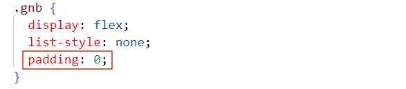
.gnb가 ul로 되어 있습니다.
ul은 기본적으로 리스트 아이콘 자리로 왼쪽 패딩이 많이 있습니다.
padding: 0 넣어주시면 없어집니다.
가로스크롤
1
479
1
상위 태그 영역 무시 하는 방법
1
859
2
반응형 적응형 구분
2
819
2
flex가 적용되면 하위에 있는 인라인의 속성은?
1
371
1
슬릭 슬라이더 버튼
1
385
1
slick 모바일로 변환했을때..
1
618
1
x scroll 이 왜 생기는 걸까요?
1
880
1
영상 16분 field margin-left 문제 (다운로드 교재도 동일한 문제)
1
259
1
모바일에서 이미지 짤림 현상
1
2758
2
질문 있습니다
1
248
1
모바일버전에서 스크롤이 생겨서요 ㅜㅜ
1
295
1
반응형 헤더 네비게이션 공부중인데요. 궁금한것이 있어서요.
1
398
2
슬라이딩 스크롤이 이상하게 먹혀요!
1
427
2
slick slider 하는데 패딩이 안먹혀요
1
778
2
제이쿼리 부드럽게 스크롤할때 제이쿼리에 밑줄오류가 있습니다.
1
327
1
혹시 이 강의 싸이트를 혼자의 힘으로 만들수 있으면 어느정도 실력정도 되나요?
1
263
1
소스랑 자료 다운로는 어디서 받을 수 있나요?
1
312
1
반응형 헤더 네비게이션 강의 질문있습니다.
1
215
1
그 반응형 질문 있습니다
1
231
1
질문드립니다 강사님
1
303
2
flex 레이아웃 배치 질문있습니다.
1
229
1
미디어쿼리 반응형 만들때 사이즈 질문있습니다.
1
209
1
인라인요소인 label 에 margin-bottom 이 되다니... 어렵습니다.
1
981
1
태블릿부분에서 사진이 삐져나오는 부분 질문
2
246
1