안녕하세요 쌤~질문이 있습니다..
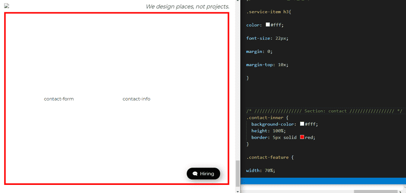
pc 레이아웃 상세 퍼블리싱 contact section -#1 에서 .contact-inner 부분이 아무리해도 border, 색상 자체가 나타나지 않아요. 완성파일 받아서 그부분 css, html,js..복붙해도 아예 나타나지가 않는데요. 이유를 모르겠어요. 맨앞에 .content에 바탕에 #ddd색이 깔려 있는데 그것만 보입니다. 알려주세요 ㅜㅜ
몇가지 질문이 더 있는데요,
맨처음에 dody>container>cd-section>div에서 가로폭은 설정이 아예 없던데 div가 100%라서 않설정하는건가요?
그리고 피시형->반응형을 할때 처음부터 마진 패딩 폰트 모두다 퍼센트와 rem으로 계산하던데 아직은 pc 상세긴하나 퍼센트나 rem을 라인하이츠 외에 쓰지 않는데 나중에 어떻게 되는건가요?
감사합니다!
pc 레이아웃 상세 퍼블리싱 contact section -#1
html
<!doctype html>
<html lang="ko">
<head>
<meta charset="UTF-8">
<meta name="viewport" content="width=device-width, initial-scale=1.0">
<title>DesignWorks Architecture Agency</title>
<script src="https://kit.fontawesome.com/a69c137eb6.js" crossorigin="anonymous"></script>
<script src="js/jquery-2.1.4.js"></script>
<!-- Page Scroll Effects JS & CSS -->
<script src="./js/velovity/modernizr.js"></script>
<script src="./js/velovity/velocity.min.js"></script>
<script src="./js/velovity/velocity.ui.min.js"></script>
<script src="./js/velovity/main.js"></script>
<link rel="stylesheet" href="./js/velovity/velocity.css">
<!-- Smooth Scrolling -->
<script src="js/jquery.scrollTo.min.js"></script>
<!-- Custom JS & CSS -->
<script src="custom.js"></script>
<link rel="stylesheet" href="style.css">
<link rel="stylesheet" href="responsive.css">
</head>
<!-- hijacking: on/off - animation: none/scaleDown/rotate/gallery/catch/opacity/fixed/parallax -->
<body data-hijacking="off" data-animation="rotate">
<div class="container"><!-- container -->
<!-- section -->
<section class="cd-section visible" id="home"><!-- Section: home -->
<div>
<div class="content">
<img src="images/temp-section-01.jpg" alt="">
</div>
</div>
</section>
<section class="cd-section" id="about"><!-- Section: about -->
<div>
<div class="content">
<div class="about-inner">
<div class="about-items">
<div class="item">
<img src="images/careers-main-01.png" alt="career01">
<span>
<h3>Together we can make an impact</h3>
<p>
Design Works the excitement of an entrepreneurial environment with the stability of an established practice. Principals and senior leadership work side-by-side with junior designers to create innovative, workable designs.
</p>
</span>
</div>
<div class="item">
<img src="images/careers-main-02.png" alt="career02">
<span>
<h3>We’re always looking for talent</h3>
<p>
If you don’t see an open position that fits your talents, send us your resume. We’re always looking for smart, self-starters and will reach out to you if something becomes available.
</p>
</span>
</div>
<div class="item">
<img src="images/careers-main-03.png" alt="creer03">
<span>
<h3>Fellowship</h3>
<p>Every summer we offer a Fellowship to a select group of students in architecture, planning and landscape architecture. Read about our 2019 Fellowship winners and learn more about what the Fellowship has to offer.</p>
</span>
</div>
</div>
</div>
</div>
</div>
</section>
<section class="cd-section" id="project"><!-- Section: project -->
<div>
<div class="content">
<img src="images/temp-section-03.jpg" alt="">
</div>
</div>
</section>
<section class="cd-section" id="plan"><!-- Section: plan -->
<div>
<div class="content">
<img src="images/temp-section-04.jpg" alt="">
</div>
</div>
</section>
<section class="cd-section" id="awards"><!-- Section: awards -->
<div>
<div class="content">
<div class="awards-inner">
<div class="about-awards">
<div class="about-heading">
<h2>2020<br>Architecture Award<br> Winner</h2>
<hr class="bar">
<p>
The mission of the Architecture MasterPrize (AMP) is
to advance the appreciation and exposure of quality
architectural design worldwide. The AMP architecture
award celebrates creativity and innovation in the fields
of architectural design, landscape architecture, and
interior design. Submissions from architects all around
the world are welcome.
</p>
<a class="view-awards" href="https://architectureprize.com/" target="_blank">View the awards</a>
</div>
</div>
<div class="victory-jump">
<img src="images/victory-jump.png" alt="victory">
</div>
</div>
</div>
</div>
</section>
<section class="cd-section" id="location"><!-- Section: location -->
<div>
<div class="content">
<div class="location-inner">
<div class="feature">
<div class="office">
<div class="headquarters">
<b>CREATIVE DESGIN GROUP</b>
<h2>Headquarters</h2>
<p>
Lorem ipsum, dolor sit amet consectetur adipisicing elit. Minima alias voluptatibus aspernatur accusamus sapiente esse quo iure voluptatem laudantium, tempore libero reprehenderit voluptate ipsam eum error mollitia sunt ducimus autem?
</p>
<span>
Address : Address: 309, New Cavendish St, EC1Y 3WK / Tel : 0800 214 5252
</span>
</div>
<div class="customer">
<b>THE PERFECT WAY</b>
<h2>Customer Service</h2>
<p>
Lorem ipsum dolor sit amet, consectetur adipisicing elit. Exercitationem laboriosam accusamus tenetur dolore temporibus explicabo odio sint ullam officia porro. Amet eos molestiae omnis tenetur culpa iste non dignissimos expedita!
</p>
<span>Address : 11 Fifth Ave - New York, US / Tel : 0800 809 3400</span>
</div>
</div>
<div class="service">
<div class="service-item">
<i class="fas fa-leaf"></i>
<h3>Built and natural contexts</h3>
<p>
Lorem ipsum dolor sit, amet consectetur adipisicing elit. Nihil in ipsum suscipit nobis sint totam.
</p>
</div>
<div class="service-item">
<i class="fas fa-bullseye"></i>
<h3>Landscape design</h3>
<p>
Lorem ipsum dolor sit, amet consectetur adipisicing elit. Nihil in ipsum suscipit nobis sint totam.
</p>
</div>
<div class="service-item">
<i class="fas fa-cube"></i>
<h3>Every building site unique
</h3>
<p>
Lorem ipsum dolor sit, amet consectetur adipisicing elit. Nihil in ipsum suscipit nobis sint totam.
</p>
</div>
</div>
</div>
</div>
</div>
</div>
</section>
<section class="cd-section" id="contact">
<div>
<div class="content">
<div class="contact-inner">
<div class="contact-feature">
<div class="contact-form">
contact-form
</div>
<div class="contact-info">
contact-info
</div>
</div>
</div>
</div>
</div>
</section>
<!-- Header -->
<header><!--css에서 header.active 흰색-->
<div class="gnb-inner"><!-- gnb-inner -->
<div class="logo"><!-- logo-->
<a href="#none"><img src="images/logo.png"></a>
</div>
<div class="gnb"><!-- gnb -->
<div class="menu"><!-- menu -->
<a href="#home">Home</a>
<a href="#about">About</a>
<a href="#project">Project</a>
<a href="#plan">Plan & History</a>
<a href="#awards">Awards</a>
<a href="#location">Location</a>
<a href="#contact">Contact</a>
</div>
<div class="slogan">We design places, not projects.</div>
</div><!-- gnb end -->
<div class="trigger"><!--toggle button: active 추가는 responsive.css 제어는 jquery -->
<span></span>
<span></span>
<span></span>
</div><!-- trigger end-->
</div><!-- gnb-inner end-->
</header><!-- Header end -->
</div><!-- container end -->
<!-- Container end -->
<a href="#" class="gototop"><!-- gototop -->
<img src="images/gototop.png" alt="">
</a><!--a="#"" 문서의가장 탑상단!-->
<a href="#" class="btn_hiring"><!-- btn-hiring-->
<i class="fas fa-comment-dots"></i>
Hiring</a>
<nav><!-- nav -->
<ul class="cd-vertical-nav">
<li><a href="#0" class="cd-prev inactive">Next</a></li>
<li><a href="#0" class="cd-next">Prev</a></li>
</ul>
</nav>
<!-- nav end -->
</body>
</html>
css
/* Google Web Font : Montserrat */
@import url('https://fonts.googleapis.com/css?family=Montserrat:200,300,400,500&display=swap');
@import url('https://fonts.googleapis.com/css?family=Manrope:300,400,500,600&display=swap');
@import url('https://fonts.googleapis.com/css2?family=Source+Sans+Pro:wght@200;300;400;600;700;900&display=swap');
@import url('https://fonts.googleapis.com/css2?family=Overpass&display=swap');
/* FontAwesome CDN 4.7 */
@import url('https://stackpath.bootstrapcdn.com/font-awesome/4.7.0/css/font-awesome.min.css');
/* ################### Reset CSS ################### */
* {
box-sizing: border-box;
}
ul {
list-style: none;
}
a {
text-decoration: none;
}
/* ################### Default CSS ################### */
body {
font-family: 'Montserrat', sans-serif;
color: #222;
font-size: 15px;
margin: 0;
height: 100vh;
background-color: #fff;
}
/* ################### Entire Layout ################### */
.cd-section {
height: 100vh;
}
.cd-section>div {
height: 100%;
position: relative;
}
.content {
/* background-color: #ddd; */
position: absolute;
width: calc(100% - 40px);
height: calc(100% - 80px);
left: 20px;
bottom: 20px;
overflow: hidden;
}
/* ################### Header ################### */
header {
position: fixed;
width: 100%;
top: 0;
left: 0;
z-index: 10;
}
.gnb-inner {
/* border: 1px solid #000; */
width: calc(100% - 40px);
margin: auto;
height: 60px;
line-height: 60px;
}
.logo {
float: left;
}
.logo img {
padding-top: 17px;
}
.gnb {
float: right;
}
.gnb a {}
.menu {
display: none;
}
.slogan {
font-size: 18px;
font-style: italic;
}
.trigger {
display: none;
}
/* ################### Hiring Button ################### */
.btn_hiring {
position: fixed;
right: 50px;
bottom: 50px;
color: #fff;
background-color: #000;
padding: 10px 20px;
border-radius: 20px;
box-shadow: 5px 5px 20px rgba(0, 0, 0, 0.4);
transition: 0.5s;
}
.fa-comment-dots{
transform: rotateY(180deg);
margin-right: 5px;
}
.btn_hiring:active{/*버튼 누르면 작아지는 액티브 가상클래스*/
transform: scale(0);
}
/* ################### Section : About ################### */
.about-inner{ /*background 한줄쓰기: color url no-repeat position/size*/
background: #0dace3 url(images/line-drawing.png) no-repeat right bottom;
height: 100%;
position: relative;;
/* background-color: #0dace3; */
/* background-size: 80%; */
/* background: blue; */
}
.about-items{
/* border: 1px solid #000; */
width: 50%;
position: absolute;
top: 50%;
left: 100px;
transform: translateY(-50%); /*y - 위로 올라감*/
}
.item{
overflow: hidden; /* float준 부모를 해제 */
/* clear: both; */
color:#fff;
margin-bottom: 30px;
}
.item img{
height: 120px;
float: left;
margin-right: 20px;
filter:invert(1); /* img에 색상필터 넣을떄 filter, (1)은100% */
}
.item span{
transition: 0.5s;
}
.item span h3{
font-size: 28px;
font-weight: 500;
margin: 0;
letter-spacing: -1px; /*자간*/
}
.item span p{
overflow: hidden; /* float떄문에 글자가 아래로 밀린경우*/
font-size: 18px;
}
.item:hover h3{
color: #000;
}
.item:hover img{
filter:invert(0);
}
/* ################### Section : awards winner ################## */
.awards-inner{
height: 100%; /*부모에 높이를 100%줘야 자식이 float 플롯됐을떄 높이를 줄수있음!! */
border: 1px solid #ddd;
}
.awards-inner >div{ /* awards-inner안에 자식div 2개만 해당되므로 >div */
float: left;
width: 50%;
height: 100%;
position: relative;
}
.about-awards{
background-color: #000;
color: #fff;
}
.about-heading{
position: absolute;
top: 50%;
left: 50%;
transform: translate(-50%, -50%);
text-align: center;
width: 70%;
}
.about-heading .bar{
width: 50px;
height: 4px;
border: none;
background-color: crimson;
margin: 30px auto;/* 위아래30 가로중앙 auto*/
}
.about-heading p{
color: #999;
font-size: 16px;
line-height: 1.5em;
}
/* A button */
.view-awards{
color: #bbb;
border: 1px solid #bbb;
padding: 5px 15px;
border-radius: 20px;
transition: 0.5s; /*hover*/
/* margin-top: 200px; 마진상하가 안되니까 인라인임 p테그에서 내리거나*/
display: inline-block;
margin-top: 20px;
}
.view-awards:hover{ /*호버시 색상변화, ** 보더가 안보여야하는데 none으로하면 픽셀이빠져서 화면이 흔들림, 투명으로해야 */
background-color: #31c0ce;
color:#fff;
/* border: none; */
border-color: transparent;
}
.victory-jump{
background-color: #fff;
}
.victory-jump img{ /*img 중앙배치하는 방법*/
position: absolute;
top: 50%;
left:50%;
transform: translate(-50%, -50%);
width: 80%;
}
/* ################### Section : Location ################### */
.location-inner{
background: url(images/background-location.jpg) no-repeat center center; /*background 안나오는이유: 크기줘야쟎이*/
height: 100%;
}
.location-inner:before{
content:''; /*before, after content:'' 로시작, 인라인이되므로 크기줘도안보인다. position: absoulte/display inline-block 줘서 인라인블럭화한다*/
background-color:rgba(0,0,0,0.85);
width: 100%;
height: 100%;
/* display: inline-block; */
position: absolute;
}
.feature{
width: 70%;
position: absolute;
top:50%;
left: 50%;
transform: translate(-50%, -50%);
color: #ddd;
}
.feature>div{
float: left;
}
.office{
width: 60%;
padding-right: 100px;
}
.service{
width: 40%;
}
.office b{
font-weight: normal;
}
.office h2{ /*h2는 마진0줘야한다*/
color: #1db1f0;
font-weight: 500;
margin: 0;
margin-top: 5px;
}
.office p{
font-size: 16px;
line-height: 1.5em;
}
.office span{color: #fff;}
.customer{
margin-top: 40px;
}
/* Service */
.service{}
.service-item{
margin-bottom: 20px;
}
.service-item .fas{
color: #1db1f0;
font-size: 40px;
}/*fontawesome 인라인임*/
.service-item h3{
color: #fff;
font-size: 22px;
margin: 0;
margin-top: 10x;
}
/* ////////////////// Section: contact ///////////////// */
.contact-inner {
background-color: #fff;
height: 100%;
border: 1px solid #ddd;
}
.contact-feature {
width: 70%;
position: absolute;
top: 50%;
left: 50%;
transform: translate(-50%, -50%);
}
.contact-feature > div {
float: left;
width: 50%;
padding: 20px;
}
.contact-form{}
.contact-info{}
custom js
/*Trigger */ // $(function(){})의미가 html을 읽어라, 이게 없으면 js부터 읽으니까 trigger인식못함.('.따옴표')toogleClass('class명')*/
$(function(){
$('.trigger').click(function(){
$(this).toggleClass('active')//1.togglebutton제어
$('.gnb').toggleClass('active')//2.gnb메뉴판 토글하게 제어
})
$('section,.menu a').click(function(){ //3.바탕(섹션)클릭시 메뉴없어지게 제어
$('.gnb').removeClass('active')//gnb메뉴판 클래스(left:0)를 떄어서 들어가게 제어
$('.trigger').removeClass('active')//5. trigger x는 섹션, 메뉴클릭시 gnb닫고 동시에 사라져야함.
})
/*$('.menu a').click(function(){ 4. menu a클릭시 gnb닫혀야하므로 위에씀.
$('.gnb').removeClass('active')
})*/
/*Smooth scrolling 플러그인*/
$('.menu a,.gototop').click(function(e){
$.scrollTo(this.hash || 0,900)//5. scrollTo 0.9초에 부드럽게 스크롤
})
/* Header/ Gototop Change CSS with Scroll*/
$(window).scroll(function(){
if($(window).scrollTop() > 50){
$('header, .gototop').addClass('active')//윈도우스크롤50 내리면, 헤더, 고투탑 보여라
}
else{ //아니면(스크롤이 탑에있을떄 헤더, 고투탑은 사라진다.)
$('header, .gototop').removeClass('active')
}
})
})//end
responsive.css
/* Mobile 768 */
@media (max-width: 768px){
/* html{
scroll-behavior: smooth; /*제이쿼리스크롤 플러그인비슷함*/
/* Entire Layout */
.cd-section {
/* height: 100vh; 뷰포트하이츠,100%는 모바일에서는 해제해야함*/
height: auto;
}
.cd-section > div {
height: auto;
/*position: relative; */
}
.content {
position: static;
width: 100%;
height: 100%;
/* overflow: hidden; */
}
/* Header */
.menu {
display: block;
}
.slogan {
display: none;
}
.gnb {
background-color: #fff;
position: fixed;
top: 0;
right:-280px;
width: 250px;
height: 100vh;
box-shadow: -5px 0 10px rgba(0, 0, 0, 0.1);
transition: 0.5s;
}
.menu {
line-height: 40px;
margin-top: 60px;
}
.menu a {
text-align: right;
display: block;
padding-right: 20px;
color: #000;
font-size: 20px;
}
/* Trigger */
/*중요-trigger:absoulte으로 배치, span:absoulte 으로배치.
트리거의 자식이지만 다시 부모trigger에 relative주면 안되고 앱솔루트로 부모를 냅둬라*/
.trigger{
display: block;/*나오게함*/
/* border: 1px solid red; */
width: 24px;
height: 14px;
position: absolute;
top: 20px;
right: 20px;}
.trigger span{
position: absolute;
height: 1px;
width: 100%;
background-color: #000;
transition: 0.5s;
}
.trigger span:nth-child(1){
top:0;
}
.trigger span:nth-child(2){
top:50%;
width: 80%;
}
.trigger span:nth-child(3){
top:100%;
}
.trigger.active span:nth-child(1){
top:50%;
transform: rotate(45deg);
}
.trigger.active span:nth-child(2){
top:50%;
width: 80%;
opacity: 0;/*안보이게 할때는 투명도 0*/
}
.trigger.active span:nth-child(3){
top:50%;
transform: rotate(-45deg);
}
.gnb.active{/*gnb메뉴를 보이게함 .active를 js에 설정*/
right:0;
}
/* Header*/
header{
transition: 0.5s; /*header 스크롤 나타날떄*/
}
header.active{
background-color: #fff;
border: 1px solid #eee;
}
/* Gototop */
.gototop{ /*누르면 탑으로간다: html->a href="#" 스크롤자연스럽게 플러그인에 삽입*/
position: fixed;
bottom:20px;
left: 20px;
border: 1px solid #fff;
border-radius: 50%;
display: block;
width: 40px;
height: 40px;
text-align: center;
line-height: 60px;
opacity: 0; /*고투탑 기본설정을 안보이게+트랜스폼 아래위치하게*/
transform: translateY(30px);
transition: 0.5s;
}
.gototop.active{ /*고투탑 보이게 액티브를 제이쿼리에 추가 */
opacity:1;
transform: translateY(0);
}
/* goto top */
.btn_hiring{
right: 20px;
bottom: 20px;
}
/* end */
}/*최대 768 모바일까지만 실행*/


답변 1