inflearn logo

Data Analysis (Power Query + Tableau + Dashboard Planning) Core Essentials in 4 Hours

Data Preprocessing + Data Visualization + Dashboard Planning = Data-Driven Problem Solving

(5.0) 1 reviews

45 learners

Level Beginner

Course period Unlimited

Chart Analysis
Chart Analysis
Big Data
Big Data
Tableau
Tableau
Chart Analysis
Chart Analysis
Big Data
Big Data
Tableau
Tableau

What you will gain after the course

  • Data Preprocessing

  • Data Visualization

  • Communication

  • Data Analysis

  • Power Query

  • tableau

  • Tableau

  • Design Thinking

[Scheduled for updates: 2nd round in September, 3rd round in October]

I'm already busy with my main job, so when will I find time to learn data analysis? 🤔

If you have ever had these thoughts, you have come to the right place.

According to Google's Hal Varian, the ability to handle data well is defined as the ability to process data, extract value, visualize it, and use it to communicate effectively. If you are already a practitioner with rich domain knowledge, your ability to find value from data will be superior to anyone else's. However, you may lack the ability to preprocess and visualize the data itself.


In the midst of all this, organizations are telling us to learn about data.
We're already busy with our actual work, so when are we supposed to learn SQL and develop dashboards?


STEP BY STEP Data Analysis for Everyone + Design Thinking Dashboard Planning Method is a course where you can quickly and easily learn the essential skills of 1. Data Preprocessing, 2. Data Visualization, and 3. Communication to solve problems based on data within 5 hours.

In this course, you can learn how to preprocess data using Excel's Power Query and visualize data using Tableau. Additionally, you can learn how to plan dashboards that are truly needed based on user research by studying the Design Thinking planning methodology. After completing the course, you will be able to develop a stunning dashboard based on the tools and planning methodologies learned above, using a real-world scenario.

Features of this course

📌 A course covering the entire data analysis process, from data preprocessing to visualization

📌A data analysis course you can learn without coding

📌 A course where you can select and develop the appropriate data visualization charts based on data characteristics and analysis objectives

📌 A course where you can learn Excel Power Query and Tableau

📌 A course where you can learn only the essential processes of data analysis, condensed into 5 hours

📌 A course that you can keep for a lifetime and is updated periodically

📌 Student open chat room provided

Recommended for these people

I want to extract big data.
Those whose organizations encourage data-driven work, but lack the time to learn new tools

I want to develop a dashboard.
Those who find chart analysis difficult but want to properly create reports or dashboards using data.

I want to quickly skim through data analysis
Those who want to learn the overall content of data analysis over a short weekend

After completing the course

  • You can easily handle data with over 1 million rows in Excel.

  • Even if you don't know SQL, you can still perform data preprocessing.

  • You can develop and design appropriate data visualization charts that suit the purposes of reports, dashboards, and data analysis.

  • You can plan dashboards and give reports or presentations using systematic planning methodologies.

  • If you have access to data within the organization, your ability to utilize that data environment will improve.

Here is what you will learn.

What should you learn to be good at data analysis?

To perform data analysis efficiently, you need the ability to preprocess data, visualize it, and use it for communication.

How those of us who don't know SQL can perform data preprocessing

In this course, you will learn how to preprocess data within the familiar tool of Excel, just like you would with SQL, but without needing to know SQL. Extract the data you want even in environments with over a million rows, and analyze it comfortably in Excel!

How to communicate data more effectively

Tableau is a tool already adopted and utilized by many companies. However, those encountering it for the first time may find it difficult. In this course, you will learn how to create and design five types of data visualizations step-by-step, simply by following along with the lectures.

How to communicate using data

A dashboard is one of the most efficient ways to communicate data analysis results. However, a typical data-analytical approach often fails to consider the user, ultimately resulting in a dashboard that is forgotten. Apply Design Thinking problem-solving methods to plan a dashboard designed for the user!

The person who created this course

  • Graduate of Social Sciences, PhD in Design


  • Data Analyst at a major corporate affiliate


  • Published numerous papers related to user data analysis and design research


  • Desearch Lab blog and SNS content creation


Notes before taking the course

Practice Environment

  • The lectures are explained based on MacOS, but you can follow along with the same interface on Windows as well.

  • Excel is used in the lecture. If you have version 2016 or later, you will be able to follow along without any issues.

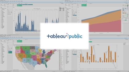
  • In the lecture, we will use the free version, Tableau Public. I will start by explaining how to install it.

Learning Materials

  • Provided via Google Drive.

Prerequisites and Notices

  • It is good if you have experience using Excel in your work.

  • If you work at a company with an existing data organization, the utility of this will be even higher.


Recommended for
these people

Who is this course right for?

  • An office worker who wants to extract data from big data

  • Office workers who want to handle data with over 1 million rows in Excel

  • All job categories interested in Tableau

  • Those who want to add cool charts to their reports using the free version of Tableau

  • Everyone who wants to learn data visualization

  • Those who have introduced Tableau in their company but don't know how to use it

Need to know before starting?

  • Excel

Hello
This is Thinknod Lab

In an era where data and AI tell us everything, what is your real weapon?

Hello, I am Thinknod, a researcher and designer of 'Problem-Solving Thinking' in the face of uncertain, real-world work environments where there are no right answers.

The real problems (Wicked Problems) we face in the field cannot find their own way, no matter how powerful the data and latest AI tools are provided. What is more important than the skill of handling tools is a solid thinking system that deconstructs problems and builds conclusions on its own.

At thinknod.ai, we break down massive problems into the smallest units called 'Thinking Nodes' and transparently share the 'trajectory of thought' that relentlessly solves problems by repeating expansion and convergence across three states: Diagnosis, Strategy, and Execution.

Rather than a simple explanation of features, we share the most practical operational manual on how to break down the problems you face at work today, which tools to open, and what kind of results you need to produce.

More

Curriculum

All

76 lectures ∙ (4hr 35min)

Course Materials:

Lecture resources
Published: 
Last updated: 

Reviews

All

1 reviews

5.0

1 reviews

  • halee3081님의 프로필 이미지
    halee3081

    Reviews 2

    Average Rating 4.5

    5

    100% enrolled

    Similar courses

    Explore other courses in the same field!

    25% off for new members

    $16.40

    25%

    $26.40