
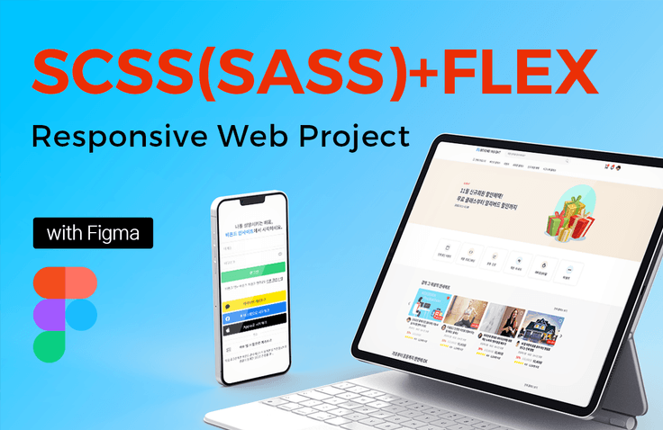
SCSS(SASS)+FLEX Practical Responsive Web Project with Figma
Master the practical use of SCSS (SASS) and FLEX Layout! This is a systematic responsive website project creation process that designs the main page and key sub-page UI of the entire website with Figma, creates an HTML wireframe structure with consistent class names, and completes publishing. In the course, which lasts more than 41 hours in total, you will learn the core theory and practical application skills and design and create PC-mobile-tablet responsive layouts, which will greatly improve your experience and know-how with responsive web projects as well as your core jQuery theory and practical application skills.
332 learners
Level Basic
Course period Unlimited
[Course Open] Mobile Web Publishing Portfolio with CSS Nesting
[Lecture Open] Mobile Web Publishing Portfolio with CSS Nesting
You can improve your mobile web production skills, which are most competitive in publisher employment and publisher practice, while producing 22 different mobile layouts on 19 pages. As a publisher, you can acquire almost all production methods and know-how for producing mobile web.
The most powerful part of the mobile web publishing class is the detailed HTML wireframe creation method, which explains each page in detail. Through the lecture, your HTML wireframe creation ability will greatly improve. In particular, you will be able to sufficiently learn the CSS nesting method. You will be able to sufficiently acquire intermediate to advanced CSS practical skills, focusing on the Flex layout.
✅ Go to lecture introduction: https://inf.run/yfNHF
