61,600원
다른 수강생들이 자주 물어보는 질문이 궁금하신가요?
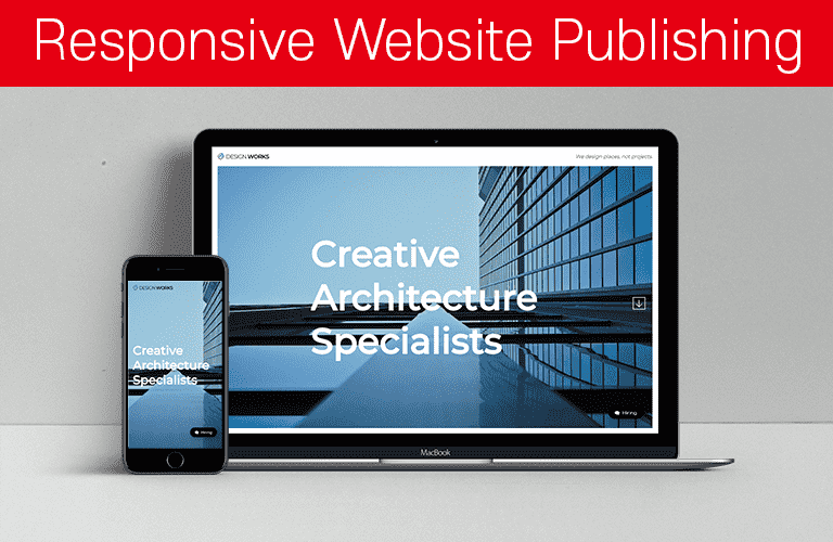
- 해결됨반응형 웹사이트 포트폴리오(Architecture Agency)
확장 프로그램
MaraCopy 자바스크립트로 텍스트 복사 막아 놓은 웹 페이지 내에서 텍스트 복사하기 Enable Right Click context menu on any website 자바스크립트로 마우스 우측 버튼 메뉴를 막아 놓은 웹 사이트에서 마우스 우측 버튼 사용하기 요거 두개가 크롬확장에서 없어용 Font Picker 요거는 아직도 있네요
- 미해결반응형 웹사이트 포트폴리오(Architecture Agency)
모바일 화면에서 hiring의 sns 문제-소스코드 올려 놓았습니다.
index.html: <!doctype html> <html lang="ko"> <head> <meta charset="UTF-8"> <meta name="viewport" content="width=device-width, user-scalable=no, initial-scale=1.0, maximum-scale=1.0, minimum-scale=1.0"> <title>bizpage website-Architecture</title> <link rel="icon" href="images/bizpage_logo3.png"> <script src="js/jquery-2.1.4.js"></script> <!-- Page scroll Effects JS & CSS --> <script src="js/velocity/modernizr.js"></script> <script src="js/velocity/velocity.min.js"></script> <script src="js/velocity/velocity.ui.min.js"></script> <script src="js/velocity/main.js"></script> <link rel="stylesheet" href="js/velocity/velocity.css"> <!-- Smooth Scrolling --> <script src="js/jquery.scrollTo.min.js"></script> <!-- Slick.js --> <script src="js/slick/slick.min.js"></script> <link rel="stylesheet" href="js/slick/slick-theme.css"> <link rel="stylesheet" href="js/slick/slick.css"> <!-- Featherlight.js --> <script src="js/featherlight/featherlight.js"></script> <link rel="stylesheet" href="js/featherlight/featherlight.css"> <!-- Custom JS & CSS --> <script src="custom.js"></script> <link rel="stylesheet" href="style.css"> <link rel="stylesheet" href="responsive.css"> </head> <!-- hijacking: on/off - animation: none/scaleDown/rotate/gallery/catch/opacity/fixed/parallax --> <body data-hijacking="on" data-animation="rotate"> <div class="container"> <section class="cd-section visible" id="home"> <div> <div class="content"> <div class="home-inner"> <h3 class="welcome-text">Can your homepage do this?<br>You can!!<span>with bizpage<i class="fa fa-heart"></i></span></h3> <div class="opacity-image"></div> <div class="home-heading"> <span>Creative</span> <span>Architecture</span> <span>Specialist</span> </div> </div> </div> </div> </section> <section class="cd-section" id="about"> <div> <div class="content"> <div class="about-inner"> <div class="about-items"> <div class="item"> <img src="images/careers-main-01.png"> <span> <h3>Together we can make an impact</h3> <p>Design Works the excitement of an entrepreneurial environment with the stability of an established practice. Principals and senior leadership work side-by-side with junior designers to create innovative, workable designs.</p> </span> </div> <div class="item"> <img src="images/careers-main-02.png"> <span> <h3>We’re always looking for talent</h3> <p>If you don’t see an open position that fits your talents, send us your resume. We’re always looking for smart, self-starters and will reach out to you if something becomes available.</p> </span> </div> <div class="item"> <img src="images/careers-main-03.png"> <span> <h3>Fellowship</h3> <p>Every summer we offer a Fellowship to a select group of students in architecture, planning and landscape architecture. Read about our 2019 Fellowship winners and learn more about what the Fellowship has to offer.</p> </span> </div> </div> </div> </div> </div> </section> <section class="cd-section" id="project"> <div> <div class="content"> <div class="project-inner"> <input type="radio" name="tabmenu" id="tab1" checked> <input type="radio" name="tabmenu" id="tab2"> <input type="radio" name="tabmenu" id="tab3"> <div class="tabs"> <div class="tab"> <div class="project-info" data-text="01"> <h3>Project: Glass Wall Architecture</h3> <p> Lorem ipsum dolor sit amet consectetur adipisicing elit. Quia atque ratione, vitae culpa natus ex quae labore architecto nostrum odit laboriosam laborum aut vel dolores nulla et cumque placeat molestiae sunt? Aut consequuntur eos mollitia quam adipisci labore, sequi impedit. </p> <ul> <li><b>Area</b> : 1670 m2</li> <li><b>Completed Date</b> : September 2018</li> <li><b>Architect</b> : Daniel Kang</li> <div class="detail"> <div> <span>225</span>WORKING DAY </div> <div> <span>320</span>MEMBERS </div> <div> <span>3M</span>BUDGET </div> </div> <a class="view-project" href="project-detail-01.html" data-featherlight="iframe">view project<i class="fa fa-long-arrow-right"></i></a> </ul> </div> <div class="project-photo"> <img src="images/project-main-01-01.jpg"> <img src="images/project-main-01-02.jpg"> <img src="images/project-main-01-03.jpg"> <img src="images/project-main-01-04.jpg"> </div> </div> <div class="tab"> <div class="project-info" data-text="02"> <h3>Project : Hallway of Architecture</h3> <p> Lorem ipsum dolor sit amet consectetur adipisicing elit. Quia atque ratione, vitae culpa natus ex quae labore architecto nostrum odit laboriosam laborum aut vel dolores nulla et cumque placeat molestiae sunt? Aut consequuntur eos mollitia quam adipisci labore, sequi impedit. </p> <ul> <li><b>Area</b> : 2345 m2</li> <li><b>Completed Date</b> : April 2019</li> <li><b>Architect</b> : Daniel Kang</li> <div class="detail"> <div> <span>321</span>WORKING DAY </div> <div> <span>420</span>MEMBERS </div> <div> <span>8M</span>BUDGET </div> </div> <a class="view-project" href="project-detail-02.html" data-featherlight="iframe">view project<i class="fa fa-long-arrow-right"></i></a> </ul> </div> <div class="project-photo"> <img src="images/project-main-02-01.jpg"> <img src="images/project-main-02-02.jpg"> <img src="images/project-main-02-03.jpg"> <img src="images/project-main-02-04.jpg"> </div> </div> <div class="tab"> <div class="project-info" data-text="03"> <h3>Project : Outside Stairs Architecture</h3> <p> Lorem ipsum dolor sit amet consectetur adipisicing elit. Quia atque ratione, vitae culpa natus ex quae labore architecto nostrum odit laboriosam laborum aut vel dolores nulla et cumque placeat molestiae sunt? Aut consequuntur eos mollitia quam adipisci labore, sequi impedit. </p> <ul> <li><b>Area</b> : 1200 m2</li> <li><b>Completed Date</b> : May 2020</li> <li><b>Architect</b> : Mark Lee</li> <div class="detail"> <div> <span>132</span>WORKING DAY </div> <div> <span>202</span>MEMBERS </div> <div> <span>5M</span>BUDGET </div> </div> <a class="view-project" href="project-detail-03.html" data-featherlight="iframe">view project<i class="fa fa-long-arrow-right"></i></a> </ul> </div> <div class="project-photo"> <img src="images/project-main-03-01.jpg"> <img src="images/project-main-03-02.jpg"> <img src="images/project-main-03-03.jpg"> <img src="images/project-main-03-04.jpg"> </div> </div> </div> <div class="btn"> <label for="tab1"></label> <label for="tab2"></label> <label for="tab3"></label> </div> </div> </div> </div> </section> <section class="cd-section" id="plan"> <div> <div class="content"> <div class="plan-inner"> <div class="plan-feature"> <div class="plan-info"> <div class="plan-heading"> <h2>Planning<br> For the Next Project</h2> <hr class="bar"> <p>Lorem ipsum dolor sit amet consectetur, adipisicing elit. Facilis at deleniti ullam aut. Ex, dolorem animi, enim vitae molestiae eligendi, neque deserunt veritatis nam voluptate repellendus? Quis, itaque totam fuga repellat ut animi molestiae suscipit commodi culpa ducimus. Illo accusantium non numquam? Hic tempore molestias dicta labore debitis cupiditate ab.</p> </div> <div class="plan-photo"> <img src="images/plan-main-01.jpg"> </div> </div> <div class="history-info"> <h2>History</h2> <hr class="bar"> <div class="history-slider"> <div> <h4>The Project <br>of Architecture for the <span>2013</span></h4> <p> Lorem ipsum dolor sit amet consectetur, adipisicing elit. Nostrum et beatae aperiam perferendis explicabo quod voluptate sed autem sapiente distinctio. </p> </div> <div> <h4>The Project <br>of Architecture for the <span>2014</span></h4> <p> Lorem ipsum dolor sit amet consectetur, adipisicing elit. Nostrum et beatae aperiam perferendis explicabo quod voluptate sed autem sapiente distinctio. </p> </div> <div> <h4>The Project <br>of Architecture for the <span>2015</span></h4> <p> Lorem ipsum dolor sit amet consectetur, adipisicing elit. Nostrum et beatae aperiam perferendis explicabo quod voluptate sed autem sapiente distinctio. </p> </div> <div> <h4>The Project <br>of Architecture for the <span>2016</span></h4> <p> Lorem ipsum dolor sit amet consectetur, adipisicing elit. Nostrum et beatae aperiam perferendis explicabo quod voluptate sed autem sapiente distinctio. </p> </div> <div> <h4>The Project <br>of Architecture for the <span>2017</span></h4> <p> Lorem ipsum dolor sit amet consectetur, adipisicing elit. Nostrum et beatae aperiam perferendis explicabo quod voluptate sed autem sapiente distinctio. </p> </div> <div> <h4>The Project <br>of Architecture for the <span>2018</span></h4> <p> Lorem ipsum dolor sit amet consectetur, adipisicing elit. Nostrum et beatae aperiam perferendis explicabo quod voluptate sed autem sapiente distinctio. </p> </div> <div> <h4>The Project <br>of Architecture for the <span>2019</span></h4> <p> Lorem ipsum dolor sit amet consectetur, adipisicing elit. Nostrum et beatae aperiam perferendis explicabo quod voluptate sed autem sapiente distinctio. </p> </div> <div> <h4>The Project <br>of Architecture for the <span>2020</span></h4> <p> Lorem ipsum dolor sit amet consectetur, adipisicing elit. Nostrum et beatae aperiam perferendis explicabo quod voluptate sed autem sapiente distinctio. </p> </div> </div> </div> </div> </div> </div> </div> </section> <section class="cd-section" id="awards"> <div> <div class="content"> <div class="awards-inner"> <div class="about-awards"> <div class="about-heading"> <h2>2020 <br>Architecture Awards <br>Winner</h2> <hr class="bar"> <p> The mission of the Architecture MasterPrize (AMP) is to advance the appreciation and exposure of quality architectural design worldwide. The AMP architecture award celebrates creativity and innovation in the fields of architectural design, landscape architecture, and interior design. Submissions from architects all around the world are welcome. </p> <a class="view-awards" href="https://architectureprize.com/" target="_blank">VIEW THE AWARDS</a> </div> </div> <div class="victory-jump"> <img src="images/victory-jump.png"> </div> </div> </div> </div> </section> <section class="cd-section" id="location"> <div> <div class="content"> <div class="location-inner"> <div class="feature"> <div class="office"> <div class="headquater"> <b>CREATIVE DESGIN GROUP</b> <h2>Headquarter</h2> <p> Lorem ipsum dolor sit amet, consectetur adipisicing elit. Mollitia culpa libero, veritatis vero corporis quasi eaque commodi quia fugiat, qui ad consectetur vitae. Obcaecati odit expedita officia, veritatis accusamus illo. </p> <span>Address : #324, 510, Misa-daero, Hanam-si, Gyeonggi-do, Republic of Korea / Tel : 031 425 3336</span> </div> <div class="customer"> <b>THE PERFECT WAY</b> <h2>Customer Service</h2> <p> Lorem ipsum dolor sit amet, consectetur adipisicing elit. Mollitia culpa libero, veritatis vero corporis quasi eaque commodi quia fugiat, qui ad consectetur vitae. Obcaecati odit expedita officia, veritatis accusamus illo. </p> <span>Address : #324, 510, Misa-daero, Hanam-si, Gyeonggi-do, Republic of Korea / Tel : 031 425 3336</span> </div> </div> <div class="service"> <div class="service-item"> <i class="fa fa-leaf"></i> <h3>Built and natural contexts</h3> <p> Lorem ipsum dolor sit amet consectetur adipisicing elit. Modi nulla voluptatibus debitis tempora impedit quam. </p> </div> <div class="service-item"> <i class="fa fa-bullseye"></i> <h3>Landscape design</h3> <p> Lorem ipsum dolor sit amet consectetur adipisicing elit. Modi nulla voluptatibus debitis tempora impedit quam. </p> </div> <div class="service-item"> <i class="fa fa-cube"></i> <h3>Every building site unique</h3> <p> Lorem ipsum dolor sit amet consectetur adipisicing elit. Modi nulla voluptatibus debitis tempora impedit quam. </p> </div> </div> </div> </div> </div> </div> </section> <section class="cd-section" id="contact"> <div> <div class="content"> <div class="contact-inner"> <div class="contact-feature"> <div class="contact-form"> <h3><b>Contact </b>Us</h3> <p>Feel free to ask for details, don't save any questions.</p> <form class="send-box"> <label>Email <span>*</span></label> <input type="email"> <label>Subject <span>*</span></label> <input type="text"> <label>Message <span>*</span></label> <textarea cols="30" rows="10"></textarea> <!-- <input type="submit" value="send message"> --> <button>send message</button> </form> </div> <div class="contact-info"> <h4>Our <b>Office</b></h4> <ul> <li>Address : #324, 510, Misa-daero, Hanam-si, Gyeonggi-do, Republic of Korea</li> <li>Phone: +82-31-425-3336, +82-10-3687-4054</li> <li>Email: oykang64@gmail.com</li> </ul> <h4>Business <b>Hours</b></h4> <ul> <li><i class="fa fa-clock-o"></i> Monday - Friday : 9am to 5pm</li> <li><i class="fa fa-clock-o"></i> Saturday : 9am to 2pm</li> <li><i class="fa fa-clock-o"></i> Sunday : Closed</li> </ul> <h4>Get in <b>Touch</b></h4> <p> Lorem ipsum dolor sit amet consectetur adipisicing elit. Suscipit impedit qui harum nulla cum hic sed esse molestias animi veniam. </p> </div> </div> </div> </div> </div> </section> <header> <div class="gnb-inner"> <div class="logo">bizpage</div> <div class="gnb"> <div class="menu"> <a href="#home">Home</a> <a href="#about">About</a> <a href="#project">Project</a> <a href="#plan">Plan & History</a> <a href="#awards">Awards</a> <a href="#location">Location</a> <a href="#contact">Contact</a> </div> <div class="slogan">We think different and make different.</div> </div> <div class="trigger"> <span></span> <span></span> <span></span> </div> </div> </header> </div> <a href="#" class="gototop active"><img src="images/gototop.png"></a> <a href="hiring.html" class="btn-hiring" data-featherlight="iframe"><i class="fa fa-commenting"></i></i>Hiring</a> <nav> <ul class="cd-vertical-nav"> <li><a href="#0" class="cd-prev inactive">Next</a></li> <li><a href="#0" class="cd-next">Prev</a></li> </ul> </nav> </body> </html> style.css: /* Google Web Font : Montserrat */ @import url('https://fonts.googleapis.com/css?family=Montserrat:200,300,400,500&display=swap'); @import url('https://fonts.googleapis.com/css?family=Manrope:300,400,500,600&display=swap'); @import url('https://fonts.googleapis.com/css2?family=Source+Sans+Pro:wght@200;300;400;600;700;900&display=swap'); @import url('https://fonts.googleapis.com/css2?family=Nanum+Gothic&family=Nunito&family=Open+Sans:ital,wght@0,300;0,400;0,500;0,600;1,400&display=swap'); @import url('https://fonts.googleapis.com/css2?family=Nanum+Gothic&family=Nunito&family=Open+Sans:ital,wght@0,300;0,400;0,500;0,600;1,400&family=Overpass&family=Source+Sans+Pro&display=swap'); /* FontAwesome CDN 4.7 */ @import url('https://stackpath.bootstrapcdn.com/font-awesome/4.7.0/css/font-awesome.min.css'); /* Reset CSS */ * { box-sizing: border-box;} ul {list-style: none; padding: 0;} a {text-decoration: none;} /* Default CSS */ body { font-family: 'Open Sans', 'sans-serif'; color: #222; font-size: 15px; margin: 0; height: 100vh; background-color: #fff; } /* Entire Layout */ .cd-section { height: 100vh; } .cd-section > div { height: 100%; position: relative; } .content { position: absolute; width: calc(100% - 40px); height: calc(100% - 80px); left: 20px; bottom: 20px; overflow: hidden; } /* Header */ header { position: fixed; top: 0; left: 0; width: 100%; z-index: 100; } .gnb-inner { /* border: 1px solid #000; */ width: calc(100% - 40px); margin: auto; height: 60px; line-height: 60px; } .logo { font-size: 2.4rem; font-weight: bold; color: #066bf7; float: left; } /* .logd img { padding-top: 17px; } */ .gnb { float: right; } .menu { display: none; } /* .menu a {} */ .slogan { font-style: italic; font-size: 16px; float: right; } .trigger { display: none; } /* Hiring Button */ .btn-hiring { position: fixed; right: 30px; bottom: 30px; color: #fff; background-color: #000; padding: 10px 20px; border-radius: 20px; box-shadow: 5px 5px 20px rgba(0, 0, 0, 0.38); transition: 0.5s; } .btn-hiring .fa { transform: rotateY(180deg); margin-right: 5px; } .btn-hiring:active { transform: scale(0); } /* ################## Section : home ################## */ .home-inner { background-color: #fff; height: 100%; } .home-inner::before { content: ''; background-color: #000; position: absolute; width: 0%; height: 100%; top: 0; left: 0; animation: overlay 1s 3s ease-in-out both; } .welcome-text { position: absolute; top: 50%; left: 50%; transform: translate(-50%, -50%); font-size: 50px; font-weight: 300; text-align: center; line-height: 1.2em; margin: 0; font-family: 'Source Sans Pro', sans-serif; animation: slideup 3s 0s linear; animation-fill-mode: both; } .welcome-text span { display: block; font-size: 26px; color: #066bf7; } .welcome-text span .fa { color: crimson; margin-left: 10px; } .opacity-image { background: url(images/section-bg-01.jpg) no-repeat center center; height: 100%; background-size: cover; opacity: 0; animation: opacity-image 1s 3.5s ease-in both; } .home-heading { position: absolute; top: 50%; left: 250px; transform: translateY(-50%); } .home-heading span { display: block; font-size: 90px; color: #fff; font-weight: bold; width: 0; overflow: hidden; } .home-heading span:nth-child(1) { animation: reveal 1s 4s ease-in-out both; } .home-heading span:nth-child(2) { animation: reveal 1s 4.5s ease-in-out both; } .home-heading span:nth-child(3) { animation: reveal 1s 5s ease-in-out both; } @keyframes slideup { 0% { opacity: 0; margin-top: 50px; } 20% { opacity: 0.5; margin-top: 0; } 80% { opacity: 1; margin-top: 0; } 100% { opacity: 0; } } @keyframes overlay { 0% { width: 0; left: 0; } 50% { width: 100%; left: 0; } 100% { width: 0; left: 100%; } } @keyframes opacity-image { 0% { opacity: 0; } 100% { opacity: 1; } } @keyframes reveal { 0% { width: 0; } 100% { width: 100%; } } /* ################## Section : about ################## */ .about-inner { background: #0dace3 url(images/line-drawing.png) no-repeat right bottom; height: 100%; background-size: 60%; /* background-color: #0dace3; */ } .about-items { width: 60%; color: #fff; position: absolute; top: 50%; transform: translateY(-50%); margin-left: 100px; } .item { overflow: hidden; margin: 60px; } .item:hover h3 { color: #000; /* letter-spacing: 0px; */ } .item:hover img { filter: invert(0); } .item img { height: 160px; float: left; margin-right: 30px; filter: invert(1); transition: 0.5s; } .item h3 { font-size: 30px; font-weight: 500; margin: 0; transition: 0.5s; letter-spacing: -1px; } .item p { overflow: hidden; font-size: 20px; } /* ################## Section : project ################## */ .project-inner { height: 100%; } .tabs { height: 100%; width: 300%; transition: 0.5s; } .tab { height: 100%; float: left; width: 33.333333%; } .tab > div { height: 100%; float: left; } .project-info { width: 25%; background-color: #fff; } .project-photo { width: 75%; height: 100%; /* overflow: hidden; */ } .project-photo img { width: 100%; height: inherit; object-fit: cover; } input[name="tabmenu"] { display: none; } .btn { position: absolute; left: 0; bottom: 30px; width: 25%; text-align: center; } .btn label { cursor: pointer; width: 5px; height: 5px; background-color: #000; display: inline-block; border-radius: 50%; margin: 8px; position: relative; } .btn label::before { content: ''; display: inline-block; border: 1px solid transparent; width: 15px; height: 15px; border-radius: 50%; position: absolute; left: -5px; top: -5px; transition: 0.3s; } .btn label:hover::before { border: 1px solid #aaa; } input[id=tab1]:checked ~ .btn label[for=tab1]::before, input[id=tab2]:checked ~ .btn label[for=tab2]::before, input[id=tab3]:checked ~ .btn label[for=tab3]::before { border: 1px solid #aaa; } input[id=tab1]:checked ~ .tabs { margin-left: 0; } input[id=tab2]:checked ~ .tabs { margin-left: -100%; } input[id=tab3]:checked ~ .tabs { margin-left: -200%; } /* project-info */ .project-info { padding: 30px; position: relative; } .project-info h3 { font-size: 18px; position: relative; } .project-info p { font-size: 16px; line-height: 1.4em; } .project-info ul { line-height: 2em; } .project-info ul li::before { content: "\f105"; font-family: fontawesome; margin-right: 10px; } .detail { margin-top: 30px; margin-bottom: 30px; } .detail div { display: inline-block; text-align: center; width: 32%; color: #999; font-size: 12px; } .detail div span { font-size: 36px; font-weight: bold; display: block; margin-bottom: 10px; color: #000; } .view-project { background-color: #3f3f3f; color: #fff; text-transform: uppercase; font-size: 13px; text-align: center; width: 200px; display: inline-block; transition: 0.5s; } .view-project:hover { background-color: #000; } .view-project .fa { margin-left: 10px; transition: 0.5s; } .view-project:hover .fa { margin-left: 30px; } .project-info::before { content: attr(data-text); font-size: 100px; color: #eee; position: absolute; top: -15px; left: 10px; } /* ################## Section : plan ################## */ .plan-inner { background-color: #1d1b24; height: 100%; } .plan-feature { width: 85%; height: 85%; position: absolute; top: 50%; left: 50%; transform: translate(-50%, -50%); } .plan-feature > div { height: 250px; color: #aaa; } .plan-info > div { float: left; } .plan-heading { width: 70%; padding-right: 50px; } .plan-heading h2, .history-info h2 { font-weight: normal; color: #fff; margin: 0; } .plan-heading p { font-size: 14px; line-height: 1.4em; margin: 0; } .plan-photo { width: 30%; } .plan-photo img { height: 200px; } .plan-heading hr.bar, .history-info hr.bar { background-color: dodgerblue; margin-top: 20px; display: inline-block; } .history-slider div { margin-right: 10px; } .history-slider div h4 { color: #fff; font-size: 20px; font-weight: normal; margin: 0; } .history-slider div h4 span { color: dodgerblue; } .history-slider div p { font-size: 14px; line-height: 1.5em; } /* Slick.js Custom CSS */ .history-slider .slick-arrow { display: none !important; } .history-slider .slick-dots li button::before { color: #fff; font-size: 40px; } .history-slider .slick-dots li { margin: 0; } /* ################## Section : awards ################## */ .awards-inner { height: 100%; } .awards-inner > div { float: left; width: 50%; height: 100%; position: relative; } .about-awards { background-color: #1a1f24; color: #fff; } .about-heading { position: absolute; top: 50%; left: 50%; transform: translate(-50% ,-50%); text-align: center; width: 70%; } .victory-jump { background-color: #eee; } .victory-jump img { position: absolute; top: 50%; left: 50%; transform: translate(-50% ,-50%); width: 80%; } .about-heading h2 { margin: 0; } hr.bar { width: 50px; height: 4px; border: none; background-color: crimson; margin: 30px auto; } .about-heading p { color: #999; font-size: 17px; line-height: 1.5em; /* 16px * 1.5 */ /* margin-bottom: 40px; */ } .view-awards { color: #aaa; border: 1px solid #aaa; padding: 5px 15px; border-radius: 20px; transition: 0.5s; display: inline-block; margin-top: 20px; } .view-awards:hover { background-color: #31c0ce; color: #fff; border-color: transparent; } /* ################## Section : location ################## */ .location-inner { background: url(images/background-location.jpg) no-repeat center center; height: 100%; position: relative; } .location-inner::before { content: ''; background-color: rgba(0, 0, 0, 0.8); width: 100%; height: 100%; position: absolute; /* display: block; */ } .feature { width: 80%; position: absolute; top: 50%; left: 50%; transform: translate(-50%, -50%); } .feature > div { float: left; color: #aaa; } .office { width: 60%; padding-right: 100px; } .service { width:40%; } .office b { font-weight: normal; } .office h2 { color: #1db1f0; font-weight: 500; margin: 5px 0; } .office p { font-size: 16px; line-height: 1.5em; } .office span { color: #fff; } .customer { margin-top: 40px; } .service-item { margin-top: 40px; } .service-item .fa { color: #1db1f0; font-size: 40px; } .service-item h3 { color: #fff; font-size: 22px; margin: 0; } /* ################## Section : contact ################## */ .contact-inner { background-color: #eee; height: 100%; border: 1px solid #ddd; } .contact-feature { width: 80%; position: absolute; top: 50%; left: 50%; transform: translate(-50%, -50%); } .contact-feature > div { float: left; width: 50%; padding: 20px; } .contact-form h3 { font-size: 30px; font-weight: normal; margin: 0; } .send-box label { display: block; font-weight: bold; font-size: 16px; margin: 10px 0; margin-top: 20px; } .send-box label span { color: crimson; font-weight: normal; } .send-box input[type=email], .send-box input[type=text], .send-box textarea { border: 1px solid #ccc; padding: 10px; border-radius: 3px; outline: none; width: 100%; transition: 0.5s; } .send-box input[type=email]:hover, .send-box input[type=text]:hover, .send-box textarea:hover { border: 1px solid #0088cc; box-shadow: 0 0 5px #0088cc; } .send-box input[type=email]:focus, .send-box input[type=text]:focus, .send-box textarea:focus { background-color: #fff; } .send-box button { background-color: #0088cc; color: #fff; display: block; text-transform: uppercase; padding: 12px 20px; border: none; border-radius: 5px; cursor: pointer; transition: 0.5s; margin-top: 20px; } .send-box button:hover { background-color: #000; } .contact-info h4 { font-weight: normal; font-size: 20px; margin: 0; margin-top: 20px; } .contact-info ul li { line-height: 2em; /* body 15px x 2 */ } .contact-info ul li:last-child { color: #0088cc; } .contact-info p { line-height: 1.5em; } /* ################## Subpage : hiring ################## */ .modal { font-family: 'Source Sans Pro', sans-serif; } .header { position: fixed; width: 100%; background-color: #fff; z-index: 1000; } .header-inner { width: 95%; margin: auto; height: 90px; line-height: 90px; border-bottom: 1px solid #ddd; } .modal-dispaly { font-size: 16px; } .hiring-main { height: 600px; position: relative; } .hiring-heading { position: absolute; top: 50%; left: 50%; transform: translate(-50%, -50%); text-align: center; } .hiring-heading span { text-transform: uppercase; font-weight: 600; font-size: 20px; position: relative; } .hiring-heading span::before, .hiring-heading span::after { content: ''; height: 2px; background-color: #000; position: absolute; width: 30px; top: 50%; } .hiring-heading span::before { right: 120%; } .hiring-heading span::after { left: 120%; } .hiring-heading h1 { font-size: 80px; font-weight: 200; margin: 0; margin-top: 40px; } .hiring-info { overflow: hidden; margin-bottom: 30px; } .hiring-info > div { float: left; width: 50%; height: 480px; } .center-parent { position: relative; } .center-child { position: absolute; top: 50%; left: 50%; transform: translate(-50%, -50%); width: 70%; } .center-child h2 { font-size: 30px; font-weight: normal; } .center-child p { font-size: 20px; font-weight: 300; line-height: 1.5em; } /* .photo { background: url(images/hiring-main-01-01.jpg) no-repeat center center; background-size: cover; } */ .photo img { width: 100%; height: 100%; } .hiring-slogan { display: inline-block; padding: 100px; } .hiring-slogan p { font-size: 25px; font-weight: 300; text-align: center; width: 80%; margin: auto; position: relative; color: #999; } .hiring-slogan p::before { content: ',,'; font-family: 'Overpass', sans-serif; font-size: 180px; position: absolute; color: #ddd; transform: rotate(180deg); top: -78px; left: -85px; } .hiring-contact ul { display: inline-block; width: 49%; font-size: 16px; font-weight: 300; line-height: 1.6rem; } .hiring-contact ul li:first-child { font-weight: 400; } .hiring-contact ul li:last-child { color: dodgerblue; } .sns { margin-top: 20px; } .sns a { font-size: 15px; color: #000; width: 30px; height: 30px; display: inline-block; border-radius: 50%; text-align: center; line-height: 30px; margin: 2px; position: relative; transition: 0.3s; } .sns a::before { content: ''; position: absolute; width: inherit; height: inherit; border-radius: 50%; z-index: -1; left: 50%; transform: translateX(-50%) scale(0); transition: 0.3s; } .sns a:hover { color: #aaa; } .sns a:hover::before { transform: translateX(-50%) scale(1); } .sns a:nth-child(1)::before { background-color: #1877F2; } .sns a:nth-child(2)::before { background-color: #1DA1F2; } .sns a:nth-child(3)::before { background-color: #0A66C2; } .sns a:nth-child(4)::before { background-color: #E4405F; } .sns a:nth-child(5)::before { background-color: #CD201F; } .sns a:nth-child(6)::before { background-color: #09B83E; } /* ################## Subpage : project-detail ################## */ .project-detail .hiring-main.project-main1 { background: url(images/project-modal-main-01.jpg) no-repeat center center; background-size: cover; height: 100vh; } .project-detail .hiring-main.project-main2 { background: url(images/project-modal-main-02.jpg) no-repeat center center; background-size: cover; height: 100vh; } .project-detail .hiring-main.project-main3 { background: url(images/project-modal-main-03.jpg) no-repeat center center; background-size: cover; height: 100vh; } .project-detail .hiring-heading { color: #fff; width: 100%; animation: slidedown 1s linear both; } .project-detail .hiring-heading h1 { font-size: 60px; } .project-detail .hiring-heading span::before, .project-detail .hiring-heading span::after { background-color: #fff; } .project-detail .hiring-info { margin-bottom: 0; } .project-detail .center-child p { font-size: 18px; } .project-detail .project-info { font-size: 18px; font-weight: 300; padding-top: 100px; border: none; } @keyframes slidedown { 0% { opacity: 0; margin-top: -50px; } 100% { opacity: 1; margin-top: 0; } } /* Featherlight Custom CSS */ .featherlight .featherlight-content { position: relative; text-align: left; vertical-align: middle; display: inline-block; overflow: auto; padding: 0; border-bottom: 25px solid transparent; margin-left: 0; margin-right: 0; max-height: 100%; background: #fff; cursor: auto; white-space: normal; width: 100%; height: 100%; outline: none; } .featherlight iframe { border: none; width: 100%; height: 100%; } .featherlight .featherlight-close-icon { position: absolute; z-index: 9999; top: 10px; right: 10px; line-height: 25px; width: 25px; cursor: pointer; text-align: center; font-family: Arial, sans-serif; background: #fff; background: rgba(255, 255, 255, 0.3); color: #000; border: none; padding: 0; font-size: 30px; color: #bbb; } responsive.css: @media (max-width: 480px) { /* html { scroll-behavior: smooth; } */ /* Entire Layout */ .cd-section { height: auto; } .cd-section > div { height: auto; } .content { position: static; width: 100%; height: 100%; } /* Header */ header { transition: 0.5s; z-index: 100; } header.active { background-color: #fff; border-bottom: 1px solid #eee; } .logo { color: #fff; } .logo.active { color: #066bf7; } .menu { display: block; } .slogan { display: none; } .gnb { background-color: #fff; position: fixed; top: 0; right: -270px; width: 250px; height: 100vh; box-shadow: -5px 0 10px rgba(0, 0, 0, 0.1); transition: 0.5s; } .gnb.active { right: 0; } .menu { line-height: 40px; margin-top: 60px; } .menu a { text-align: right; display: block; padding-right: 20px; color: #000; font-size: 20px; } /* Trigger */ .trigger { display: block; width: 24px; height: 14px; position: absolute; right: 20px; top: 20px; } .trigger span { position: absolute; height: 1px; width: 100%; background-color: #000; transition: 0.5s; } .trigger span:nth-child(1) { top: 0; } .trigger span:nth-child(2) { top: 50%; width: 80%; } .trigger span:nth-child(3) { top: 100%; } .trigger.active span:nth-child(1) { top: 50%; transform: rotate(45deg); } .trigger.active span:nth-child(2) { top: 50%; width: 80%; opacity: 0; } .trigger.active span:nth-child(3) { top: 50%; transform: rotate(-45deg); } /* Gototop */ .gototop { position: fixed; bottom: 20px; left: 20px; border: 1px solid #fff; display: block; width: 40px; height: 40px; border-radius: 50%; text-align: center; line-height: 50px; transform: translateY(30px); opacity: 0; transition: 0.5s; } .gototop.active { opacity: 1; transform: translateY(0px); } .btn-hiring { right: 15px; bottom: 20px; font-size: 15px; padding: 5px 10px; } .cd-vertical-nav { display: none; } /* ################## Section : home ################## */ .home-inner { height: 100vh; } .welcome-text { transform: translate(-50%, -50%) scale(0.7); width: 100%; font-size: 40px; } .home-heading { left: 30px; } .home-heading span { font-size: 40px; } /* ################## Section : about ################## */ .about-inner { height: auto; padding-top: 10px; } .about-items { width: 100%; position: static; margin-left: 0; transform: none; text-align: center; padding: 20px; } .item img { float: none; height: 120px; } .item h3 { font-size: 22px; } .item p { font-size: 16px; } /* ################## Section : project ################## */ .project-inner { height: auto; padding-top: 60px; } .tab > div { width: 100%; float: none; } .view-project { width: 100%; } .project-info { padding: 20px; } .project-info p { position: relative; } .btn { width: 100%; bottom: -10px; background-color: #fff; padding: 20px; } .project-info::before { top: -20px; } /* ################## Section : plan ################## */ .plan-inner { height: auto; padding-top: 60px; } .plan-feature { width: 100%; position: static; transform: none; padding: 20px 0 20px 20px; } .plan-feature > div { height: auto; } .plan-info > div { float: none; width: 100%; } .plan-photo img { width: 100%; margin: 20px 0; } .plan-heading { padding-right: 0; } /* ################## Section : awards ################## */ .awards-inner { height: auto; } .awards-inner > div { float: none; width: 100%; } .about-heading, .victory-jump img { position: static; transform: none; width: 100%; padding: 70px 20px; } /* ################## Section : location ################## */ .location-inner { height: auto; } .feature { width: 100%; position: relative; top: 0; left: 0; transform: none; padding-top: 50px; } .feature > div { float: none; width: 100%; padding: 20px; } /* ################## Section : contact ################## */ .contact-inner { height: auto; padding: 60px 20px 20px 20px; } .contact-feature { width: 100%; position: static; transform: none; } .contact-feature > div { float: none; width: 100%; } /* ################## Subpage : hiring ################## */ .hiring-main { height: 300px; } .hiring-heading { width: 100%; top: 65%; } .hiring-heading h1 { font-size: 32px; margin-top: 20px; } .hiring-info > div { float: none; width: 100%; height: auto; padding: 20px; } .center-child { position: static; transform: none; width: 100%; } .center-child h2 { font-size: 24px; } .hiring-slogan { padding: 50px 20px; } .hiring-slogan p { font-size: 24px; } .hiring-slogan p::before { font-size: 140px; top: -60px; left: -45px; } .hiring-contact ul { display: block; width: 100%; } /* featherlight */ .featherlight .featherlight-close-icon { font-size: 24px; right: 20px; top: 30px; } /* ################## Subpage : project-detail ################## */ .project-detail .hiring-main.project-main1, .project-detail .hiring-main.project-main2, .project-detail .hiring-main.project-main3 { height: 70vh; } .project-detail .hiring-heading { top: 220px; } .project-detail .hiring-heading h1 { font-size: 40px; } .project-detail .project-info { font-size: 18px; font-weight: 300; padding-top: 0; } /* slick-theme.css .slick-prev slick-arrow 제거 */ .slick-prev:before { content: ''; } }
- 미해결반응형 웹사이트 포트폴리오(Architecture Agency)
모바일 화면에서 hiring의 sns 문제
안녕하세요 강사님, 모바일 화면에서 hiring 화면으로 넘어가면 sns a:nth-child 들이 클릭하면 배경색 표시 적용 안됩니다. responsive.css에서는 이 부분을 터치 하지 않아서 style.css의 구현을 따라가야 할 것 같은데.. 왜 배경색 적용이 안되는지 모르겠습니다.
- 미해결반응형 웹사이트 포트폴리오(Architecture Agency)
1. 모바일 화면에서 menu a 클릭하여 다른 project 화면이나 다른 화면으로 전환할 경우 화면이 걸치는 문제, 2. 홈 화면 모바일 전환시 메뉴화면이 자동 적용되는 문제
강사님 강의 잘 듣고 잘 배웠습니다~^^ 첫번째 질문: 모바일 화면에서 다른 화면으로 바로 가기위해 menu a 를 클릭할 경우 화면에 정확히 맨 윗 부분부터 보이지 않고 아바로 전 화면 밑 부분이 보이거나 아님 전환된 화면 윗부분이 짤려 보입니다. menu a 클릭하여 다른 화면으로 전화시 정확히 전환된 화면의 맨 윗 부분부터 찾아가 보이게 하려면 어떻게 해야 하느지 알려 주시기 바랍니다. 두번째 질문: 모바일 전환시 home 화면의 메뉴가 자동으로 적용이 되어 메인 이미지를 가립니다. index.html 파일에서 강사님 코딩과 제 코딩에 차이는 첨부 이미지 처럼 active 클래스가 있고 없고 차이 입니다. 강사님 코딩처럼 active 클래스를 제거하니 잘 문제가 해결 되었습니다. html에서 active 클래스를 지정 안해도 css에서 header.active 나 .gnb.active가 실행 되는게 js에서 클릭시 강제로 add 기능으로 toggleClass 'active' 와 remove기능으로 removeClass 'active' 적용 해줄 경우 html에서 굳이 별도의 .active 클래스를 안해줘도 css에 적용되어 실행 되는 건지 설명 부탁 드립니다.
- 미해결반응형 웹사이트 포트폴리오(Architecture Agency)
Project photo img 크기 조정 이슈
나머지 content에서는 width로 조정을 하였는데.. 여기서는 이미 project-info 와 project-photo의 분할비율로 width 75를 설정해서 width로 조정할 수 없는 상황에서 이미지 사진이 조정을 overflow:hidden; 하였는데, 여전히 이미지가 커서 축소해야 할 경우 어떻게 하면 되는지 방법을 알려 주시기 바랍니다.
- 미해결반응형 웹사이트 포트폴리오(Architecture Agency)
Web화면에서 a태그 링크시 이동에 대해 질문 드립니다
안녕하세요 선생님 좋은 강의 정말 잘 듣고 있습니다. 이번 강의를 듣고 velocity 전체 스크롤 js를 사용해서 제 개인 포트폴리오를 제작중인데 강의내용과 다르게 제 포트폴리오에는 모바일 화면과 웹화면 둘다 gnb menu를 사용하였습니다. 그런데 모바일화면에서는 a태그에 섹션을 링크하면 잘 이동하는반면 web화면에서는 이동이 안되더라구요. <body data-hijacking="off" data-animation="rotate"> 에서 하이재킹 on 을 하면 이동이 안되고 off를 하면 링크 이동이 되지만 스크롤을 하면 나이스하게 이동이 되지않습니다. 제 포트폴리오코딩이 잘못되었는지 확인을 위해 velocity index파일에 적용을 해보니 마찬가지였습니다. js에서 추가적으로 수정을 해야하는지 아니면 velocity 자체가 웹화면상에서 a태그 링크이동이 불가능한건지 알고싶습니다. 감사합니다.
- 미해결반응형 웹사이트 포트폴리오(Architecture Agency)
hiring button의 comment-dots image issue 2
말씀하신대로 index.html 과 style.css 풀 코드 올립니다. comment-dots image가 왜 적용 안되는지.. 혹 fontawesome 문제인지.. 설명 부탁 드리겠습니다. index.html: <!doctype html> <html lang="ko"> <head> <meta charset="UTF-8"> <meta name="viewport" content="width=device-width, user-scalable=no, initial-scale=1.0, maximum-scale=1.0, minimum-scale=1.0"> <title>bizpage website - Architecture</title> <script src="js/jquery-2.1.4.js"></script> <!-- Page scroll Effects JS & CSS --> <script src="js/velocity/modernizr.js"></script> <script src="js/velocity/velocity.min.js"></script> <script src="js/velocity/velocity.ui.min.js"></script> <script src="js/velocity/main.js"></script> <link rel="stylesheet" href="js/velocity/velocity.css"> <!-- Smooth Scrolling --> <script src="js/jquery.scrollTo.min.js"></script> <!-- Custom JS & CSS --> <script src="custom.js"></script> <link rel="stylesheet" href="style.css"> <link rel="stylesheet" href="responsive.css"> </head> <!-- hijacking: on/off - animation: none/scaleDown/rotate/gallery/catch/opacity/fixed/parallax --> <body data-hijacking="on" data-animation="rotate"> <div class="container"> <section class="cd-section visible" id="home"> <div> <div class="content"> <img src="images/temp-section-01.jpg"> </div> </div> </section> <section class="cd-section" id="about"> <div> <div class="content"> <img src="images/temp-section-02.jpg"> </div> </div> </section> <section class="cd-section" id="project"> <<div> <div class="content"> <img src="images/temp-section-03.jpg"> </div> </div> </section> <section class="cd-section" id="plan"> <div> <div class="content"> <img src="images/temp-section-04.jpg"> </div> </div> </section> <section class="cd-section" id="awards"> <div> <div class="content"> <img src="images/temp-section-05.jpg"> </div> </div> </section> <section class="cd-section" id="location"> <div> <div class="content"> <img src="images/temp-section-06.jpg"> </div> </div> </section> <section class="cd-section" id="contact"> <div> <div class="content"> <img src="images/temp-section-07.jpg"> </div> </div> </section> <header class="active"> <div class="gnb-inner"> <div class="logo active">bizpage</div> <div class="gnb active"> <div class="menu"> <a href="#home">Home</a> <a href="#about">About</a> <a href="#project">Project</a> <a href="#plan">Plan & History</a> <a href="#awards">Awards</a> <a href="#location">Location</a> <a href="#contact">Contact</a> </div> <div class="slogan">We think different and make different.</div> </div> <div class="trigger active"> <span></span> <span></span> <span></span> </div> </div> </header> </div> <a href="#" class="gototop active"><img src="images/gototop.png"></a> <a href="" class="btn-hiring"><i class="fa-duotone fa-comment-dots"></i>Hiring</a> <nav> <ul class="cd-vertical-nav"> <li><a href="#0" class="cd-prev inactive">Next</a></li> <li><a href="#0" class="cd-next">Prev</a></li> </ul> </nav> </body> </html> style.css: /* Google Web Font : Montserrat */ @import url('https://fonts.googleapis.com/css2?family=Nanum+Gothic&family=Nunito&family=Open+Sans&display=swap'); @import url('https://fonts.googleapis.com/css?family=Montserrat:200,300,400,500&display=swap'); @import url('https://fonts.googleapis.com/css?family=Manrope:300,400,500,600&display=swap'); @import url('https://fonts.googleapis.com/css2?family=Source+Sans+Pro:wght@200;300;400;600;700;900&display=swap'); @import url('https://fonts.googleapis.com/css2?family=Overpass&display=swap'); /* FontAwesome CDN 4.7 */ @import url('https://stackpath.bootstrapcdn.com/font-awesome/4.7.0/css/font-awesome.min.css'); /* Reset CSS */ * { box-sizing: border-box;} ul {list-style: none;} a {text-decoration: none;} /* Default CSS */ body { font-family: 'Mondtserrat', 'sans-serif'; color: #222; font-size: 15px; margin: 0; height: 100vh; background-color: #fff; } /* Entire Layout */ .cd-section { height: 100vh; } .cd-section > div { height: 100%; position: relative; } .content { background-color: #ddd; position: absolute; width: calc(100% - 40px); height: calc(100% - 80px); left: 20px; bottom: 20px; overflow: hidden; } /* Header */ header { position: fixed; top: 0; left: 0; width: 100%; z-index: 100; } .gnb-inner { /* border: 1px solid #000; */ width: calc(100% - 40px); margin: auto; height: 60px; line-height: 60px; } .logo { font-size: 2.4rem; font-weight: bold; color: #066bf7; float: left; } /* .logd img { padding-top: 17px; } */ .gnb { float: right; } .menu { display: none; } /* .menu a {} */ .slogan { font-style: italic; font-size: 16px; float: right; } .trigger { display: none; } /* Hiring Button */ .btn-hiring { position: fixed; right: 30px; bottom: 30px; color: #fff; background-color: #000; padding: 10px 20px; border-radius: 20px; box-shadow: 5px 5px 20px rgba(0, 0, 0, 0.38); transition: 0.5s; } .btn-hiring .fa-duotone { transform: rotateY(180deg); margin-right: 5px; } .btn-hiring:active { transform: scale(0); }
- 미해결반응형 웹사이트 포트폴리오(Architecture Agency)
브라우저 크기에 따른 위치 변경에 관한 질문이 있습니다.
선생님 안녕하세요. hiring-slogan 쪽에서 질문이 있습니다. 따옴표 모양을 before로 줘서 position을 absolute로 준 후 top, left 위치를 각각 -82px, -29px로 조정해주셨는데이렇게 하니 화면이 작아졌을 때 :before와 기존 slogan이 아래처럼 겹치는 현상이 발생합니다. 보통 이런 현상을 막아주기 위해서는 어떤 방법을 쓰나요? 찾아보니 반응형 웹에서는 미디어쿼리를 적용시키는 것 같은데 이런경우에도 같은 방법을 사용하는지 궁금합니다.
- 미해결반응형 웹사이트 포트폴리오(Architecture Agency)
hiring button의 comment-dots image issue
hiring button에서 comment-dots image 가 화면에 안 나타납니다. 기본적인 부분인데 이유를 모르겠어서 요청 드립니다. index.html 과 style.css 풀 코드 올립니다. index.html: <!doctype html> <html lang="ko"> <head> <meta charset="UTF-8"> <meta name="viewport" content="width=device-width, user-scalable=no, initial-scale=1.0, maximum-scale=1.0, minimum-scale=1.0"> <title>bizpage website - Architecture</title> <script src="js/jquery-2.1.4.js"></script> <!-- Page scroll Effects JS & CSS --> <script src="js/velocity/modernizr.js"></script> <script src="js/velocity/velocity.min.js"></script> <script src="js/velocity/velocity.ui.min.js"></script> <script src="js/velocity/main.js"></script> <link rel="stylesheet" href="js/velocity/velocity.css"> <!-- Smooth Scrolling --> <script src="js/jquery.scrollTo.min.js"></script> <!-- Custom JS & CSS --> <script src="custom.js"></script> <link rel="stylesheet" href="style.css"> <link rel="stylesheet" href="responsive.css"> </head> <!-- hijacking: on/off - animation: none/scaleDown/rotate/gallery/catch/opacity/fixed/parallax --> <body data-hijacking="on" data-animation="rotate"> <div class="container"> <section class="cd-section visible" id="home"> <div> <div class="content"> <img src="images/temp-section-01.jpg"> </div> </div> </section> <section class="cd-section" id="about"> <div> <div class="content"> <img src="images/temp-section-02.jpg"> </div> </div> </section> <section class="cd-section" id="project"> <<div> <div class="content"> <img src="images/temp-section-03.jpg"> </div> </div> </section> <section class="cd-section" id="plan"> <div> <div class="content"> <img src="images/temp-section-04.jpg"> </div> </div> </section> <section class="cd-section" id="awards"> <div> <div class="content"> <img src="images/temp-section-05.jpg"> </div> </div> </section> <section class="cd-section" id="location"> <div> <div class="content"> <img src="images/temp-section-06.jpg"> </div> </div> </section> <section class="cd-section" id="contact"> <div> <div class="content"> <img src="images/temp-section-07.jpg"> </div> </div> </section> <header class="active"> <div class="gnb-inner"> <div class="logo active">bizpage</div> <div class="gnb active"> <div class="menu"> <a href="#home">Home</a> <a href="#about">About</a> <a href="#project">Project</a> <a href="#plan">Plan & History</a> <a href="#awards">Awards</a> <a href="#location">Location</a> <a href="#contact">Contact</a> </div> <div class="slogan">We think different and make different.</div> </div> <div class="trigger active"> <span></span> <span></span> <span></span> </div> </div> </header> </div> <a href="#" class="gototop active"><img src="images/gototop.png"></a> <a href="" class="btn-hiring"><i class="fa-duotone fa-comment-dots"></i>Hiring</a> <nav> <ul class="cd-vertical-nav"> <li><a href="#0" class="cd-prev inactive">Next</a></li> <li><a href="#0" class="cd-next">Prev</a></li> </ul> </nav> </body> </html> style.css: /* Google Web Font : Montserrat */ @import url('https://fonts.googleapis.com/css2?family=Nanum+Gothic&family=Nunito&family=Open+Sans&display=swap'); @import url('https://fonts.googleapis.com/css?family=Montserrat:200,300,400,500&display=swap'); @import url('https://fonts.googleapis.com/css?family=Manrope:300,400,500,600&display=swap'); @import url('https://fonts.googleapis.com/css2?family=Source+Sans+Pro:wght@200;300;400;600;700;900&display=swap'); @import url('https://fonts.googleapis.com/css2?family=Overpass&display=swap'); /* FontAwesome CDN 4.7 */ @import url('https://stackpath.bootstrapcdn.com/font-awesome/4.7.0/css/font-awesome.min.css'); /* Reset CSS */ * { box-sizing: border-box;} ul {list-style: none;} a {text-decoration: none;} /* Default CSS */ body { font-family: 'Mondtserrat', 'sans-serif'; color: #222; font-size: 15px; margin: 0; height: 100vh; background-color: #fff; } /* Entire Layout */ .cd-section { height: 100vh; } .cd-section > div { height: 100%; position: relative; } .content { background-color: #ddd; position: absolute; width: calc(100% - 40px); height: calc(100% - 80px); left: 20px; bottom: 20px; overflow: hidden; } /* Header */ header { position: fixed; top: 0; left: 0; width: 100%; z-index: 100; } .gnb-inner { /* border: 1px solid #000; */ width: calc(100% - 40px); margin: auto; height: 60px; line-height: 60px; } .logo { font-size: 2.4rem; font-weight: bold; color: #066bf7; float: left; } /* .logd img { padding-top: 17px; } */ .gnb { float: right; } .menu { display: none; } /* .menu a {} */ .slogan { font-style: italic; font-size: 16px; float: right; } .trigger { display: none; } /* Hiring Button */ .btn-hiring { position: fixed; right: 30px; bottom: 30px; color: #fff; background-color: #000; padding: 10px 20px; border-radius: 20px; box-shadow: 5px 5px 20px rgba(0, 0, 0, 0.38); transition: 0.5s; } .btn-hiring .fa-duotone { transform: rotateY(180deg); margin-right: 5px; } .btn-hiring:active { transform: scale(0); }
- 미해결반응형 웹사이트 포트폴리오(Architecture Agency)
Source와 images 폴더 이슈
소스와 이미지 폴더를 어디서 다운로드 받아야 하나요? 현 강의 내용 목차 옆에 찾아봐도 없습니다.
- 미해결반응형 웹사이트 포트폴리오(Architecture Agency)
position 속성문의합니다.
position속성 문의드립니다. 강의내용중 display 속성에대한 이해도 강의가 별도로 있는것처럼 position속성에대한 자세한 강의는 없는지해서 문의드립니다. 강의내용중 if조건문을 이용한 스크롤 후 헤더 디자인변경이라는 강의내용중 헷갈리는 부분이 나타서 말입니다. 상단메뉴 position-"fix" 를 주셨는데 아래 내용 section p 안에 내용이 상단으로 붙어있더라구요. 강사님 화면도 그런거같던데 padding-top:100px;를 줘서 잡아주기는했는데, position속성에대한 이해도가 좀 부족한거 같아 문의드립니다. - 먼저 유사한 질문이 있었는지 검색해주세요.- 궁금한 부분이 있으시면 해당 강의의 타임라인 부분을 표시해주시면 좋습니다.- HTML, CSS, JQUERY 코드 소스를 텍스트 형태로 첨부해주시고 스크린샷도 첨부해주세요.- 다운로드가 필요한 파일은 해당 강의의 마지막 섹션에 모두 있습니다.
- 미해결반응형 웹사이트 포트폴리오(Architecture Agency)
비쥬얼스튜디오 코드로 코딩중인데 수정하면 미리보기가 맨위로 올라갑니다.
설정에서 full reload 체크해주었습니다. 상관없이 css 수정하면 미리보고 화면에서 맨위로올라가지네요 html수정해도 미리보기 화면이 해당화면에 있지않고 맨위로 올라가집니다.계속 스크롤해서 내리는게 넘 불편합니다. 설정이 머가 잘못되었을까요?
- 미해결반응형 웹사이트 포트폴리오(Architecture Agency)
beautify 대체 할 수 있는 확장이 있나요?
저는 beautify [이 확장은 더 이상 유지 관리되지 않으므로 더 이상 사용되지 않습니다.] 라고 나오는데 대체할만 한 게 있을까요? 그리고 수업 pdf 파일은 어디에서 다운 받나용~?
- 미해결반응형 웹사이트 포트폴리오(Architecture Agency)
안녕하세요 :before같이 가상클래스를 사용 하였을때 content에 관해 질문드립니다
■ 질문 남기실 때 꼭! 참고해주세요.- 먼저 유사한 질문이 있었는지 검색해주세요.- 궁금한 부분이 있으시면 해당 강의의 타임라인 부분을 표시해주시면 좋습니다.- HTML, CSS, JQUERY 코드 소스를 텍스트 형태로 첨부해주시고 스크린샷도 첨부해주세요.- 다운로드가 필요한 파일은 해당 강의의 마지막 섹션에 모두 있습니다. 프로젝트 부분 css파트를 진행하실 때, .btn label:before{}을 하셨을 때는 맨위에 content=''를 넣어주셨는데 .btn label:hover:before{} 랑 input[id="tab1"]:checked ~ .btn label[for="tab1"]:before{} 하셨을때는 content를 안넣는 이유가 궁금합니다. 직접 넣어보기도 빼보기도 해봤으나 실행에 큰 차이가 없었습니다
- 미해결반응형 웹사이트 포트폴리오(Architecture Agency)
안녕하세요 선생님!! gototop 버튼과 레이아웃? 관련해 질문 드립니다.
완성본 responsive.css와 custom.js를 보고 대조해보아도 왜 생기는 문제인지 모르겠어서 질문 드립니다.ㅠㅠ 처음에 모바일 퍼블리싱 하기 전에 pc버전 먼저 하고 나서 만들어도 좋다고 하셔서 그렇게 진행하다 슬릭 js 부분에서 위의 js가 어떻게 되어있는지 모르겠어서 모바일 부분으로 넘어왔는데요, pc버전에서는 문제없이 보이는데 모바일로 하면 저렇게 모든 섹션이 다 겹쳐져서 나와버립니다.ㅠㅠ gototop 버튼도 어디로 사라졌는지...ㅠㅠㅠ 내비게이션 기능은 제대로 작동하는데 대체 어디서 꼬인 걸까요?? 완성본 중간까지 완성된걸로 다시 시작해야할까요?? https://github.com/gamnamu4/kim-jeeyoung-portfolio/tree/main/portfolio/website-works/01 파일들은 이쪽 깃허브에 실전 포트폴리오 강의에서 선생님이 가르쳐주신 대로 폴더 정리를 해놨습니다ㅠ_ㅠ
- 미해결반응형 웹사이트 포트폴리오(Architecture Agency)
hiring-info margin-bottom 30px이 안됩니다ㅜㅜ
hriing info - #06(sns 아이콘 애니메이션 이펙트) 안녕하세요:) 질문이 있습니다! 17:53 부분에서 .hiring-info에 margin-bottom : 30px 를 줬는데 위에있는 .hiring-info는 30px이 적용되는데 밑에 있는 .hiring-info는 안먹힙니다. 그래서 선생님이 올려주신 파일도 확인했는데 선생님이 올려주신 파일도 위에 .hiring-info만 적용되고 밑에 있는 .hiring-info은 30px이 안먹히고 사진에 나온 것처럼 밑에 딱 달라붙어있습니다. padding-bottom으로 하면 밑에 띄어지긴 띄어지는데 margin-bottom 30px이 안먹히는 이유가 궁금합니다 왜 안되는 걸까요?ㅜㅜ
- 미해결반응형 웹사이트 포트폴리오(Architecture Agency)
슬릭슬라이더에서 아래에 DOTS가 안보여서요.
프로젝트 섹션 마지막 slick.js에서 dots: true 로 되어 있는데.제 화면에서는 아래쪽에 동그라미들이 안보여서요 ㅜㅜ
- 미해결반응형 웹사이트 포트폴리오(Architecture Agency)
모니터 해상도따라 꽉차는 이미지 표현은 어떻게 하나요?
제가 3840 해상도 모니터인데요. 브라우저 크기를 가로로 줄이면 이미지가 가운데만 보이고 남는 영역들이 생깁니다.이런건 어떻게 처리해야 하나요?
- 미해결반응형 웹사이트 포트폴리오(Architecture Agency)
textarea 난에 글쓸때 지정된 폰트가 안먹혀서요
■ 질문 남기실 때 꼭! 참고해주세요.- 먼저 유사한 질문이 있었는지 검색해주세요.- 궁금한 부분이 있으시면 해당 강의의 타임라인 부분을 표시해주시면 좋습니다.- HTML, CSS, JQUERY 코드 소스를 텍스트 형태로 첨부해주시고 스크린샷도 첨부해주세요.- 다운로드가 필요한 파일은 해당 강의의 마지막 섹션에 모두 있습니다.
- 미해결반응형 웹사이트 포트폴리오(Architecture Agency)
opacity-image background 문제
선생님 제가 .welcome-text를 flex를 이용해서 중앙정렬시켰거든요 그렇게 했더니 .opacity-image에 backgrund 넣어도 화면에 안뜨는데 원래 이런건가요?